An introduction to North Korean graphic design(creativereview.co.uk)
creativereview.co.uk
An introduction to North Korean graphic design
https://www.creativereview.co.uk/north-korea-graphic-design-book-phaidon/
58 comments
Most of the products you see in this book are specifically manufactured to be sold in shops where foreign tourists are taken. Tourists have virtually no access to the shops ordinary Koreans would go, and the opposite is also true: ordinary Koreans in most cases would simply not be allowed entry to the shop for foreigners, and they would have no Western currency to use in those stores anyways. So the English on all labels is easy to explain: people making that book mostly had access to a specially prepared versions of any product.
If you want to see the most fascinating look at how things work in North Korea, at least in Pyongyang for a foreign diplomat, I highly recommend watching videos made by Jaka Parker. He lives there with his family and, though it is through his specific lens, you get to see some of the more well known stores that you can spot on google maps, but from the inside. How the purchase process works, how stores are layed out and so on.
https://www.youtube.com/channel/UCzvCf_q10UZkUJE0lOav0ag
https://www.instagram.com/jakaparker/?hl=en
https://jakaparker.blogspot.com/
Here's one of my favorites, Jaka goes to buy a flashlight: https://www.youtube.com/watch?v=WeBtSnFeA18
https://www.youtube.com/channel/UCzvCf_q10UZkUJE0lOav0ag
https://www.instagram.com/jakaparker/?hl=en
https://jakaparker.blogspot.com/
Here's one of my favorites, Jaka goes to buy a flashlight: https://www.youtube.com/watch?v=WeBtSnFeA18
I also found it strange and surprising, especially with how prominent the English is on the labels. If it is due to being sold in foreign markets, which most likely have competition, then the point of the labeling not being used to promote the product due to lack of competition seems to be somewhat contradictory. Although the point about the labeling supporting North Korea being the best Korea still stands. I wonder if designers or approvers consider and balance the domestic and foreign labeling goals.
I also wonder how many North Korean's know English and what they think about the English being on the labels.
I also wonder how many North Korean's know English and what they think about the English being on the labels.
Good question! Perhaps those products are made for foreign markets too.
Also possibly for the benefit of Chinese and Russian (bordering nations) visitors in particular who may have a better grasp of English than Korean, which is easier than putting trilingual labels on products. English is the new Lingua-Franca anyway, whether or not North Korea likes it.
North Korea is a good inverting mirror of our modern societies, and there is always something of inspiration in the diametrically opposite. I, for one, would welcome a brandless packaging of most products, where a pack of coffee would just be a dark brown folded paper with "coffee" written on it. Same with sugar, yogurt, butter, etc. We are brainwashed into believing that sugar X is different from sugar Y but it is the same thing with different packaging, often produced in the same lines in the same factories.
Muji is a successful Japanese brandless shop where I get my clothes. We have generics drugs that are less expensive. I think a brandless Walmart would be successful too, for those who refuse to be brainwashed.
Muji is a successful Japanese brandless shop where I get my clothes. We have generics drugs that are less expensive. I think a brandless Walmart would be successful too, for those who refuse to be brainwashed.
> brandless packaging
I stayed in Yanggakdo International Hotel on Yanggak Island in the river Taedong in Pyongyang on a tour, and there were two restaurants, and they were called "Restaurant 1" and "Restaurant 2". I found that quite refreshing.
I stayed in Yanggakdo International Hotel on Yanggak Island in the river Taedong in Pyongyang on a tour, and there were two restaurants, and they were called "Restaurant 1" and "Restaurant 2". I found that quite refreshing.
"Muji is a successful Japanese brandless shop where I get my clothes. We have generics drugs that are less expensive. I think a brandless Walmart would be successful too, for those who refuse to be brainwashed."
This is one of the appeals of Marks & Spencer, who are one of the last survivors of the old British department stores. They sell clothes and food, all almost entirely their own-brand products, which are not cheap but are good quality. You can go into an M&S and buy essentials just by collecting the things on your list, without ever having to choose between brands.
This is one of the appeals of Marks & Spencer, who are one of the last survivors of the old British department stores. They sell clothes and food, all almost entirely their own-brand products, which are not cheap but are good quality. You can go into an M&S and buy essentials just by collecting the things on your list, without ever having to choose between brands.
Muji is a pretty fun case in irony. No brand markings but super obvious that things come from it due to its unique style.
Maye it is "unique" but then just because it is the simplest design possible. T-shirts are just T-shirts with nothing special, even no "tickets" (the shitty piece of cloth with all the useless warning signs that hurts the skin and serve no purpose).
In the US in the 70s-80s this used to be a thing:
http://gbnfgroceries.blogspot.com/2014/01/from-misc-foods-ai...
There were actually a few no-brand brands from supermarket chains like this that I can recall.
http://gbnfgroceries.blogspot.com/2014/01/from-misc-foods-ai...
There were actually a few no-brand brands from supermarket chains like this that I can recall.
I don't know if it's the case in other countries, but in France, most supermarket chains have their own "budget" brand which are generally quite explicit/generic in term of packaging.
Here is the label of the tin I ate yesterday for example:
https://image.ibb.co/kCxA0b/IMG_20171008_094309.jpg
no product name, just the composition of it.
Even the color are meant to associate to the composition (green -> little peas, pink/red -> bacon, white -> onions, orange -> carrots).
And a realistic photo of what to expect.
Here is the label of the tin I ate yesterday for example:
https://image.ibb.co/kCxA0b/IMG_20171008_094309.jpg

no product name, just the composition of it.
Even the color are meant to associate to the composition (green -> little peas, pink/red -> bacon, white -> onions, orange -> carrots).
And a realistic photo of what to expect.
Does it change colors for each product? I would never consider that one as a budget brand by looking at it.
In Sweden (etc, I suppose) we have Euroshopper which is as minimal as it gets. It's instantly recognisable in each isle.
Example http://files2.coloribus.com/files/adsarchive/part_1664/16649...
In Sweden (etc, I suppose) we have Euroshopper which is as minimal as it gets. It's instantly recognisable in each isle.
Example http://files2.coloribus.com/files/adsarchive/part_1664/16649...

Australia has Black & Gold brand, not specific to a certain store but always low priced and bland packaging that is identical for every product (yellow box, black text).
http://www.lossofprivacy.com/wp-content/uploads/2014/01/abou...
Still not as utilitarian as the Dharma Initiative food packaging in the TV show Lost, though:
https://cdn2.vox-cdn.com/uploads/chorus_asset/file/1313454/l...
http://www.lossofprivacy.com/wp-content/uploads/2014/01/abou...

Still not as utilitarian as the Dharma Initiative food packaging in the TV show Lost, though:
https://cdn2.vox-cdn.com/uploads/chorus_asset/file/1313454/l...
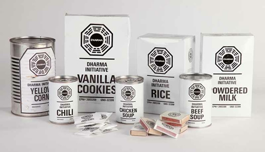
Walmart tried this with the 'Price First' brand, I don't watch tv but I pointed it out to my wife and she said it reminds her of 'Lost'
> I don't know if it's the case in other countries, but in France, most supermarket chains have their own "budget" brand which are generally quite explicit/generic in term of packaging.
Very common in the United States as stores don't license the brand names and so have to come up with a non-trademarked name.
Very common in the United States as stores don't license the brand names and so have to come up with a non-trademarked name.
In Chile we have the acuenta brand, whose packages are almost as plain as you can get: https://i.imgur.com/DeH1KR4.png

The ironic thing about Muji is everything I come across there costs 50-100% more than branded products I see elsewhere. Single serving packets of curry for 800 yen? Basic shirts for 3000 yen? No thanks.
I live in Beijing and there, for the few I know (because I never shop elsewhere), clothes in Muji are good quality, simple functional design, and relatively cheap.
This is still a thing in U.S. grocery stores, it's just that they have "store brand" generic products. For instance in Costco they sell "Kirkland brand". These generics are usually a good deal in terms of quality for price.
Canada has this, with amazing stark-yellow packaging and big black Helvetica nouns:
https://en.wikipedia.org/wiki/No_Name_(brand)
https://en.wikipedia.org/wiki/No_Name_(brand)
Nick Bonner, the author of the book reviewed in the article, once ran (still runs?) Koryo Studio[1] in Beijing, which carries a bunch of North Korean art and "stuff". I once bought a slim volume of film theory there, by Kim Jong-il. It had been translated into English, but was still almost literally unintelligible.
[1]: http://koryostudio.com/
[1]: http://koryostudio.com/
This reminds me quite a bit of soviet packaging: https://www.google.com/search?q=soviet+packaging&client=safa.... With it's use of state colors and very minimal and straight to the point designs.
The designs remind me on 1950-1960s US advertising styles.
NK seems like a living time capsule of that era.
I feel like more and more often I am clicking on pictures and cannot zoom in enough to be satisfied with the detail (here I cannot read the captions).
Is this something that is happening? Is it becoming standard to use lower resolutions for some reason?
Is this something that is happening? Is it becoming standard to use lower resolutions for some reason?
It seems all communist regimes were alike :)
Some packagins from communist Poland:
https://www.google.pl/search?q=prl+opakowania&safe=off&sourc...
Some packagins from communist Poland:
https://www.google.pl/search?q=prl+opakowania&safe=off&sourc...
I found it rather annoying the article lead up to a modernizing of the packaging and how it has changed over time, with basically no examples of anything that shows change.
Beautiful designs
I agree. I find them better than many modern American designs.
Compare the North Korean peas to a modern American label
NK: https://s3-eu-central-1.amazonaws.com/centaur-wp/creativerev...
American: https://encrypted-tbn0.gstatic.com/images?q=tbn:ANd9GcSnVKbi...
Compare the North Korean peas to a modern American label
NK: https://s3-eu-central-1.amazonaws.com/centaur-wp/creativerev...

American: https://encrypted-tbn0.gstatic.com/images?q=tbn:ANd9GcSnVKbi...
I’m more suprised at the english descriptions in every product and at the fact the author seems not ever notice them.
Looks like the labels in the grocery store on The Handmaid's Tale.
Randgalt(5)
That seems very unkorean to me. Everywhere in the world nationalists are complaining about the use of foreign language in advertisement. Why is the state allowing it in NK?