Electricity Maps(app.electricitymaps.com)
app.electricitymaps.com
Electricity Maps
https://app.electricitymaps.com
127 comments
I fucking love maps.
Open Infra Map; shows major electrical lines, power plants, gas & oil lines, and telecom/data centers. Gets its data from Open Street Map: https://openinframap.org/
Open Railway Map; shows railroad lines. Also gets its data from OSM: https://www.openrailwaymap.org/
Also Sentinel Hub has satellite imagery that although it has less resolution than ie Google Maps, it is updated daily: https://apps.sentinel-hub.com/sentinel-playground/
Open Infra Map; shows major electrical lines, power plants, gas & oil lines, and telecom/data centers. Gets its data from Open Street Map: https://openinframap.org/
Open Railway Map; shows railroad lines. Also gets its data from OSM: https://www.openrailwaymap.org/
Also Sentinel Hub has satellite imagery that although it has less resolution than ie Google Maps, it is updated daily: https://apps.sentinel-hub.com/sentinel-playground/
For railways, there is a genre of "track diagrams" which are more like circuit diagrams for the railway, showing lines, crossovers, platforms, etc. The best ones for the UK are perhaps the Quail maps, which include all sorts of gory details, but are commercial:
https://www.trackmaps.co.uk/wp-content/uploads/2023/01/Book5...
There are some pretty good open ones though:
https://cartometro.com/cartes/metro-tram-london/index.php?st...
https://www.trackmaps.co.uk/wp-content/uploads/2023/01/Book5...
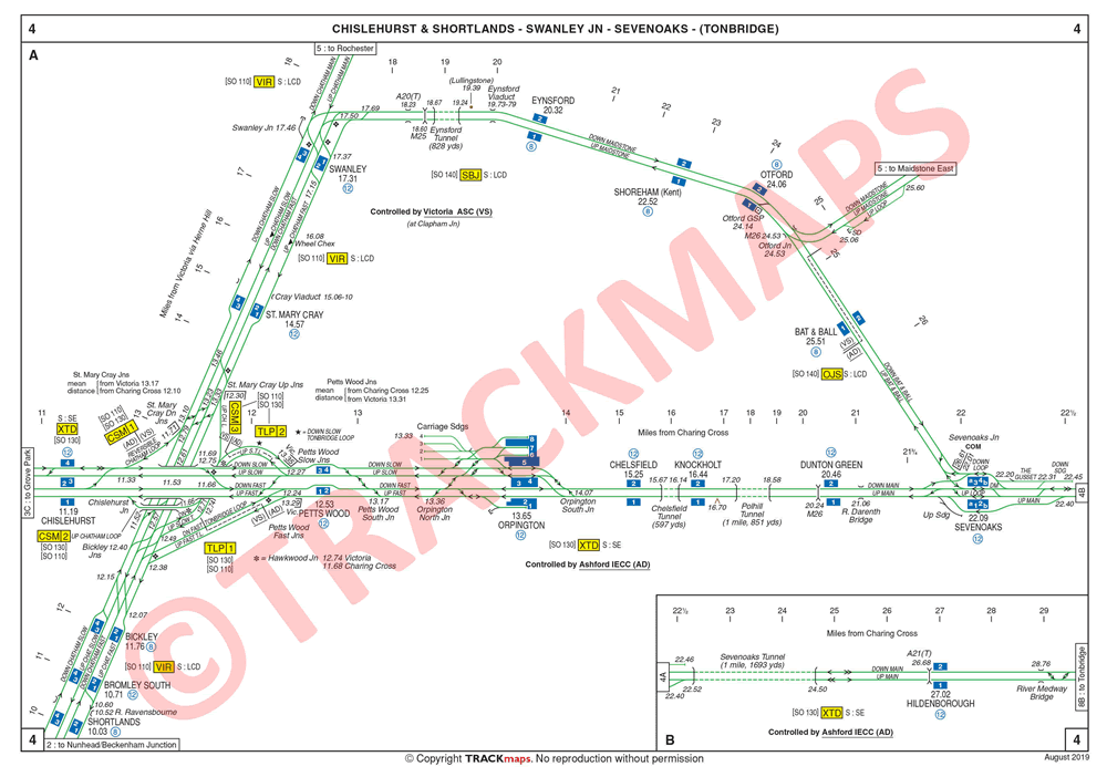
There are some pretty good open ones though:
https://cartometro.com/cartes/metro-tram-london/index.php?st...
Open Infra Map is just the kind of thing I was hoping for! I'm interested/surprised at how many megawatt batteries there are in the UK, and how many 10MW+ solar farms and at all the names of the offshore wind farms and where they connect back to.
> Open Infra Map
Wow. London is surprisingly neat compared to a place like Paris.
Wow. London is surprisingly neat compared to a place like Paris.
A few more.
Light Pollution - https://www.lightpollutionmap.info
Fire and Smoke - https://fire.airnow.gov/ (US) https://firesmoke.ca/forecasts/current/ (Canada)
Earthquakes - https://earthquake.usgs.gov/earthquakes/map/
Ship traffic - https://www.marinetraffic.com/en/ais/home/
Light Pollution - https://www.lightpollutionmap.info
Fire and Smoke - https://fire.airnow.gov/ (US) https://firesmoke.ca/forecasts/current/ (Canada)
Earthquakes - https://earthquake.usgs.gov/earthquakes/map/
Ship traffic - https://www.marinetraffic.com/en/ais/home/
Here’s one for tracking satellites and debris: http://astria.tacc.utexas.edu/AstriaGraph/
True, unfortunately lightning maps doesn't seem to be accurate - at least I had 0 luck with it.
On the other hands flightradar24 and similar are so fascinating if you are on a busy plane route. The observation time is so perfect to speculate over the plane and destinations, chat about interesting facts or recent developments at destinations.
A few years ago I visited a small village where a relative of mine lives and happen to show a kid the app. Next year, I heard that the all the kids there made it a hobby to do plane spotting.
On the other hands flightradar24 and similar are so fascinating if you are on a busy plane route. The observation time is so perfect to speculate over the plane and destinations, chat about interesting facts or recent developments at destinations.
A few years ago I visited a small village where a relative of mine lives and happen to show a kid the app. Next year, I heard that the all the kids there made it a hobby to do plane spotting.
> These kind of world maps with 'live' data
I agree. And I'm glad you put quotes around live. Much of the data for the US is estimated, not actually sourced from the grid operator. It'll be great when we have realtime data everywhere.
I agree. And I'm glad you put quotes around live. Much of the data for the US is estimated, not actually sourced from the grid operator. It'll be great when we have realtime data everywhere.
This thread already contains many candidates for the awesome map list! We just need a hero.
I DuckDuckWent it and it looks like there's a few heroes already:
- https://github.com/drushadrusha/awesome-maps
- https://github.com/thedoubler/awesome-maps-data
- https://github.com/drushadrusha/awesome-maps
- https://github.com/thedoubler/awesome-maps-data
I wonder if this might be misleading. A lot of Los Angeles’ (LADWP) electricity has traditionally been generated generated by coal-fired plants in other states. I’d have to dig into more recent sources to see if that’s still the case, and whether that’s reflected in this dataset.
(Edit: read the sources list, and that should be reflected, but the map is not displaying heavy imports to SoCal. If I had to hazard a guess, I’d suspect LADWP obscuring sources in the published data).
(Edit: read the sources list, and that should be reflected, but the map is not displaying heavy imports to SoCal. If I had to hazard a guess, I’d suspect LADWP obscuring sources in the published data).
Navajo shut down, so I think it’s substantially less today. Solar is also way way up in the entire Southwest.
Been a few years so things may have changed. But California no longer has long term contracts with coal fired plants. But probably is buying it on the spot market. With California it's natural gas -> solar -> everything else.
That’s interesting yeah like a tonne of Quebec hydro gets sold to New England it might or might not get counted
But I also can’t tell where the data is coming from why are so many Canadian provinces gray? I’m sure the website had citations somewhere but it was pretty slow in mobile safari so I didn’t bother to check
But I also can’t tell where the data is coming from why are so many Canadian provinces gray? I’m sure the website had citations somewhere but it was pretty slow in mobile safari so I didn’t bother to check
It is open source and they generally scrape it from the most direct source: https://github.com/electricitymaps/electricitymaps-contrib
It started as an open source project and it became an entire company
It started as an open source project and it became an entire company
The test I always use for this is Prince Edward Island -- 100% of their provincial electricity generation is wind, but it only makes up 3% of their usage, the rest being imported from New Brunswick.
From that perspective the map must be at least trying to reflect imports, as PEI isn't listed as 100% green energy.
From that perspective the map must be at least trying to reflect imports, as PEI isn't listed as 100% green energy.
[deleted]
I find it mildly amusing how for all green talk and net zero pledges, EU bureaucrats and wide public does not give much notice to the third-world-level dirty-as-hell coal-powered generation in Poland.
They do - Poland agreed to the same decarbonization targets and participation in the carbon market as the rest of the EU so it had to implement policies supporting them - chiefly in the form a solar power subsidy program.
The program was more successful than the government anticipated and capacity ballooned so much that the grid needs modernization if it's to support more renewables.
Also electricity usage per capita per year is like 25% lower than say in Germany or France, so emissions in absolute terms are lower than they might appear.
There's a long way to go, but the country is on track to meet the goals set - partly because it's actually cheaper that way.
The program was more successful than the government anticipated and capacity ballooned so much that the grid needs modernization if it's to support more renewables.
Also electricity usage per capita per year is like 25% lower than say in Germany or France, so emissions in absolute terms are lower than they might appear.
There's a long way to go, but the country is on track to meet the goals set - partly because it's actually cheaper that way.
The EU has a cap and trade system ("EU ETS") for large industrial installations. So as far as I understand, the Poland coal plants are not invisible to the EU. They pay a market price for each ton of CO2 emitted.
https://www.europarl.europa.eu/news/en/headlines/society/201...
Poland does try to cancel out the price signal sent by the EU ETS with billions of subsidies. I guess that's part of the reason why they emit so much. But the emission cap still holds; if Poland pays for the right to emit a ton of CO2, then that ton cannot be emitted elsewhere in the EU.
https://ec.europa.eu/commission/presscorner/detail/es/ip_22_...
https://www.europarl.europa.eu/news/en/headlines/society/201...
Poland does try to cancel out the price signal sent by the EU ETS with billions of subsidies. I guess that's part of the reason why they emit so much. But the emission cap still holds; if Poland pays for the right to emit a ton of CO2, then that ton cannot be emitted elsewhere in the EU.
https://ec.europa.eu/commission/presscorner/detail/es/ip_22_...
Unlike most of Europe they have very poor starting point with minimal hydroelectric power resources etc which makes things look relatively worse. However their current progress if you look at the graphs is still fast paced.
“In September 2020, the government and mining unions agreed a plan to phase out coal by 2049 which coincides with 100th anniversary of Karol Wojtyła being assigned to st. Florian's parish in Kraków,[10][11] with coal used in power generation falling to negligible levels in 2032“ https://en.wikipedia.org/wiki/Energy_in_Poland
“In September 2020, the government and mining unions agreed a plan to phase out coal by 2049 which coincides with 100th anniversary of Karol Wojtyła being assigned to st. Florian's parish in Kraków,[10][11] with coal used in power generation falling to negligible levels in 2032“ https://en.wikipedia.org/wiki/Energy_in_Poland
I read your sentences three times and I don't get what exactly you're trying to criticize here or what you're raving at?
"All the green talk" is precisely about getting rid of coal-powered generation in Poland (and other EU states), so what the heck is your complaint here?
"All the green talk" is precisely about getting rid of coal-powered generation in Poland (and other EU states), so what the heck is your complaint here?
It sounds like to me that the complaint is why Poland hasn’t switched to green power already. A comment like that demonstrates a lack of understanding about the levels of effort to make such a change, as if the change to green power is as instantaneous and painless as flicking a switch (pun half intended).
Poland has lower per capita CO2 emissions then germany. The map is per kilowatt, not per capita, so poland looks worse there.
This is super cool! For California, my understanding (from PG&E materials) was that highest demand and carbon intensity was around 3pm to 9pm. The graph here seems to show that even though demand/supply is smaller at night, we have very little non-solar renewables so that carbon intensity is pretty bad all night as well... If that's true, I'm curious why PG&E makes it sound like electricity use at night is not as bad. Do they anticipate bringing more wind online and are trying to get ahead with the messaging to the public?
You have a different definition of “bad” than PG&E. You are trying to minimize the release of CO2, they are trying to minimize the spending of dollars. As a huge generalization, building a power plant is more expensive than running it, so being able to run it 24/7 is generally more profitable than having to use “peaker” plants that are only running and profiting from 4-9pm.
https://www.energy.gov/eere/articles/confronting-duck-curve-...
In the industry the "duck curve" drives a lot of decision making and messaging around the grid in California.
Energy use late at night is not as bad, because there's less of it used. It's the 3-9pm (Usually I hear 4-9, but same thing) hours when solar supply drops off and demand peaks at the same time that they are speaking about. People plugging in cars to L2 chargers when they get home, lights all go on, AC on, etc. It's usually just talked about in the context of grid availability, not so much with GHG emissions, but things are changing in that direction as regulations continue to change.
Shameless plug - If anyone is interesting in developing in this field, we're hiring at olivineinc.com for C# and node/react developers :)
In the industry the "duck curve" drives a lot of decision making and messaging around the grid in California.
Energy use late at night is not as bad, because there's less of it used. It's the 3-9pm (Usually I hear 4-9, but same thing) hours when solar supply drops off and demand peaks at the same time that they are speaking about. People plugging in cars to L2 chargers when they get home, lights all go on, AC on, etc. It's usually just talked about in the context of grid availability, not so much with GHG emissions, but things are changing in that direction as regulations continue to change.
Shameless plug - If anyone is interesting in developing in this field, we're hiring at olivineinc.com for C# and node/react developers :)
The change from NEM 2 to NEM 3 makes getting solar without a battery pointless - so looks like stored demand shifting.
One concern I have about this map, is that the allocation of natural gas applies a flat coefficient to all natural gas sources. As far as I can tell, it does not give any rebate/reduction for natural gas that has a dual purpose -- namely, to provide heating and cooling in addition to the electricity process.
In other words, there are additional processes being driven by the residual heat, often called combined heat and production or cogeneration. It seems that the CO2 g/kWh should be lowered to reflect that these plants only supply a portion of the CO2 for electricity production. [1]
1 - https://www.jenbacher.us/en/our-solutions/industries/industr...
In other words, there are additional processes being driven by the residual heat, often called combined heat and production or cogeneration. It seems that the CO2 g/kWh should be lowered to reflect that these plants only supply a portion of the CO2 for electricity production. [1]
1 - https://www.jenbacher.us/en/our-solutions/industries/industr...
Is Iceland really 100% renewable, that's pretty amazing!
I also liked the cross border exports and our dependency on each other.
I also liked the cross border exports and our dependency on each other.
Being located on the mid-Atlantic rift means they have lots of volcanoes and plentiful geothermal power. So yes, they are 100% renewable, but they are also a bit of a special case.
They do have geothermal plants, but hydro is the bigger factor, accounting for about 75% of electricity generation [1]. Somewhat similar to Norway in having a favorable ratio between wet mountains and small population.
[1] https://www.government.is/topics/business-and-industry/energ...
[1] https://www.government.is/topics/business-and-industry/energ...
They still import and burn a lot of fuel. 85% of cars are still burning fuel and more worryingly nearly 40% of new cars are still fuel burners.
They use Geothermal energy for heating and hot water. I visited the power plant outside Reykjavik a few years back, really interesting!
They joked (but seriously): "when it gets too warm in the house, you just open a window".
They joked (but seriously): "when it gets too warm in the house, you just open a window".
Altho all the hot water in the country has a slight whiff of sulfur.
That UK -- Norway link is (or was) the longest undersea electricity cable in the world[1] at 450 miles (720km).
How do the exports and imports balance; Finland is importing 800MW from Sweden then exporting 400MW to Estonia, is it possible some of that is the same power? Norway is importing 425MW from The Netherlands and exporting 1.2GW to the UK and 200MW to Denmark?
Why does the UK export 73MW to Northern Ireland but then import 286MW from the Republic of Ireland, i.e. why doesn't Northern Ireland import from Republic of Ireland and skip the overseas bit?
[1] https://www.bbc.co.uk/news/uk-england-tyne-58772572
How do the exports and imports balance; Finland is importing 800MW from Sweden then exporting 400MW to Estonia, is it possible some of that is the same power? Norway is importing 425MW from The Netherlands and exporting 1.2GW to the UK and 200MW to Denmark?
Why does the UK export 73MW to Northern Ireland but then import 286MW from the Republic of Ireland, i.e. why doesn't Northern Ireland import from Republic of Ireland and skip the overseas bit?
[1] https://www.bbc.co.uk/news/uk-england-tyne-58772572
Keep in mind this is a very 'zoomed out' view of the power grid. In reality every country is going to have grid limits internally and different sources of demand in different places.
For example, in your Finland observation it may be cheaper/easier to supply the north of Finland from Sweden rather than send the power that could otherwise go to Estonia to the other side of the country, probably not a lot of north south distribution internally in Finland because of terrain (I know Norway really struggles with this, you can see huge price differences in the north of Norway vs south of Norway on EPEX Spot - https://www.epexspot.com/en/market-data), so I would assume Finland is the same.
The UK also has huge bottlenecks north/south in distributing power. There's 4GW of HVDC planned to transmit power from Scotland to England, for example. Probably much more is going to be needed: https://en.m.wikipedia.org/wiki/Eastern_HVDC
For example, in your Finland observation it may be cheaper/easier to supply the north of Finland from Sweden rather than send the power that could otherwise go to Estonia to the other side of the country, probably not a lot of north south distribution internally in Finland because of terrain (I know Norway really struggles with this, you can see huge price differences in the north of Norway vs south of Norway on EPEX Spot - https://www.epexspot.com/en/market-data), so I would assume Finland is the same.
The UK also has huge bottlenecks north/south in distributing power. There's 4GW of HVDC planned to transmit power from Scotland to England, for example. Probably much more is going to be needed: https://en.m.wikipedia.org/wiki/Eastern_HVDC
As it happens this has been in the news quite a bit, and we've been told that the Finnish trunk lines are built for this [1]. Finland isn't split up into multiple electricity price areas unlike its neighbors.
[1] https://www.fingrid.fi/en/pages/company/information-for-cons...
[1] https://www.fingrid.fi/en/pages/company/information-for-cons...
There is currently only one small interconnect between Ireland and Northern Ireland. Another one (1500MW) is being built. This will allow Northern Ireland to benefit from Ireland’s substantial wind resources (~2GW).
https://www.bbc.com/news/articles/czdvj4dv2pyo
> Procurement for the supply of materials for the construction of the overhead line is underway. Testing of the final pylon designs is being undertaken, with a view to construction beginning next year in order to have the project fully operational by 2026.
https://www.soni.ltd.uk/the-grid/projects/tyrone-cavan/the-p...
https://www.bbc.com/news/articles/czdvj4dv2pyo
> Procurement for the supply of materials for the construction of the overhead line is underway. Testing of the final pylon designs is being undertaken, with a view to construction beginning next year in order to have the project fully operational by 2026.
https://www.soni.ltd.uk/the-grid/projects/tyrone-cavan/the-p...
Hmm, maybe this is a "bug" or some intentional way this measurement is made, but when you view the carbon production over time, you can see that some low-carbon sources like wind & solar seem to vary in proportion to the energy being produced. So these aren't exactly zero-carbon because of production and maintenance and whatnot, but it's obviously very low. However, wouldn't this carbon production be annualised at a constant rate - solar power doesn't produce more carbon the brighter the sun shines (does it?)
It makes sense that there's some lookup of X energy source being Y tons co2 per mwh, and this is probably correct when the vast majority of the co2 is coming from the fuel, and the construction + maintenance etc are a rounding error, but this wouldn't be the case for solar, wind, etc.
It makes sense that there's some lookup of X energy source being Y tons co2 per mwh, and this is probably correct when the vast majority of the co2 is coming from the fuel, and the construction + maintenance etc are a rounding error, but this wouldn't be the case for solar, wind, etc.
The source likely says “x g of co2 per kWh”, and doesn’t break that into fixed and variable.
I suspect the sources would typically underestimate legacy sources (meausiring the co2 from burning gas but not the co2 from maintaining the oil rig)
I suspect the sources would typically underestimate legacy sources (meausiring the co2 from burning gas but not the co2 from maintaining the oil rig)
France emits more co² with solar power than with its nuclear powerplants?
It's the manufacturing process of the solar panels and replacement being factored in. Obviously, power generation is carbon free during the panels lifecycle but manufacturing today produces co2
I’m not sure of the answer on this website, but if you’re going that route you’d also need to factor in the carbon cost of the building materials for power plants of any type. Steal and concrete aren’t carbon free either.
the averaged total emissions per kWh is higher for solar power than for nuclear, yes.
Can you please elaborate more on this?
I take it this includes CO2 released during manufacturing. Is it averaged over the expected life span? What about for a nuclear plant? Whole I can see how we can estimate CO2 for a panel, I don’t think we can have good idea of a whole plant.
Ideally it's lifecycle carbon footprint averaged over expected power production during that time, but the numbers aren't always directly comparable and the error bars are huge to boot.
With solar, most of the carbon footprint comes from the massive energy requirements needed to produce the panels, and countries that use coal to produce panels like China have a significantly higher carbon footprint than say the EU. Then there's the matter of where you install them, panels in most of Europe will have a CO2/kWh figure similar to to panels installed in north-west Canada, while panels installed in the US will have a similar figure to panels installed in southern Europe and northern Africa. Newer panels generally have a longer lifespan and are more efficient so will have a lower number even if the total footprint stays the same. Should the albedo effect be considered with solar? It matters if you plan to cover a light desert with dark panels. How often it rains can also ironically have a difference, as rain helps clean the panels keeping them running efficiently.
With nuclear, there's the mostly fixed costs of constructing and decommissioning the plants, the ongoing cost of running and maintaining the plants, disposing of spent fuel, and with most of the cost coming from mining the fuel. To me nuclear seems a little more straight forward to calculate, but there's still variability that can come from the availability and difficulty of mining the ore. There's also political issues to consider. If your country decides to shut down your nuclear plants prematurely, like Germany did, the huge upfront cost of building the plants can't be recouped by running them for an additional 10, 20, 30+ years until it becomes necessary to decommission them.
Regardless of how renewables are compared to nuclear, coal and gas are the elephants in the room when it comes to CO2 produced per kWh.
With solar, most of the carbon footprint comes from the massive energy requirements needed to produce the panels, and countries that use coal to produce panels like China have a significantly higher carbon footprint than say the EU. Then there's the matter of where you install them, panels in most of Europe will have a CO2/kWh figure similar to to panels installed in north-west Canada, while panels installed in the US will have a similar figure to panels installed in southern Europe and northern Africa. Newer panels generally have a longer lifespan and are more efficient so will have a lower number even if the total footprint stays the same. Should the albedo effect be considered with solar? It matters if you plan to cover a light desert with dark panels. How often it rains can also ironically have a difference, as rain helps clean the panels keeping them running efficiently.
With nuclear, there's the mostly fixed costs of constructing and decommissioning the plants, the ongoing cost of running and maintaining the plants, disposing of spent fuel, and with most of the cost coming from mining the fuel. To me nuclear seems a little more straight forward to calculate, but there's still variability that can come from the availability and difficulty of mining the ore. There's also political issues to consider. If your country decides to shut down your nuclear plants prematurely, like Germany did, the huge upfront cost of building the plants can't be recouped by running them for an additional 10, 20, 30+ years until it becomes necessary to decommission them.
Regardless of how renewables are compared to nuclear, coal and gas are the elephants in the room when it comes to CO2 produced per kWh.
Note that the "CO2/kWh equivalent emissions" given on the page are provided with source to document describing methodology: UNECE 2022. Can't link you to specific place right now, but quick google gives a bunch of starting points like https://unece.org/sites/default/files/2022-04/LCA_3_FINAL%20...
Inside you will find description of the model for various power sources including what total lifecycle sources of emissions contribute how much.
Consider also the ridiculous power density of nuclear fuels, best visualized IMHO in this good old XKCD comic: https://xkcd.com/1162/
Inside you will find description of the model for various power sources including what total lifecycle sources of emissions contribute how much.
Consider also the ridiculous power density of nuclear fuels, best visualized IMHO in this good old XKCD comic: https://xkcd.com/1162/
For South Africa it doesn't seem to have nuclear, hydro, wind, or any other source except coal for carbon emissions. It's missing some data points:
https://www.eskom.co.za/dataportal/supply-side/station-build...
https://www.eskom.co.za/dataportal/supply-side/station-build...
This doesn't seem accurate, it says that Greece uses 0% coal when I know that at least 660 MW come from coal.
It’s live updating, so 0% of the electricity right now is being generated by coal (ie. The coal power plant is off). Note that Greece says “estimated” though so I presume they don’t have the actual live numbers.
You can view averages from the past 30 days, 12 months, and 6 years though and that shows the percentage of coal generation being about 800MW over the past 12 months.
You can view averages from the past 30 days, 12 months, and 6 years though and that shows the percentage of coal generation being about 800MW over the past 12 months.
Hmm, maybe the station isn't operational right now, thanks.
According to wikipedia, there are no coal powered power stations
https://en.wikipedia.org/wiki/List_of_power_stations_in_Gree...
https://en.wikipedia.org/wiki/List_of_power_stations_in_Gree...
Sure there are
https://en.m.wikipedia.org/wiki/Agios_Dimitrios_Power_Statio...
They just use terms like “thermal” and “lignite” (brown coal) to make it sound nicer.
https://en.m.wikipedia.org/wiki/Agios_Dimitrios_Power_Statio...
They just use terms like “thermal” and “lignite” (brown coal) to make it sound nicer.
Well, there is one around 2km from me, though I'm not sure if it's running right this instant. I can look later, though.
EDIT: It doesn't seem like the specific unit is on the list, it's called Ptolemaida 5.
EDIT: It doesn't seem like the specific unit is on the list, it's called Ptolemaida 5.
That page lists 7 coal powered plants.
Most zones are not accurate. The US also has very doubtful numbers.
I guess depends a lot on public sources.
I guess depends a lot on public sources.
Texas (ERCOT) uses more power than any country in Europe it seems. Gotta keep the air conditioners running.
Website is somewhat inaccurate. The Appalachian Power (AEP) for central VA is 100% hydro, yet the whole of Virginia is colored like coal.
No idea what's happening, but is it possible that they're importing electricity from dirty sources? That would change the colour from green to brown.
Ah that could be it. They state that they generate 100% of all their power needs with hydro, but I know power markets are weird black magic entities. It's possible they could really generate all their power needs with hydro, but then sell that power to another company and then buy-in coal for less.
Do you have a reference for AEP's coverage? I can't find anything on their website.
By reference do you mean area? I only know any of this from the annual reports they sent when I lived in Lynchburg. I do know that the do not cover anywhere east of the James River.
Thanks, I just wondered where you got the info and if it might be publicly accessible. I lived in the area too and was curious where my power came from.
If you get a paper statement then they ought to be sending you an annual report explaining power creation stuff, total and average usage, etc. When I switched to the online statement I stopped getting the report. Should be online too, just no clue where..d
Wow, Cyprus is doing much worse than I'd have guessed, 870g/kWh as I write this.
This map looks very cool. I use it on a project and it fits really well to it.
sturmbraut(10)
What is a Birkeland current?
The addition of China data would make the legend useless, but it still goes to show out sized some things are, while the UK continues to chase Net Zero at the expense of its citizen's wealth, other countries (India, China, the US) prioritise their economy.
Heading towards a clean energy future is great, but it's costing our poorer citizens unequally more than our wealthier ones. See: ULEZ.
Heading towards a clean energy future is great, but it's costing our poorer citizens unequally more than our wealthier ones. See: ULEZ.
I'm always at a loss with this argument. How does chasing cheaper sources of energy that also happen to be renewable hurt the poor? Gas generators cost the most per kWh to run. Our electricity prices rocketted because of natural gas prices rocketing.
If we'd managed to get off gas sooner we'd have clean cheap power, and energy independence.
If we'd managed to get off gas sooner we'd have clean cheap power, and energy independence.
It's clearly not cheaper, is it! Energy prices are higher than they have ever been! What are yuo talking about? Do you know anyone that lives in poverty? I do, I help them financially. These people are struggling, and NetZero is not helpful.
Wind is not cheap. We can do better than this
Edit: Seriously, I'm willing to be convinced but I am at a loss whenever I see people deny that increased inflation hurts people with less money than it does people like you. If you need me to explain how it works (that as a % of your income, poorer people will pay FAR MORE in energy, housing, food, and other inflation-related costs, which, you know, is in part fueled by chasing NetZero) I'll happily sacrifice my time to help you understand.
Wind is not cheap. We can do better than this
Edit: Seriously, I'm willing to be convinced but I am at a loss whenever I see people deny that increased inflation hurts people with less money than it does people like you. If you need me to explain how it works (that as a % of your income, poorer people will pay FAR MORE in energy, housing, food, and other inflation-related costs, which, you know, is in part fueled by chasing NetZero) I'll happily sacrifice my time to help you understand.
Poorer people in the ULEZ area don’t own cars, they live in flats overlooking car ridden streets. Besides ULEZ is not about stopping Co2 emissions or net zero, it’s about removing dirty smoke from the roads poor people (the ones you see on the bus) live on.
> Climate Impact by Area
This thing again, with Sweden being all green while one of its biggest companies is busy with cutting down trees left, right and center, and then there's of course Norway, which have made their money on oil and gas, with the latter being extremely lucrative especially now, after the war in Ukraine started.
Of course, I know this is "only" about the way they're generating electricity, yadayadayada, because I'm sure the only thing stopping the African countries from going all "green" when generating electricity is the lack of will, not the lack of money (which, again, countries like Norway and Sweden acquired on the back of very non-green actions).
And then there's a question about how "green" hydro is in the first place, as even Khrushchev himself received a lot of critics from inside the Party for the environment devastation brought by building lots of hydro projects on the Volga [1]
[1] https://en.wikipedia.org/wiki/Volga_Hydroelectric_Station
This thing again, with Sweden being all green while one of its biggest companies is busy with cutting down trees left, right and center, and then there's of course Norway, which have made their money on oil and gas, with the latter being extremely lucrative especially now, after the war in Ukraine started.
Of course, I know this is "only" about the way they're generating electricity, yadayadayada, because I'm sure the only thing stopping the African countries from going all "green" when generating electricity is the lack of will, not the lack of money (which, again, countries like Norway and Sweden acquired on the back of very non-green actions).
And then there's a question about how "green" hydro is in the first place, as even Khrushchev himself received a lot of critics from inside the Party for the environment devastation brought by building lots of hydro projects on the Volga [1]
[1] https://en.wikipedia.org/wiki/Volga_Hydroelectric_Station
Is there a collection like an "awesome maps" list anywhere?
[1] https://news.ycombinator.com/item?id=37187760