Show HN: I built a site to roast landing pages(roastd.io)
roastd.io
Show HN: I built a site to roast landing pages
https://www.roastd.io/
23 comments
You might have 10 years of experience in UX design, but whoever made this landing page did not bother to read it on a mobile device.
It looks mobile optimized to me on iPhone.
What issues are you having? I've tested on mobile.
* "Why should I pick you to humiliate n" is what I see on my phone. Samsung S22, Chrome window is being reported as 412px wide, 892px tall.
* I'd say whitespace use is dubious for my taste, but it is definitely inconsistent between the 3rd and the 4th review.
* Once I tap on 'Menu', I can't dismiss it by tapping outside of it. It's actually very annoying.
Miscellaneous complaints, just because my mantra is that if I'm going to be roasting other people's work, my stuff better be perfect.
* animation is overused imo, but the hero animation is janky, presumably because the rest of the site is still loading.
* autoscrolling 'proof of tears' with no way to stop or scroll them? From a 'user experience designer'? They do scroll rather slowly, but if the top sentence catches my eye, it goes off the screen and I have no way to bring it back.
* too many colors when you take the icons into account (and the color palette isn't my cup of tea, but that's fine)
I won't charge you anything for the QA feedback because I would like you to succeed with this and I wish you all the best.
Good luck!
* I'd say whitespace use is dubious for my taste, but it is definitely inconsistent between the 3rd and the 4th review.
* Once I tap on 'Menu', I can't dismiss it by tapping outside of it. It's actually very annoying.
Miscellaneous complaints, just because my mantra is that if I'm going to be roasting other people's work, my stuff better be perfect.
* animation is overused imo, but the hero animation is janky, presumably because the rest of the site is still loading.
* autoscrolling 'proof of tears' with no way to stop or scroll them? From a 'user experience designer'? They do scroll rather slowly, but if the top sentence catches my eye, it goes off the screen and I have no way to bring it back.
* too many colors when you take the icons into account (and the color palette isn't my cup of tea, but that's fine)
I won't charge you anything for the QA feedback because I would like you to succeed with this and I wish you all the best.
Good luck!
Thank you and really appreciate the feedback.
on mobile i see a few issues with your site,
- cutoff brands
- cutoff proof of tears section. what is the section even for?
- cutoff FAQ header text
- margins are MASSIVE, so much whitespace
- dialogs that animate in too slow
- quoting JBP? not sure necessary here and will expose you to unwanted criticism
edit: just realized JBP quote is something a client received as criticism. Not a fan of that personally, no I'm not a jbp hater, but use your own words
- cutoff brands
- cutoff proof of tears section. what is the section even for?
- cutoff FAQ header text
- margins are MASSIVE, so much whitespace
- dialogs that animate in too slow
- quoting JBP? not sure necessary here and will expose you to unwanted criticism
edit: just realized JBP quote is something a client received as criticism. Not a fan of that personally, no I'm not a jbp hater, but use your own words
that took 5 mins, we can go deeper but you'd need to send me 99$.
How much more to redditfy it rather provide serious feedback?
Thanks for the feedback!
I've tried testing on multiple devices and am not seeing the same issues regarding styling but will continue to test and make improvements. Regarding JP I love the man personally but I respect your opinion.
I've tried testing on multiple devices and am not seeing the same issues regarding styling but will continue to test and make improvements. Regarding JP I love the man personally but I respect your opinion.
I'm on a pixel 4g. brave browser, all are definitely issues for more than just me.
Is this supposed to be a parody? https://files.catbox.moe/lb3t5q.png
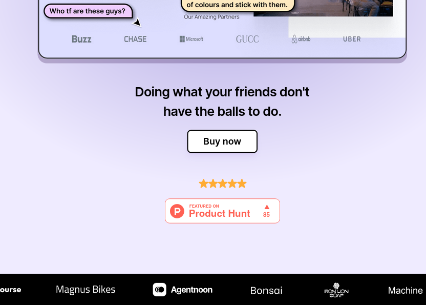
I think it's supposed to be edgy and unvarnished but it just comes off as crass and unprofessional.
No parody, I say it how I see it.
[deleted]
[deleted]
watch Hyperplexed on youtube if you want to see an actual cretics and fixes of websites and apps.
https://www.youtube.com/@Hyperplexed
https://www.youtube.com/@Hyperplexed
why should i pay for something that show hn gives me for free?