Science Fiction Movie Lettering(reaganray.com)
reaganray.com
Science Fiction Movie Lettering
https://reaganray.com/2020/05/12/sci-fi-movie-lettering.html
22 comments
That's a great site. I though it was generally Microgramma which I first discovered on the front of a Commodore PET for Sci Fi movies. TIL that one of the designers of Microgramma (Aldo Novarese) later designed Eurostyle and they are quite similar looking. To this day I still often label things with TLAs in Microgramma because it looks futurey to me.
The Microgramma Wikipedia page has a decent size list of it's use in popular culture.
https://en.wikipedia.org/wiki/Microgramma_(typeface)
Thanks for the rabbit hole!
The Microgramma Wikipedia page has a decent size list of it's use in popular culture.
https://en.wikipedia.org/wiki/Microgramma_(typeface)
Thanks for the rabbit hole!
When 2001 came out in 4k, you could read the zero gravity toilet instructions... :)
The book is very nice too!
Pretty cool. I'd love to see it sorted by year of release, since the change in style over time, as new fads and technologies emerge, is a pretty interesting story to track.
+1 on this; first thought I had while scrolling through
Definitely! You can tell that the idea of what constitutes high-tech changes over time. Alphaville (1965) has letters that look like they're made of stiff wires and The Terminator (College Roadshow Version) (1984) uses a 7-segment display style font (with plenty of liberties taken). Both of these look old-fashioned in retrospect but at the time probably evoked very modern imagery.
Some early science fiction movies used variations on the MICR font [1], which still appears on bank checks.[1] The amusing thing is that the real MICR font has no letters; just numbers and some delimiters. Those strange letter forms are designed to be read with a 1-track magnetic read head. A horizontal scan of the amount of ink alone is enough to uniquely identify the number. It's really a bar code made to be human readable.
[1] https://www.1001fonts.com/micr-encoding-font.html
[1] https://www.1001fonts.com/micr-encoding-font.html
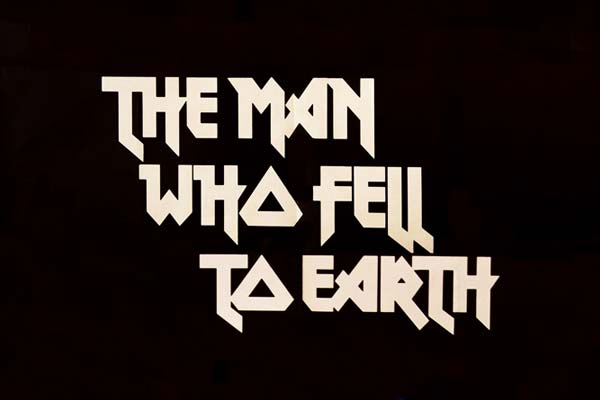
Iron Maiden was one of the first bands that I got into and they had (and presumably still have) incredible visual imagery and graphic design. But, today I learned that the typeface for their logo¹ was not original. It’s very similar to the The Man Who Fell to Earth² which came out in 1976 (the only letter that looks different is the ‘E’).
¹ https://en.wikipedia.org/wiki/File:Iron_Maiden_Logo.png
² https://reaganray.com/img/blog/sci-fi-logos/the-man-who-fell...
¹ https://en.wikipedia.org/wiki/File:Iron_Maiden_Logo.png

² https://reaganray.com/img/blog/sci-fi-logos/the-man-who-fell...
Interesting absence of scanlines. Close Encounters of the Third Kind has them but a image search appears to indicate that was only used in a few cases. The Matrix has somewhat of a scanline inspired artifact and Tron could be argued to be somewhere between the other two. Given how many consumer logos of the late 70s and 80s were influenced by scanlines, it's interesting that sci-fi logos appear to have mostly avoided their use.
The page displays the movie title logos for Superman I-III but not Superman IV or Man Of Steel. I suppose that's a selection bias from the website owner Reagan Ray.
Here's his page on Marvel Comics title logos: https://reaganray.com/2021/04/06/marvel-lettering.html
Here's his page on Marvel Comics title logos: https://reaganray.com/2021/04/06/marvel-lettering.html
Man of Steel is past the 2000 cut-off.
Then there were the fonts in the 70s, inspired by banking magnetic fonts
https://www.pinterest.com.au/pin/471118810990909200/
https://www.pinterest.com.au/pin/471118810990909200/
Nice to see "Phase IV" get a mention. It's a wild ride.
I'm inclined to try and analyze with ML how typefaces evolve over time in particular domains
The Bride of Frankenstein lettering looks surprisingly like the Jurassic Park typeface!
Whoa, they're almost all using capital letters.
Missing:
• *batteries not included
• Bicentennial Man
• Billion Dollar Brain
• Blue Thunder
• Capricorn One
• Colossus – The Forbin Project
• Electric Dreams
• Eraser
• eXistenZ
• The Fifth Element
• Flight of the Navigator
• Gog
• Harrison Bergeron
• The Hidden
• La Jetée
• The Lawnmower Man
• The Monolith Monsters
• Looker
• Pitch Black
• Soldier
• Split Second
• Strange Days
• The Quatermass Xperiment
• Quatermass 2
• Quatermass And The Pit
• Them!
• The Thirteenth Floor
• Timecop
• WarGames
• *batteries not included
• Bicentennial Man
• Billion Dollar Brain
• Blue Thunder
• Capricorn One
• Colossus – The Forbin Project
• Electric Dreams
• Eraser
• eXistenZ
• The Fifth Element
• Flight of the Navigator
• Gog
• Harrison Bergeron
• The Hidden
• La Jetée
• The Lawnmower Man
• The Monolith Monsters
• Looker
• Pitch Black
• Soldier
• Split Second
• Strange Days
• The Quatermass Xperiment
• Quatermass 2
• Quatermass And The Pit
• Them!
• The Thirteenth Floor
• Timecop
• WarGames
1: https://typesetinthefuture.com/
2: https://typesetinthefuture.com/2014/01/31/2001-a-space-odyss...