Jessica Hische Brings New Life to an Old Logo(printmag.com)
printmag.com
Jessica Hische Brings New Life to an Old Logo
https://www.printmag.com/designer-interviews/jessica-hische-logo-refresh/
24 comments
The oscillation between brands wanting consistent weights and spacing within logos to look "cleaner", and wanting inconsistency to look "authentic", all of it happening on an almost subconscious level for everyone subjected to it, employs so many graphic designers. It's mind-boggling.
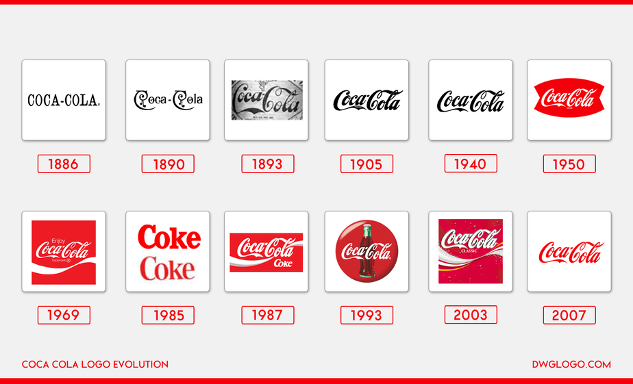
Lots of negative comments so far, but this is much preferable to having every brand trend towards plain san-serif wordmarks[0] that will be easier to use. Much closer to something like the evolution the Coke brand[1], which occasionally refreshes and modernizes, but retains the same character it had 100+ years ago.
[0]: https://velvetshark.com/articles/why-do-brands-change-their-... [1]: https://dwglogo.com/wp-content/uploads/2016/03/coca-cola_log...
[0]: https://velvetshark.com/articles/why-do-brands-change-their-... [1]: https://dwglogo.com/wp-content/uploads/2016/03/coca-cola_log...
The first thing I thought was "Corporate needs you to find the difference between these two pictures"
Seems like these examples are selected as the ones where the corp overall actually likes the logo they have to begin with.
So to be most successful at giving the client what they want, they need to make no drastic changes.
While still earning comparable designer fees as if a whole new logo was produced instead.
So everybody wins.
So to be most successful at giving the client what they want, they need to make no drastic changes.
While still earning comparable designer fees as if a whole new logo was produced instead.
So everybody wins.
Aha, so the reason the "refreshed" logo looks damn near identical to the original is because the brief is not "give us a new logo" but "give us the old logo but fixed so we can put it on our website, print it on paper, and vinyl cut it on the side of a van, and it won't look wrong" then.
Tech companies have really brought in an era of completely lifeless and inauthentic graphic design. I think we really are in in a sort of art dark-age right now, in general.
On the upside, I can tell how long it is until my next eye exam by how long it takes me to differentiate Google's five dozen nearly identical rainbow circle products from one another.
Basically better kerning and font weight changes, nothing too scary for the huge committees of empty suits to be presented to, meet over and approve
"It can be a challenge for them to get executives on board with something that seems so subtle, but I do my best to provide them with the right language and tools to prove the value."
For larger firms, getting a conference room full of executives involved in design approvals - whether for logos or websites or packaging or whatever - is a huge waste of time and inserts all kinds of personal bias and counterproductive decisions. The result is often design by committee, or purely "data driven" designs that lead companies down the path of mediocrity and following yesterday's trends.
For larger firms, getting a conference room full of executives involved in design approvals - whether for logos or websites or packaging or whatever - is a huge waste of time and inserts all kinds of personal bias and counterproductive decisions. The result is often design by committee, or purely "data driven" designs that lead companies down the path of mediocrity and following yesterday's trends.
Not to mention a headache. She is a great speaker though, so that probably shines through.
I'm still angry about that Mailchimp logo.
This is the designer equivalent of rewriting working systems in Rust.
This is the graphical equivalent of a PR fixing a typo in a comment
the logos could have been swapped the other way around and the article would have read in exactly the same way and made the same amount of sense.
Bucking the trend, I have a cool identifiable logo that I created on my own. Like Nike, I spent about $35 on it, done by some dude in Pakistan.
I bumped into a brand expert a few days ago and we changed business cards, he just was floored by my logo and said it was fantastic, and that he knows a good logo when he sees one.
So weird that so many people and companies have no imagination. All those "logo" changes done by Hische are so insipid. Nothing bold, nothing imaginative. But I guess she avoids conflict by making microscopic changes and she earns $40,000 per logo or whatever she charges, and that's the real point of it.
And yes, I'm tooting my own horn, deal with it.
I bumped into a brand expert a few days ago and we changed business cards, he just was floored by my logo and said it was fantastic, and that he knows a good logo when he sees one.
So weird that so many people and companies have no imagination. All those "logo" changes done by Hische are so insipid. Nothing bold, nothing imaginative. But I guess she avoids conflict by making microscopic changes and she earns $40,000 per logo or whatever she charges, and that's the real point of it.
And yes, I'm tooting my own horn, deal with it.
link to the Pakistani bloke?
As I wrote, I created it on my own. I'm the one that conceptualized the logo in great detail, but he did the actual design work according to my specifications. I would never be able to do the actual design, it's not in my wheelhouse. But the concept was mine.
If you have a crisp solid idea that you can explain in great detail, just about any graphic artist will do.
That's really the key to outsourcing anything. You have to have a crystal clear idea and the ability to communicate it.
It doesn't only pertain to logos. It's everything. You can't really ask for ideas that they have - it'll never be yours, never have your own originality.
I thought a lot about my logo - I didn't do it in 15 minutes. I kept rolling it around in my mind until it came to full fruition. It took about a month for the concept to really work itself out. I google searched on terms for graphic images that were similar to my ideas and saw other graphics that gave me ideas. I put my own twist on it. But I was able to send the guy about 8 different examples from other graphics but told him how it would be different. Mine was completely different from the ones that I searched for the terms on Google, but they gave the "flavor" of what I wanted, plus I added words as to what I wanted and what would be different. I love my logo.
If you have a crisp solid idea that you can explain in great detail, just about any graphic artist will do.
That's really the key to outsourcing anything. You have to have a crystal clear idea and the ability to communicate it.
It doesn't only pertain to logos. It's everything. You can't really ask for ideas that they have - it'll never be yours, never have your own originality.
I thought a lot about my logo - I didn't do it in 15 minutes. I kept rolling it around in my mind until it came to full fruition. It took about a month for the concept to really work itself out. I google searched on terms for graphic images that were similar to my ideas and saw other graphics that gave me ideas. I put my own twist on it. But I was able to send the guy about 8 different examples from other graphics but told him how it would be different. Mine was completely different from the ones that I searched for the terms on Google, but they gave the "flavor" of what I wanted, plus I added words as to what I wanted and what would be different. I love my logo.
For a website called printmag you'd think they would have heard about contrast. #EEEEEE body on #FFFFFF is a shitty combination.
Mine's fine (#1b1b1b on #ffffff, chrome windows).
Are you running some low contrast mods, dark mode, or some such?
Are you running some low contrast mods, dark mode, or some such?
I'm running dark mode on iOS. Likely a broken dark mode CSS, I read it in Reader mode but it's not difficult to check dark mode CSS.