A Modern Web for Hacker News – Open-Source and Seeking Feedback(modern-hacker-news.vercel.app)
modern-hacker-news.vercel.app
A Modern Web for Hacker News – Open-Source and Seeking Feedback
https://modern-hacker-news.vercel.app/
134 comments
On a 14" MBP the new version has 6 posts visible on initial load while the old version has 22 posts, a -73% reduction in information density. Not ideal.
It looks like the vote buttons were moved to the right to so that there would not be both vote buttons and post type icons on the left side of the post title. I would argue that vote buttons are more important and should get priority. Maybe remove the post type icons and instead add tags to post title? Then you can put the vote buttons back on the left side where they belong. If you do decide to keep the post type icons, there is way too much white space inside of the circles.
I don't understand why there is a "#" in front of the usernames. Hashtags are typically used to indicate topics rather than people. Unless this is sort of callback to IRC days where operators in front of names indicate server hierarchy.
If you are going to do all-white background I would like option to switch to dark mode.
I do like the timestamps though.
It looks like the vote buttons were moved to the right to so that there would not be both vote buttons and post type icons on the left side of the post title. I would argue that vote buttons are more important and should get priority. Maybe remove the post type icons and instead add tags to post title? Then you can put the vote buttons back on the left side where they belong. If you do decide to keep the post type icons, there is way too much white space inside of the circles.
I don't understand why there is a "#" in front of the usernames. Hashtags are typically used to indicate topics rather than people. Unless this is sort of callback to IRC days where operators in front of names indicate server hierarchy.
If you are going to do all-white background I would like option to switch to dark mode.
I do like the timestamps though.
I get 9 posts on my 14" MacBook--still not great. I don't know what it is with (IMO excessive) whitespace on modern UIs.
Usability for me is about speed and convenience--see my rendering[0] on the opposite end of the scale--all stories for the day loaded on one long page. Click the date heading for yesterday's. It was made for reading while commuting (with intermittent internet) years ago and I just kept using it on desktop.
[0] https://hackerer.news
Usability for me is about speed and convenience--see my rendering[0] on the opposite end of the scale--all stories for the day loaded on one long page. Click the date heading for yesterday's. It was made for reading while commuting (with intermittent internet) years ago and I just kept using it on desktop.
[0] https://hackerer.news
I have a hunch that the reason for the excessive space is that it is much easier to make it look good.
I'm really good with frontend, but I only have quite limited design training. I can whip out a good non-dense layout pretty quickly.
On the other hand, pretty much every (good) information-dense layouts I ever worked with had to be properly designed by a professional.
Maybe the reason for that is just fashion, I'm constantly informed by what I see and it's easier to replicate, whereas something that "breaks the rules" needs a better professional.
I'm really good with frontend, but I only have quite limited design training. I can whip out a good non-dense layout pretty quickly.
On the other hand, pretty much every (good) information-dense layouts I ever worked with had to be properly designed by a professional.
Maybe the reason for that is just fashion, I'm constantly informed by what I see and it's easier to replicate, whereas something that "breaks the rules" needs a better professional.
>> whitespace on modern UIs ... Usability
Here here! But you're understating it.
Less information dense, and smaller fonts is an appalling use of type, and layout. These first principals about type, font, page layout, they are about readability, and scalability...
We have 600 years of printing, of typography to lean on. Thats 600 years of refinement on line length, spacing and size. The human eye didn't evolve in the last two decades all these lessons still apply!
Here here! But you're understating it.
Less information dense, and smaller fonts is an appalling use of type, and layout. These first principals about type, font, page layout, they are about readability, and scalability...
We have 600 years of printing, of typography to lean on. Thats 600 years of refinement on line length, spacing and size. The human eye didn't evolve in the last two decades all these lessons still apply!
All that would make sense if I were reading the page but here I'm scanning the titles to find the few stories of interest in a forest. Optimizing for scanning shouldn't require so much scrolling and Load more.
I don't think it's possible to make everyone happy here. I find it a lot faster and easier to scan the titles when there's more whitespace between them. If they're too close together, I'll end up constantly losing my place and rereading the same ones multiple times, or accidentally read two lines at the same time. I can't be the only person with this problem.
Thanks for supporting.
> The goal is to enhance the user experience and interface
What are the top user pain points your solution is attempting to address (i.e. what are your product requirements)?
What are the top user pain points your solution is attempting to address (i.e. what are your product requirements)?
This is a great question. "Be modern" is not a measurable goal and cannot guide development.
Better layout on mobile, more accessible actions, keyboard shortcuts, all those things say "modern" to me, and would be very welcome. Making the background white and adding 100px of empty space between each paragraph, less so.
Better layout on mobile, more accessible actions, keyboard shortcuts, all those things say "modern" to me, and would be very welcome. Making the background white and adding 100px of empty space between each paragraph, less so.
Jts wanna make it easy to read on mobile version.
The repo gets more into detail under "Milestones"
Not really. Those are just additional features. Sure, of course, some of the user requirements are self-evident from the feature (e.g. the "support dark mode" one), but "what are the pain points you are trying to solve?" should be the starting point, not something you back into after you have your feature list. For example, the top item there is "support PWA". Why? Is this something people actually care about or would use? I'm not even asking this question rhetorically, but I honestly don't know the answer.
My vote is to keep Hacker News working when JavaScript is disabled. This proposed design would break that. Also, the classic Hacker News interface is more information dense, which is good.
This is probably an unpopular opinion, but I find the full ISO date a bit distracting.
IMO the date is alright when you're seeing multiple ungrouped items from different days, or for closely inspecting when something was posted. But when a list has items that are mostly from the same day, I personally find the full date redundant and distracting. I mostly focus on the hours and am always bit afraid that I might "miss" that one item is from a totally different day, since my eye is in the hours/minutes.
I would prefer just the hour to be there, but what I find even better is the "X minutes ago" format (when everything is mostly from the same day), as even the full hour makes me do a bit of metal calculation.
IMO the date is alright when you're seeing multiple ungrouped items from different days, or for closely inspecting when something was posted. But when a list has items that are mostly from the same day, I personally find the full date redundant and distracting. I mostly focus on the hours and am always bit afraid that I might "miss" that one item is from a totally different day, since my eye is in the hours/minutes.
I would prefer just the hour to be there, but what I find even better is the "X minutes ago" format (when everything is mostly from the same day), as even the full hour makes me do a bit of metal calculation.
Eh... "x minutes ago" should really only be used if within the last few hours. After that I prefer exact timestamps. I really, really don't like seeing "yesterday" because I am not sure if it is the server's yesterday or my yesterday. I don't like going on YouTube and seeing "uploaded 1 year ago" when it can be any time between 1-2 years.
[deleted]
Good to know it.
"Eh... "x minutes ago" should really only be used if within the last few hours"
Yes, that's what I mean by "everything is from the same day".
Yes, that's what I mean by "everything is from the same day".
Updated it.
yep its best to have the ago for say hours but once it gets past a month or so its better to have dates
It looks pretty but I find the density of the classic layout more useful for skimming for relevant articles (less scrolling).
Guess that is highly subjective. I do like the current, compact layout better. Also there is more text per line and in your layout (on mobile) the eye does have to jump more which I find a bit more strenous.
On a 4k screen at 150% DPI scaling on Windows, in FireFox, I can see 30 items without scrolling on the current layout for https://news.ycombinator.com/
On this proposed format, I can see ten.
I believe the existing page is definitely more dense than it needs to be, but I don't think migrating to so much whitespace that it's 30% of the information that it was is a good ratio. I think I'd be happy with anything over 20 readable headlines (without scrolling) on a new format.
On this proposed format, I can see ten.
I believe the existing page is definitely more dense than it needs to be, but I don't think migrating to so much whitespace that it's 30% of the information that it was is a good ratio. I think I'd be happy with anything over 20 readable headlines (without scrolling) on a new format.
honestly, there is so much that I didnt like after getting a 4k screen that i went back to 2k.
Good ideas but not applicable to HN.
HN has the simplest, cleanest, no distractions, information dense UI i have seen. It perfectly suits the site and medium. I wish more sites would adopt this approach of "actual usefulness" rather than "prettifying" into a complicated broken mess.
HN has the simplest, cleanest, no distractions, information dense UI i have seen. It perfectly suits the site and medium. I wish more sites would adopt this approach of "actual usefulness" rather than "prettifying" into a complicated broken mess.
It's worse than a "complicated broken mess". It doesn't work at all on iOS 14.3 (iPhone). It's just stuck displaying some glowing squares.
There is an increasing number of websites which are becoming broken on iOS 14.3. https://thesaurus.com is another example; it used to work fine, until a few months ago, when they pushed a frontend update that now results in an "Unexpected application error"; not even partial functionality, only the error message is displayed.
I find revolting this culture of mandatory technology upgrades that add no real value.
There is an increasing number of websites which are becoming broken on iOS 14.3. https://thesaurus.com is another example; it used to work fine, until a few months ago, when they pushed a frontend update that now results in an "Unexpected application error"; not even partial functionality, only the error message is displayed.
I find revolting this culture of mandatory technology upgrades that add no real value.
Cool to try things out and share them. Would be good to hear what problems you are trying to address. "Modern" isn't very descriptive.
Yup, I jts realize it... Cannot change the subject again
The only improvement I desire to the HN UI, is a redesign of the link widgets on comments. On Mobile, they are too small and tightly packed. They should span the width of the comment, so my fat fingers have larger hit boxes.
Thanks
Looks pretty; the first thing I noticed is that on your site I only see the top 5 links, on HN I see the top 20 links. HN displays 4x more information in the same space.
I should reduce the spacing
On the current site I get 13 stories on my phone. On yours 4. The icons on the left seem wasteful. If you want them, put them with the title. The up vote is easier to use.
Understand.
You've removed a lot, but not added anything. Except hash signs in front of usernames. I don't get it.
Why remove the hover on links? Does having 3 separate links on each item with no visual clarity "enhance the user experience"?
Why remove the hover on links? Does having 3 separate links on each item with no visual clarity "enhance the user experience"?
As a solely mobile user of HN, my fat fingers much prefer your layout to the current one, which requires a lot of precision or zooming in to find relevant links.
I just two-finger zoom in and out for those tiny voting arrows. I’d rather have the main use case be packing more data in so I don’t have to scroll around as much.
...and it's a PITA. Even old.reddit got tap target sizing for arrows "right."
If on iOS Safari, you can easily (and permanently) increase font size for HN to the desired level. (Font size adjustments are remembered per website.)
If on android, install Harmony
Or if on the iOS side of the fence, I’ve found the Octal app is fantastic
Just opened the Play store and there are numerous Harmony apps. Could you provide a link, please?
I'm guessing they were talking about Harmonic[0] as I cannot find anything relevant either through search (DDG) or Play Store called "Harmony" for HN.
[0] https://play.google.com/store/apps/details?id=com.simon.harm...
[0] https://play.google.com/store/apps/details?id=com.simon.harm...
You're a legend, thanks for posting that.
MUCH more legible and responsive than the existing site, thank you
1. Why not just write a CSS skin for the existing site? The <table> layout?
2. Tap targets are much improved (good luck tapping up vs down arrows on the existing site on your first try)
3. Upvote/downvote icons being on the left side is a pretty well established pattern, why move to the right?
4. Type hierarchy is ok, a little too much whitespace, the titles could be bigger (still much better than existing)
5. White text on bright orange is hard to read
6. Looks like you're using JS/CSS libraries (Tailwind, Radix), only 10% of it is applied but the entire library is loaded (file is huge), a preprocessor can fix that
7. I'd consider adding infinite scroll
8. Buttons top-left have `default` as the `cursor` value, you want `pointer`
9. Those buttons' aria attrs are insane, are they valid?
10. Put hover/active states on the links
11. Are the icons on the left going to be thumbnails? Don't see the point of these
12. You absolutely MUST add a footer (lol jk)
1. Why not just write a CSS skin for the existing site? The <table> layout?
2. Tap targets are much improved (good luck tapping up vs down arrows on the existing site on your first try)
3. Upvote/downvote icons being on the left side is a pretty well established pattern, why move to the right?
4. Type hierarchy is ok, a little too much whitespace, the titles could be bigger (still much better than existing)
5. White text on bright orange is hard to read
6. Looks like you're using JS/CSS libraries (Tailwind, Radix), only 10% of it is applied but the entire library is loaded (file is huge), a preprocessor can fix that
7. I'd consider adding infinite scroll
8. Buttons top-left have `default` as the `cursor` value, you want `pointer`
9. Those buttons' aria attrs are insane, are they valid?
10. Put hover/active states on the links
11. Are the icons on the left going to be thumbnails? Don't see the point of these
12. You absolutely MUST add a footer (lol jk)
I guess people have opinions that differ from mine, lol:
HN's current design is near perfection for legibility, density, and responsiveness/load times. The up/down vote may be the most problematic aspect, but I hardly ever misclick, even on mobile.
HN's current design is near perfection for legibility, density, and responsiveness/load times. The up/down vote may be the most problematic aspect, but I hardly ever misclick, even on mobile.
We can use an objective measure of legibility — WCAG 2 AA — which HN fails miserably.
Downvoted comments (very light grey over very light beige) are illegible. Unfortunate, because sometimes they contribute to discussion, they just aren't popular.
I meant "responsive" as in "responding to different viewports widths" which HN barely does at all.
Downvoted comments (very light grey over very light beige) are illegible. Unfortunate, because sometimes they contribute to discussion, they just aren't popular.
I meant "responsive" as in "responding to different viewports widths" which HN barely does at all.
You know you can override the font size, or just press Ctrl-+ and your browser will make text larger.
The same thing for colors, why do you want every single website everywhere to have optimal display settings for your preference or arbitrary targets, instead of configuring your browser to display everything with the contrast you prefer and the font size you prefer.
Also I don't know why "responsive" is in quotes, HN works fine on desktop and mobile. While I generally prefer a mobile app for convenience like staying logged in, the website itself works perfectly on mobile too.
The same thing for colors, why do you want every single website everywhere to have optimal display settings for your preference or arbitrary targets, instead of configuring your browser to display everything with the contrast you prefer and the font size you prefer.
Also I don't know why "responsive" is in quotes, HN works fine on desktop and mobile. While I generally prefer a mobile app for convenience like staying logged in, the website itself works perfectly on mobile too.
Thanks for talking down to me.
I know zooming exists (there's no Ctrl button on phones FYI). I use more than one browser and device, some I don't own.
> instead of configuring your browser
That's exactly what I did. Text scaling on mobile in Chrome doesn't work on HN.
I went beyond your suggestions and wrote a custom skin for HN. It requires a plugin not supported by all browsers.
> why do you want every single website everywhere to have optimal display
I don't, what an awful straw man. At least try.
> HN works fine
Yes, the site isn't broken, so I never claimed that. I said it barely responds to viewport width.
The author asked for feedback, I
I know zooming exists (there's no Ctrl button on phones FYI). I use more than one browser and device, some I don't own.
> instead of configuring your browser
That's exactly what I did. Text scaling on mobile in Chrome doesn't work on HN.
I went beyond your suggestions and wrote a custom skin for HN. It requires a plugin not supported by all browsers.
> why do you want every single website everywhere to have optimal display
I don't, what an awful straw man. At least try.
> HN works fine
Yes, the site isn't broken, so I never claimed that. I said it barely responds to viewport width.
The author asked for feedback, I
Maybe you see something I do not. I don't see how the comment was talking down to you, at least not with any tone that didn't precede it. Let's just keep the whole conversation civil.
I'll respond here to your comment from earlier.
While I'd agree that 1) HN standard could be illegible to some people, that 2) WCAG 2 AA compliance would increase legibility for those people. I'd actually argue that WCAG 2 AA would be disabling for the visually unimpaired and for those with poorer memory.
While letters words and sentences would be legible for the visually unimpaired under WCAG 2 AA, it does impact legibility of the CONTEXT. I doubt that WCAG 2 AA considers this aspect. When I see less on the screen, the more I need to spend on memory because I cannot just scan for the details. This is impairing. Context change is impairing. When menus on some UIs do a fullscreen context switch, I respond slower, I am more disoriented. Context switching is hard.
HN's format is less disabling to me, and possibly to a lot of people for whom context changes (caused by scrolling seeing less at a time) cause impairment.
I am familiar with a lot of the issues of disability and able-ism, and work with individuals with intellectual disabilities and sensory sensitivities regularly. Society definitely can make the world less disabling for the impaired by taking steps to improve accessibility. However real world constraints can be so demanding that overcoming them could actually cause greater harm in certain cases, or when taken to a logical extreme.
I'll respond here to your comment from earlier.
While I'd agree that 1) HN standard could be illegible to some people, that 2) WCAG 2 AA compliance would increase legibility for those people. I'd actually argue that WCAG 2 AA would be disabling for the visually unimpaired and for those with poorer memory.
While letters words and sentences would be legible for the visually unimpaired under WCAG 2 AA, it does impact legibility of the CONTEXT. I doubt that WCAG 2 AA considers this aspect. When I see less on the screen, the more I need to spend on memory because I cannot just scan for the details. This is impairing. Context change is impairing. When menus on some UIs do a fullscreen context switch, I respond slower, I am more disoriented. Context switching is hard.
HN's format is less disabling to me, and possibly to a lot of people for whom context changes (caused by scrolling seeing less at a time) cause impairment.
I am familiar with a lot of the issues of disability and able-ism, and work with individuals with intellectual disabilities and sensory sensitivities regularly. Society definitely can make the world less disabling for the impaired by taking steps to improve accessibility. However real world constraints can be so demanding that overcoming them could actually cause greater harm in certain cases, or when taken to a logical extreme.
[deleted]
I have enabled the infinite scroll feature. You can now test it now.
Thanks for share ur suggestions, I will carefully review each point and take them into consideration.
Dump Radix UI!
One thing I noticed right away is that links open in a new tab, vs classic HN they open in the same tab. I use HN almost always on mobile, and this behavior means that it's much more difficult to go "back" after clicking on a link. I have to close a tab, which is cumbersome on most mobile browsers.
Let me change the link behaviour.
So much scrolling…
Btw how much more ram that I’m supposed to pay for does your “modern” presentation take on my computer?
Btw how much more ram that I’m supposed to pay for does your “modern” presentation take on my computer?
I have a HackerNews UI for myself as well https://r.tiye.me/Memkits/hn-reader/?id=38824070
GitHub: https://github.com/Memkits/hn-reader/
GitHub: https://github.com/Memkits/hn-reader/
I think it would be easier to read if the line spacing of the titles were much smaller, and similar design tweaks to help the eye group and prioritize information. It's a little mentally painful to read compared to the old styling.
Thanks for ur information!
Thanks but no thanks, I hate these modern JS fameworks.
https://hckrnews.com has the advantage of a reverse chronological sort, and it works for me as a front page, using this user script in Stylus:
https://hckrnews.com has the advantage of a reverse chronological sort, and it works for me as a front page, using this user script in Stylus:
  * {
      font-size: 23px;
      line-height: 1.75em;
  }
  a {
      border-bottom: 1px solid lightgrey;
  }
   * {
       font-size: 24px !important;
       line-height: 1.4em;
   }
What's the purpose of the icon on the left? It wastes a ton of space (especially on mobile), and other than marking the useless job ads as such, it has no purpose. If job ads need to be marked, add an icon or something only to those rows.
Why are post authors hashtags of all things?
Why are post authors hashtags of all things?
Yup, I do think so the icons waste the space. For hashtags of authors, jts wanna highlight it.
I dislike the huge padding on each side of the content, something close to 40% of the screen space just wasted. Not as bad as reddit though I suppose. Why do all modern pages do this? Slow initial page load, just for some news content.
Most of the ppl dont like the spacing, I will reduce the padding.
A bug. If you tap the comments link, hit the back button, and then hit the comments link again it doesn't work. Looks like there's some state being tracked. Consider just using a link?
Let me fix it now!
I like the look. But make it obvious comments and titles are actionable.
Edit: the readme lacks any information about how it can be installed
Edit: the readme lacks any information about how it can be installed
I will update the readme, wait me for a minute thanks.
This isn’t proposed to become the new UI for HN is it? I much prefer the more dense display of the current site.
This is someone's pet project- the HN UI isn't changing
It’s awful. I get a lot more information density with the standard hacker news and it loads much faster.
It’s a no for me.
It’s a no for me.
I prefer my own stylesheet. Much easier on the eyes and easier to follow comments. https://images4.imagebam.com/8d/d3/45/MEL9537_o.PNG
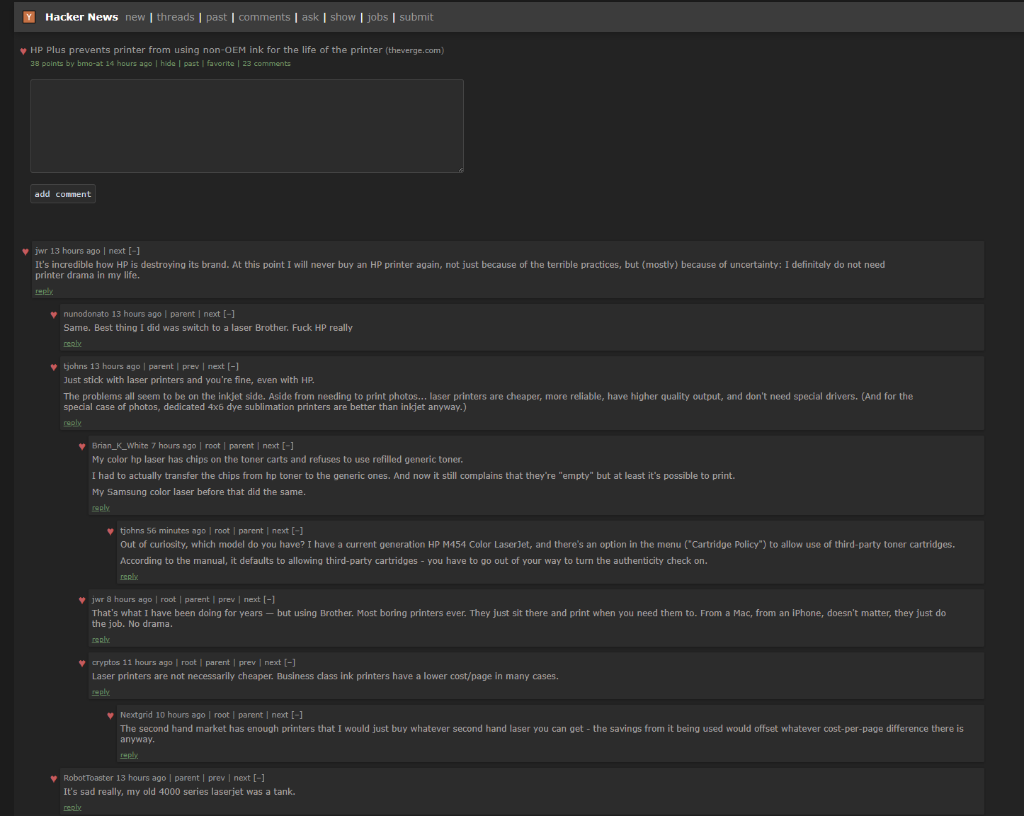
Hey, thanks for showing this!
I like how it looks on my phone, it's just the right amount of information for a small screen. I think you could keep some of the orange/beige styling, at least in the title bar.
It's however a disaster on my PC. My favourite thing about HN is how I can read top 25 titles by just opening the website, similar to how old Reddit works. That being said, it's not a problem with your website, the better part of modern design language is enshittified by design and lobotomizes the information density to kindergarten levels.
It is definitely more visually appealing, but not user-friendly at the desktop level.
It's however a disaster on my PC. My favourite thing about HN is how I can read top 25 titles by just opening the website, similar to how old Reddit works. That being said, it's not a problem with your website, the better part of modern design language is enshittified by design and lobotomizes the information density to kindergarten levels.
It is definitely more visually appealing, but not user-friendly at the desktop level.
Thanks for your information, I think I will focus on working for mobile version.
I should rename the subject to "Enhancing Mobile Readability for Hacker News"
Why is it better for me as a user that I have to scroll to see all the stories instead of 80% them being on one screen in the regular one?
The design principle of sparse layouts is a persuasion and technically a propaganda technique. It's not an improvement to a tool that does something, imo.
The design principle of sparse layouts is a persuasion and technically a propaganda technique. It's not an improvement to a tool that does something, imo.
Hey, seems very nice!
Is there a noscript/basic (x)html mode for us?
Is there a noscript/basic (x)html mode for us?
I will work on it.
Is a better UI always the best choice?
I've often wondered what impact an "enhanced ui and interface" would have on the audience HN attracts. Would more people visit? What demographics? Would it change what gets upvoted (both in content and what's above the fold)? Would there be more comments? Would there be an impact on comment quality?
Poor UXs act as barriers to entry. Barriers to entry can be beneficial depending on the goal.
That being said, I've still changed the HN styles many times over the years to make it easier for me to scan.
I've often wondered what impact an "enhanced ui and interface" would have on the audience HN attracts. Would more people visit? What demographics? Would it change what gets upvoted (both in content and what's above the fold)? Would there be more comments? Would there be an impact on comment quality?
Poor UXs act as barriers to entry. Barriers to entry can be beneficial depending on the goal.
That being said, I've still changed the HN styles many times over the years to make it easier for me to scan.
[deleted]
[deleted]
Show HN:
whats wrong with the current interface?
This feels very much like a solution in search of a problem.
The web design trend toward less and less information density is a troubling one.
The web design trend toward less and less information density is a troubling one.
I like high information density, but HN does have troubling click target density. On a phone I often misclick links if I don't zoom in first to make the target bigger than my finger. A design change that made UI links (not UGC links) more like buttons, without adding padding elsewhere for that trendy sparse look, would be quite nice. I think it could even be applied when a feature detection script sees a touch screen, so as not to inconvenience mouse users.
This actually reminded me of one of the design changes Slashdot made about two decades ago that made me stop using it. It was clear that designers came in and in an attempt to "prettify" the site (added tons of unnecessary whitespace, perhaps a better font and color scheme) clearly had no idea how users, especially frequent users, used the site. It became impossible for me to find highly rated comments so I just stopped using Slashdot.
So many of these design trends you see are due to the "tyranny of the marginal user" (there was a fantastic post on HN about this a while ago). That is, once you get your core users, design changes get made to try to appeal to people who apparently "only have one working thumb" and all they're capable of doing is scrolling.
I get that HN might not be the most "user-friendly" site for brand new users, but so what? It takes a couple mins to read the site guidelines and figure out what's going on. There is no need to make the site less appealing to frequent users in an attempt to lower the already pretty low bar for new users.
So many of these design trends you see are due to the "tyranny of the marginal user" (there was a fantastic post on HN about this a while ago). That is, once you get your core users, design changes get made to try to appeal to people who apparently "only have one working thumb" and all they're capable of doing is scrolling.
I get that HN might not be the most "user-friendly" site for brand new users, but so what? It takes a couple mins to read the site guidelines and figure out what's going on. There is no need to make the site less appealing to frequent users in an attempt to lower the already pretty low bar for new users.
My personal conceptualization (for which I have no real evidence) of the general design goals of large social media platforms is that they seek to emulate the experience of cable television. One local minima of this design is the experience of channel-surfing but with ML driving the "next" button (see: TikTok). I suspect that presenting the user with only one or two posts at a time is useful not only for determining which post to attribute the next user action to but also for triggering addiction through intermittent reinforcement.
To pursue this design pattern further I would suggest that OP continue to reduce the post density by incorporating meta tag images and videos. Additionally, adding "friendly" animations for upvotes would be useful. Slot machines are a great example of the type of slow-ish, satisfying animations designers at Facebook appear to be emulating.
However, I think the main issue is that most users of HN don’t come here to "veg out and channel surf". There’s a reason the McMaster Carr catalog and the Sears catalog ended up looking extremely different.
I would suspect that the average HN user is here to feel connected to the technology startup community and understand the latest technical trends and opinions. I further assume that they are someone who values their time and enjoys learning new things. Using these assumptions I would suggest robust keyboard navigation and "url threading" (a quick way to see other posts which contain the same url) as UI improvements which may be more appreciated. Github’s interface may be a good place to draw inspiration.
To pursue this design pattern further I would suggest that OP continue to reduce the post density by incorporating meta tag images and videos. Additionally, adding "friendly" animations for upvotes would be useful. Slot machines are a great example of the type of slow-ish, satisfying animations designers at Facebook appear to be emulating.
However, I think the main issue is that most users of HN don’t come here to "veg out and channel surf". There’s a reason the McMaster Carr catalog and the Sears catalog ended up looking extremely different.
I would suspect that the average HN user is here to feel connected to the technology startup community and understand the latest technical trends and opinions. I further assume that they are someone who values their time and enjoys learning new things. Using these assumptions I would suggest robust keyboard navigation and "url threading" (a quick way to see other posts which contain the same url) as UI improvements which may be more appreciated. Github’s interface may be a good place to draw inspiration.
It's what happens when we seek the most common denominator to design. I doubt large companies that do comparison testing do this without the numbers to back it up.
[deleted]
The posted site has the same amount of information as Hacker News' own pages. Information doesn't become less "dense" just because the kerning and whitespace increases.
Information is what is being conveyed by the text, that is a property of the language used, not the text layout itself. Smaller letters packed into a smaller space doesn't mean more information, it just means things are harder to read.
Information is what is being conveyed by the text, that is a property of the language used, not the text layout itself. Smaller letters packed into a smaller space doesn't mean more information, it just means things are harder to read.
I define density as information per unit of screen space. (Not information per word, which is a different measure. Useful, but different.)
I'm on Firefox on Ubuntu right now, 1920x1080. Classic HN shows me 19 headlines in one screen, along with point counts. So let's say, 38 pieces of information per screen. The submitter's app shows me 5 headlines and point counts, so 10 pieces of information. Classic gives me nearly four times the info per screen.
Don't get me wrong, the uncluttered view is pleasant to look at, but HN is the kind of site where density pays off.
On that basis, the classic view is
I'm on Firefox on Ubuntu right now, 1920x1080. Classic HN shows me 19 headlines in one screen, along with point counts. So let's say, 38 pieces of information per screen. The submitter's app shows me 5 headlines and point counts, so 10 pieces of information. Classic gives me nearly four times the info per screen.
Don't get me wrong, the uncluttered view is pleasant to look at, but HN is the kind of site where density pays off.
On that basis, the classic view is
On that 'modern page' I see 6 items without scrolling, on the traditional page 22 items.
TBH that new page looks like part of the CSS is missing because of all that wasted screen space ;)
TBH that new page looks like part of the CSS is missing because of all that wasted screen space ;)
> More, smaller letters packed into a smaller space doesn't mean more information
What smaller space are you talking about? The browser window dimensions don't change. On vanilla HN at the default zoom level, I can see ~22 submissions. Whereas with the posted site, I can only see ~9. How is that not less information density?
What smaller space are you talking about? The browser window dimensions don't change. On vanilla HN at the default zoom level, I can see ~22 submissions. Whereas with the posted site, I can only see ~9. How is that not less information density?
Again, and for the last time because I know it's going to be pointless, because people here have some weird hostility towards proper typography and design - information is a property of language and information density is a separate property from the density of the text itself.
That you see fewer items per line and fewer lines in your monitor does not mean there is less information on the page. It's same information, it's just spread out more. If you switched to a larger monitor, the information density would not magically increase. If you switched to a smaller monitor, it would not decrease. The information density remains the same regardless of the layout, because it's coming from HN's API and the same data sources that populate HN's own page.
That you see fewer items per line and fewer lines in your monitor does not mean there is less information on the page. It's same information, it's just spread out more. If you switched to a larger monitor, the information density would not magically increase. If you switched to a smaller monitor, it would not decrease. The information density remains the same regardless of the layout, because it's coming from HN's API and the same data sources that populate HN's own page.
The "weird hostility" probably has more to do with your opinions being presented as "proper typography and design" followed by frankly incoherent arguments wherein you try to tell people their preferences are incorrectly stated.
> It's same information, it's just spread out more.
Maybe I'm being dense, but isn't density mass per volume, or more specifically here: headline per screen area? So spreading out information would make it less dense.
Maybe I'm being dense, but isn't density mass per volume, or more specifically here: headline per screen area? So spreading out information would make it less dense.
I studied design. I know what an en-dash is, and an em-dash, and I know when to use them. I know about reading gravity, and page furniture and leading and kerning and ligatures and all that stuff. I love that stuff.
But in the end "Proper typography" is just a set of general guidelines. They are not unbreakable rules; nor are they applicable to every audience in every situation. In fact, one design rule that I remember is to "understand your audience".
I think the audience for Hacker News generally prizes economy, efficiency, time and information density; wants to see more LOC on screen not less, and probably a reasonable percentage spend their day looking at screens like this:
https://miro.medium.com/v2/resize:fit:1400/0*cZ0wb7K2E6qtZtt...
(This is an exaggeration, but exaggerations are useful for understanding sometimes).
It's less a wierd hostility to proper typography, and more an understandable hostility to affecting what is comfortable and efficient; lastly don't underestimate the power of an idiosyncratic design: it has character, it is recognisable, and it stands out.
But in the end "Proper typography" is just a set of general guidelines. They are not unbreakable rules; nor are they applicable to every audience in every situation. In fact, one design rule that I remember is to "understand your audience".
I think the audience for Hacker News generally prizes economy, efficiency, time and information density; wants to see more LOC on screen not less, and probably a reasonable percentage spend their day looking at screens like this:
https://miro.medium.com/v2/resize:fit:1400/0*cZ0wb7K2E6qtZtt...

(This is an exaggeration, but exaggerations are useful for understanding sometimes).
It's less a wierd hostility to proper typography, and more an understandable hostility to affecting what is comfortable and efficient; lastly don't underestimate the power of an idiosyncratic design: it has character, it is recognisable, and it stands out.
You're trying to make pointless semantic distinctions, so I'll put it bluntly: I think a screen where I can see a lot less info all on the screen at once, and where I need to scroll and scroll to see more info, is less efficient and useful to me than one where I can see more on-screen at once.
You can make all the arguments you want about what "semantic density" really means, but I don't care. The other site is objectively worse for me, and many others, so we don't need to be lectured to about what "proper design" is. If you like it better, congrats, knock yourself out.
You can make all the arguments you want about what "semantic density" really means, but I don't care. The other site is objectively worse for me, and many others, so we don't need to be lectured to about what "proper design" is. If you like it better, congrats, knock yourself out.
> weird hostility towards proper typography and design...It's same information, it's just spread out more.
This sounds like some kind of delusion web designers tell themselves to justify pushing out UI changes that users don't want.
"It's the same information but just more spread out" is quite literally the definition of reduced information density.
This sounds like some kind of delusion web designers tell themselves to justify pushing out UI changes that users don't want.
"It's the same information but just more spread out" is quite literally the definition of reduced information density.
Doubt the HN audience has any wish to scroll through 300 screens of one phrase per screen, even if their solo founder SaaS sites are done like that :)
Go over to Reddit, sounds like you'll love their new design...
Often excessive whitespace and 'spreading out' the content is a dark pattern, used to make you scroll more (or load more pages) and view more ads along the way.
Often excessive whitespace and 'spreading out' the content is a dark pattern, used to make you scroll more (or load more pages) and view more ads along the way.
[deleted]
> The goal is to enhance the user experience and interface, making it more user-friendly and visually appealing
I don't want to sound discouraging, but the thing you need to realize is most of us are here because we like its user interface, not despite it. If you're looking to enhance the site you should improve on its strengths, not change it to something it isn't.
Hacker News loads instantly all the time and I think I speak for most here that we don't want all these extra JS or Next React wizardry.
I don't want to sound discouraging, but the thing you need to realize is most of us are here because we like its user interface, not despite it. If you're looking to enhance the site you should improve on its strengths, not change it to something it isn't.
Hacker News loads instantly all the time and I think I speak for most here that we don't want all these extra JS or Next React wizardry.
I'll have to admit, that "modern" website loads a bit faster for me (1.23s vs 1.83s), but that's probably because its visitors count is way lower than on original HN. And, funny thing, the single resource that increases load time over a second is hot-linked y18.svg from HN.
Transfer sizes are so much different: 276.73 kB vs 14.23 kB transferred with compression. And original HN still could improve transfer size by removing IE8 support for triangle icon rotation from CSS.
To conclude: UI and UX experiments are a good thing, keep them coming, as web technologies are not standing still.
Transfer sizes are so much different: 276.73 kB vs 14.23 kB transferred with compression. And original HN still could improve transfer size by removing IE8 support for triangle icon rotation from CSS.
To conclude: UI and UX experiments are a good thing, keep them coming, as web technologies are not standing still.
Thanks for you sharing benchmark result.
[deleted]
[deleted]
Like the others have pointed out, the site is less information dense and I don't think it solves a real problem. HN looks "old school" but has good design, I think, because I come here to find a good article to read or browse an interesting comment section and the design helps me do that without getting in the way. Mostly I never even go to the second page.
Also I love HN's slightly yellowish background. It's better than a whole white bg.
Also I love HN's slightly yellowish background. It's better than a whole white bg.
"good design?" Imagine a world where you can reply to a comment and have the entire thread context, or a world where after posting a comment and hitting "back", the navigation stack didn't take you to the post form. From an accessibility and legibility standpoint, the text is honestly hard to read (insufficient contrast, long line, etc.). There are so many usability issues/quirks about HN that I'm not sure "good design" is an apt description. "Information dense" is honestly a low bar -- it's easy to achieve information density and pretend the end result is actually good.
Good to know it.
[deleted]
Reminds me of the false “front page of the internet”. Thanks, I hate it
It would be better if you provided constructive feedback over emotional or meme-ish commentary. it would help the author improve and the rest of us understand.
yes yes, thanks.
I've implemented a modern, open-source interface for Hacker News and I'd love your input. The goal is to enhance the user experience and interface, making it more user-friendly and visually appealing.
Github: https://github.com/1997roylee/modern-hacker-news