Should you add screenshots to documentation?(thisisimportant.net)
thisisimportant.net
Should you add screenshots to documentation?
https://thisisimportant.net/posts/screenshots-in-documentation/
126 comments
I've brought this up before, and even though I don't use the service much anymore, I still love Airtable's API documentation - they customize the API calls for the table you're actually on, so instead of the generic example of "say you want to create a new CAR entry linked to the SEDAN category, with the RED color property", it pulls the names of fields/etc. to use in the examples from your actual table.
It's a small detail, but is still one of my favorite examples of making documentation more concrete.
It's a small detail, but is still one of my favorite examples of making documentation more concrete.
Screenshots also help a lot when the tutorial is not in your native language. When I learned Photoshop as a teenager, my UI was in German, but most of the good tutorials were in English. The screenshots really made it easier to locate things in the menus when I didn’t know a word yet, or a non-obvious translation was used.
Yes, please and about documentation for command line programs, also adding example output (not only the command) can help a lot, especially if the reader is unexperienced with the tool.
I find myself craving examples for _everything_ even as someone experienced with a variety of tools.
So much documentation for APIs, CLI programs, _everything_ is painfully lacking in examples.
Or the examples will be just totally wrong or out of date, then search engines and LLMs slurp it up and give you bullshit examples when prompted.
So now a lot of my comments start with `// e.g.`
So much documentation for APIs, CLI programs, _everything_ is painfully lacking in examples.
Or the examples will be just totally wrong or out of date, then search engines and LLMs slurp it up and give you bullshit examples when prompted.
So now a lot of my comments start with `// e.g.`
I agree that it's the usual case, but on the other hand, right now I got quite frustrated with a project because the manufacturer has only provided examples and tutorials and there is literally no reference material - which was fine when I was starting out, but horrible for debugging where I'd really need just a few sentences describing how exactly that call works and I'd want an exhaustive list of what my other configuration options are there and what they do, not an example of doing something close to but not exactly what I need.
cheat.sh [0] has been a godsend when the man pages are too dense and I just want to use the tool and move on with my life.
[0] http://cheat.sh/
[0] http://cheat.sh/
I always thought man pages are not only too dense, but they put things in the wrong order. When I look up a man page I'm almost always trying to accomplish some task, so I am looking for instructions on how to do that task. But where are most EXAMPLES sections? At the very end or buried in the middle, if they exist at all!
Look at the sections in a typical man page:
NAME - Totally useless. I know what the name is, I just typed it in
SYNOPSIS - Explains the syntax and grammar of the command line options in an abstract way [OPTION...] HOST:SRC, and so on. Great if you're deeply studying the tool to learn all the edge cases of running it. Not as helpful if you want to do some specific thing.
DESCRIPTION - Pretty much marketing prose by the man page author. Useless.
OPTONS - Detailed, usually alphabetical(!!) list of each command line options. Great as a reference or if you want to know exactly what action X that known option Y does, but useless the other way around (I want to find the option Y that does known action X).
ENVIRONMENT - Interesting trivia about how the environment affects (or is affected by) the command.
EXAMPLES - THERE WE GO, THIS IS WHAT WE USUALLY WANT.
COMPATIBILITY - Interesting detail if you're on a weird platform or up against the edges of where the command is supported.
SEE ALSO - Useful if you don't even know which command you want.
STANDARDS - Nerd alert! You only care about this if you care what IEEE Std 1003.1-2001 is.
HISTORY - Yawn.
BUGS - Useful to know if it's not doing what you expect.
Look at the sections in a typical man page:
NAME - Totally useless. I know what the name is, I just typed it in
SYNOPSIS - Explains the syntax and grammar of the command line options in an abstract way [OPTION...] HOST:SRC, and so on. Great if you're deeply studying the tool to learn all the edge cases of running it. Not as helpful if you want to do some specific thing.
DESCRIPTION - Pretty much marketing prose by the man page author. Useless.
OPTONS - Detailed, usually alphabetical(!!) list of each command line options. Great as a reference or if you want to know exactly what action X that known option Y does, but useless the other way around (I want to find the option Y that does known action X).
ENVIRONMENT - Interesting trivia about how the environment affects (or is affected by) the command.
EXAMPLES - THERE WE GO, THIS IS WHAT WE USUALLY WANT.
COMPATIBILITY - Interesting detail if you're on a weird platform or up against the edges of where the command is supported.
SEE ALSO - Useful if you don't even know which command you want.
STANDARDS - Nerd alert! You only care about this if you care what IEEE Std 1003.1-2001 is.
HISTORY - Yawn.
BUGS - Useful to know if it's not doing what you expect.
I on the other hand am absolutely grateful for all the 'trivia' they throw in the manpages especially when trying to fix a problem withy system. It's the people that run into edge cases you want to help.
This is true... I still often don't know if instructions for entering data should include the "" or the <>...sometimes they seem to, often not. But seeing a screenshot would help.
It's also extremely helpful in helping the user realize how out of date the documentation might be.
Text just assumes you are both looking at the same thing.
But with photos the user can realize there may have been UI changes that make the documentation you are looking at no longer accurate.
Text just assumes you are both looking at the same thing.
But with photos the user can realize there may have been UI changes that make the documentation you are looking at no longer accurate.
Or, "Hey, that looks like Windows — does this even run on a Mac?"
Abstract vs concrete is not the main difference of images vs text.
The main difference is that an image (without text in it) can relay a lot of information at once. Counter example: try reproducing an image from a description.
A text on the other hand is able to give unambiguous explanation of relationships. Counter example: try painting “a primary and a secondary disk” as an image without any text.
So images are good to give an overview fast, but text is needed to make it unambiguous.
The main difference is that an image (without text in it) can relay a lot of information at once. Counter example: try reproducing an image from a description.
A text on the other hand is able to give unambiguous explanation of relationships. Counter example: try painting “a primary and a secondary disk” as an image without any text.
So images are good to give an overview fast, but text is needed to make it unambiguous.
> Counter example: try reproducing an image from a description.
we now know the impetus for generative AI! someone couldn't understand the docs, and built a tool for it
we now know the impetus for generative AI! someone couldn't understand the docs, and built a tool for it
> Counter example: try painting “a primary and a secondary disk”
Primary and secondary are kind of abstract concepts though. I think you're restating the relationship a little differently.
Primary and secondary are kind of abstract concepts though. I think you're restating the relationship a little differently.
Screenshots are good. In cluttered UIs it helps when they show you where to navigate.
Also, the author has a point: you need to keep the documentation up to date so the screenshots match the actual text. Because menus get moved around and it can be frustrating for non/semi-technical users if the screen they're looking at is not like in the documentation.
As a side note, it never crossed my mind that you can improve documentation by removing/deleting irrelevant icons/menus from the screenshots to make them more to the point without losing information.
Also, the author has a point: you need to keep the documentation up to date so the screenshots match the actual text. Because menus get moved around and it can be frustrating for non/semi-technical users if the screen they're looking at is not like in the documentation.
As a side note, it never crossed my mind that you can improve documentation by removing/deleting irrelevant icons/menus from the screenshots to make them more to the point without losing information.
> In cluttered UIs it helps when they show you where to navigate.
They're also good in minimalist UIs, which can be just as difficult to navigate if not more so. The difficulty stemming from the such UIs typically only showing you what's related to the current task, making it difficult to know if you're in the path that progresses toward your goal (if your goal extends beyond task in view).
They're also good in minimalist UIs, which can be just as difficult to navigate if not more so. The difficulty stemming from the such UIs typically only showing you what's related to the current task, making it difficult to know if you're in the path that progresses toward your goal (if your goal extends beyond task in view).
+1
Also, reference docs are not the same thing as tutorial/learning docs. The two should complement each other, but the latter should really focus on gently bringing in people new to a product, technology, ecosystem, whatever.
Shouldn't need to be said, but from experience, it does.
Also, reference docs are not the same thing as tutorial/learning docs. The two should complement each other, but the latter should really focus on gently bringing in people new to a product, technology, ecosystem, whatever.
Shouldn't need to be said, but from experience, it does.
Indeed. I have tried to learn more modern web developement recently and lot of tutorials start with "just put this into console" and I'm stuck with wtf are all these strange tools, give back my good old days of just dropping files through FTP, haha. Screenshotted tutorials help me lots.
This is why I like to watch YouTube tutorials sometimes, especially when I’m new to a certain topic. They show every step clearly. The author can’t forget to mention a piece of information because he’s doing it in real time. Too often with written tutorials there’s one or more steps missing, that are obvious to the author but not necessarily to someone new to the subject.
Yes although this requires the author to assess what they are showing to see if it makes sense from a teaching / learning perspective.
I remember watching a tutorial about a new feature in Photoshop. The author
* showed some results
* showed how the older version of the feature worked (assuming we were all familiar with it)
* did 'undo' multiple times to get back to the original image
* started showing the sequence of steps to use the new feature
* realised they had made a mistake and undid some of the steps
* restarted from the point where they had made the mistake.
I had to watch this about five times to work out the actual minimal sequence of steps involved. Some editing or a retake would really have helped here.
I remember watching a tutorial about a new feature in Photoshop. The author
* showed some results
* showed how the older version of the feature worked (assuming we were all familiar with it)
* did 'undo' multiple times to get back to the original image
* started showing the sequence of steps to use the new feature
* realised they had made a mistake and undid some of the steps
* restarted from the point where they had made the mistake.
I had to watch this about five times to work out the actual minimal sequence of steps involved. Some editing or a retake would really have helped here.
> Abstract thinking is good in the next step, when you already know the topic.
I honestly find the abstract perspective much more "approachable" (I really find it quite easy to learn highly abstract mathematics).
The issue rather is that very abstract texts have much higher quality demands on the writer - if you explain things badly, the reader will likely not understand. Similarly, much less (subtle) errors in the text are acceptable before the reader will be confused.
I honestly find the abstract perspective much more "approachable" (I really find it quite easy to learn highly abstract mathematics).
The issue rather is that very abstract texts have much higher quality demands on the writer - if you explain things badly, the reader will likely not understand. Similarly, much less (subtle) errors in the text are acceptable before the reader will be confused.
I haven’t used it in a long time and I’m guessing there might be something better now but I used to use “bro” instead of “man” when first starting out with a cli tool: http://bropages.org/
It’s documentation but with only examples.
It’s documentation but with only examples.
Looks like bro pages is archived and they recommend https://github.com/tldr-pages/tldr or https://github.com/cheat/cheat
There is a deeper problem here: what is concrete in a UX?
Most software design has a rigidly defined UI. That means that the most concrete aspect of the UX is what the user is looking at.
But does this have to be true? Is it really a good idea? I don't think so.
---
A UI that always looks the same is inflexible. This has advantages and disadvantages:
Pros:
* The UI won't surprise the user. The user can predict where to go next, because the layout never changes.
* The UX is optimized for a "happy path".
Cons:
* The UI will never accommodate the user. The user cannot move superfluous UI bits out of their way. The user must always contend with the entire app all-at-once.
* Any flow that is not the "happy path" becomes a maze at its best, and a fortress at its worst. The user's ability to introduce novel UX behavior is either minimized or outright banned.
---
We are approaching this subject with what we are used to: GUI. Let's take a step back in time, and think about text user interfaces (TUI). Let's think about shells.
What is concrete in a shell's UX? Not what you look at, that's for sure! Not the behavior, either! Hell, even the environment is flexible! Is there anything concrete?
The abstraction. That's the stable part. Shells have environment variables, stdin, stdout, stderr, signals, pipes, etc. We can't predict what will use these abstractions; but we can predict that whatever it is, it will use them.
So how does a user learn to use a shell? They learn the abstract thinking first! Pretty convenient, isn't it? Sure, there is a high upfront cost, but that only needs to be paid once.
The pros and cons are essentially the opposite as above.
Most software design has a rigidly defined UI. That means that the most concrete aspect of the UX is what the user is looking at.
But does this have to be true? Is it really a good idea? I don't think so.
---
A UI that always looks the same is inflexible. This has advantages and disadvantages:
Pros:
* The UI won't surprise the user. The user can predict where to go next, because the layout never changes.
* The UX is optimized for a "happy path".
Cons:
* The UI will never accommodate the user. The user cannot move superfluous UI bits out of their way. The user must always contend with the entire app all-at-once.
* Any flow that is not the "happy path" becomes a maze at its best, and a fortress at its worst. The user's ability to introduce novel UX behavior is either minimized or outright banned.
---
We are approaching this subject with what we are used to: GUI. Let's take a step back in time, and think about text user interfaces (TUI). Let's think about shells.
What is concrete in a shell's UX? Not what you look at, that's for sure! Not the behavior, either! Hell, even the environment is flexible! Is there anything concrete?
The abstraction. That's the stable part. Shells have environment variables, stdin, stdout, stderr, signals, pipes, etc. We can't predict what will use these abstractions; but we can predict that whatever it is, it will use them.
So how does a user learn to use a shell? They learn the abstract thinking first! Pretty convenient, isn't it? Sure, there is a high upfront cost, but that only needs to be paid once.
The pros and cons are essentially the opposite as above.
> In my mind, an outdated screenshot is one of the fastest ways to lose customer trust, so if I’m not confident I can maintain the image, I don’t add it.
Now, this isn't the fault of the documentation workers, but the UI change that obsoletes the screenshot also obsoletes all the "mental screenshots" that people use to navigate the UI. You could make a case for adding screenshots as a means of applying cost back-pressure against unnecessary UI changes.
I think screenshots are good. Sometimes essential, in a crowded UI what you want is a nice screenshot with a huge red arrow saying "this control here". The animated screenshots used by e.g. VSCode are even better.
And there's a secondary market for youtube content for really visual users which shows the UI actually in operation, all the transitions, etc.
(Not discussed: localization. This multiplies up the work, but in some cases e.g. CJK vs Latin or RTL languages, the screenshots may look significantly different. Oh, and if you have an accessibility mode for e.g. red-green colourblind, might be nice to show that in action as well)
Now, this isn't the fault of the documentation workers, but the UI change that obsoletes the screenshot also obsoletes all the "mental screenshots" that people use to navigate the UI. You could make a case for adding screenshots as a means of applying cost back-pressure against unnecessary UI changes.
I think screenshots are good. Sometimes essential, in a crowded UI what you want is a nice screenshot with a huge red arrow saying "this control here". The animated screenshots used by e.g. VSCode are even better.
And there's a secondary market for youtube content for really visual users which shows the UI actually in operation, all the transitions, etc.
(Not discussed: localization. This multiplies up the work, but in some cases e.g. CJK vs Latin or RTL languages, the screenshots may look significantly different. Oh, and if you have an accessibility mode for e.g. red-green colourblind, might be nice to show that in action as well)
> You could make a case for adding screenshots as a means of applying cost back-pressure against unnecessary UI changes.
Totally agree. As for localization, if you localize your documentation, of course, the screenshots should be in the correct locale.
However, it may be a problem when there are elements you don't control. Native UI toolkits make the appearance match that of the system. And while I think it is a good thing (I hate the modern trend where no effort is done on integration with the host system), it means that your screenshots may not match, for example if the user, doesn't use the same Windows version as you do. It is particularly true on Linux desktops where each distro has its own theme.
Totally agree. As for localization, if you localize your documentation, of course, the screenshots should be in the correct locale.
However, it may be a problem when there are elements you don't control. Native UI toolkits make the appearance match that of the system. And while I think it is a good thing (I hate the modern trend where no effort is done on integration with the host system), it means that your screenshots may not match, for example if the user, doesn't use the same Windows version as you do. It is particularly true on Linux desktops where each distro has its own theme.
That's a really insightful view.
Perhaps one can extend it to automated UI tests too: if it breaks a test by moving an element/adding a popup/changing the flow/taking longer, then it would probably undermine existing users' expertise. What used to be a fragile test is now the canary in the coal mine.
Perhaps one can extend it to automated UI tests too: if it breaks a test by moving an element/adding a popup/changing the flow/taking longer, then it would probably undermine existing users' expertise. What used to be a fragile test is now the canary in the coal mine.
I think documentation MUST have screenshots.
I was recently trying to work out TLA+ in TLA Toolbox and there is there is this screenshot in the documentation on this page on PlusCal:
https://www.learntla.com/core/pluscal.html
The screenshot about going to File menu and clicking "Translate PlusCal Algorithm" was invaluable! Now I can learn that Ctrl+T is the shortcut to run the translation.
EDIT: Before this point I was trying to work out why my code was not updating. I had no idea I had to do this important step! I didn't follow a tutorial, I just used learntla.com and the documentation is spread across multiple pages, so it's not obvious what text is important.
Some software is by its nature complicated and hard to understand. Such as IntellIJ or TLA+.
If you didn't have any training in IntelliJ, could you work out how modules work in IntelliJ? How gradle interacts with IntelliJ?
If you have a personal sideproject, I recommend you take screenshots to document milestones and progress and archive them on GitHub or somewhere. When the code stops working or building then you at least have some artifact that preserves what you did.
I was recently trying to work out TLA+ in TLA Toolbox and there is there is this screenshot in the documentation on this page on PlusCal:
https://www.learntla.com/core/pluscal.html
The screenshot about going to File menu and clicking "Translate PlusCal Algorithm" was invaluable! Now I can learn that Ctrl+T is the shortcut to run the translation.
EDIT: Before this point I was trying to work out why my code was not updating. I had no idea I had to do this important step! I didn't follow a tutorial, I just used learntla.com and the documentation is spread across multiple pages, so it's not obvious what text is important.
Some software is by its nature complicated and hard to understand. Such as IntellIJ or TLA+.
If you didn't have any training in IntelliJ, could you work out how modules work in IntelliJ? How gradle interacts with IntelliJ?
If you have a personal sideproject, I recommend you take screenshots to document milestones and progress and archive them on GitHub or somewhere. When the code stops working or building then you at least have some artifact that preserves what you did.
This specific screenshot seems unhelpful to me. The text below the screenshot already tells you the keyboard shortcut, it could also say "File > Translate PlusCal Algorithm" and be more accessible.
That’s an excellent example of a bad screenshot, something that should have been conveyed as text:
File → Translate PlusCal Algorithm (Ctrl+T/⌘T)
Later in the page there’s a potentially useful screenshot, https://www.learntla.com/_images/pluscal_run.png. But that first one shouldn’t have been a screenshot: it conveys roughly no value over text (a little value for some people, a negative value for others), and it imposes a distinct maintenance burden.
File → Translate PlusCal Algorithm (Ctrl+T/⌘T)
Later in the page there’s a potentially useful screenshot, https://www.learntla.com/_images/pluscal_run.png. But that first one shouldn’t have been a screenshot: it conveys roughly no value over text (a little value for some people, a negative value for others), and it imposes a distinct maintenance burden.
When you're learning something for the first time, it can be hard to know what mental model you need to have to be effective with the tool.
Some documentation is reference material. With reference material you might navigate the reference material in a particular traversal to get what you need to do what you want.
How do I know some fact is important in reference material? The documentation for Git, Emacs or GCC is large and it is not immediately obvious what information is important, yet.
But at the beginning of your journey, you need to be taught a "flow" an expected pattern of operation to build up the right mental model of how an average session with the tool works. For programming this might be the edit file, compile, run, debug loop, or TDD or IntelliJ's build and deploy. Or a CI system commit, push, deploy, promote cycle. Or kubernetes kubectl edit, apply.
I opened the "dining philosophers TLA+" example and ran it - this seemed to be an affordance of the TLA+ Toolbox GUI which was straightforward to understand.
But then I tried to use the tool with my own. I interpreted the existing code of the dining philosophers and tried to make my own ringbuffer model.
It took me a while to realise that some of the code in the dining philosophers code was generated from another section.
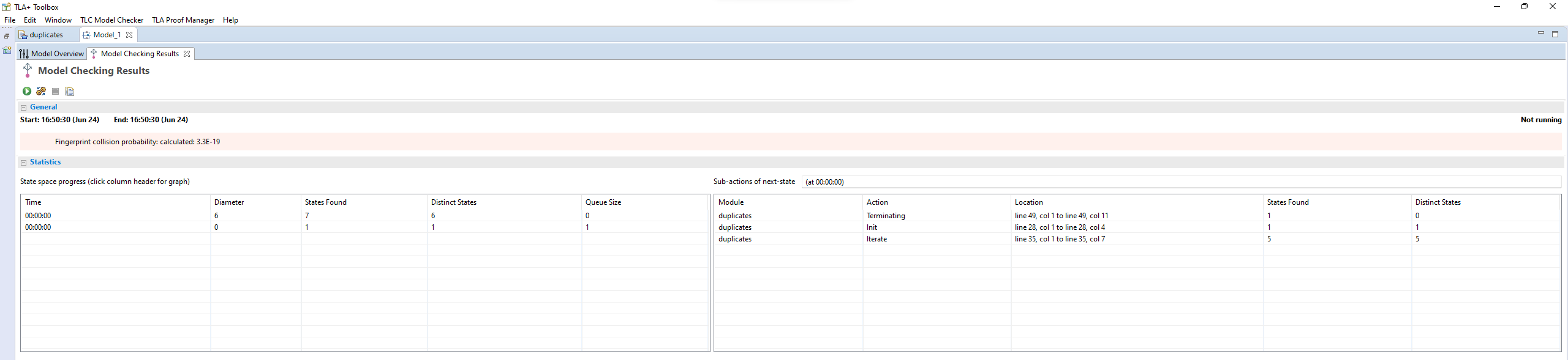
It took me a while that I needed to update this screen to put in the following details that I have filled in on the screenshot:
https://github.com/samsquire/assembly/blob/main/screenshots/...
You have to put your entrypoint in the "temporal formula" and then put your model arguments on the right hand side.
I was able to piece together the operation of this tool by piecing together various reference details together, it wasn't until I saw that screenshot I referenced in my OP that I realised I needed to do that step to get the PlusCal code to update the TLC code that follows it. I was wondering why it didn't work until I saw that screenshot.
Some documentation is reference material. With reference material you might navigate the reference material in a particular traversal to get what you need to do what you want.
How do I know some fact is important in reference material? The documentation for Git, Emacs or GCC is large and it is not immediately obvious what information is important, yet.
But at the beginning of your journey, you need to be taught a "flow" an expected pattern of operation to build up the right mental model of how an average session with the tool works. For programming this might be the edit file, compile, run, debug loop, or TDD or IntelliJ's build and deploy. Or a CI system commit, push, deploy, promote cycle. Or kubernetes kubectl edit, apply.
I opened the "dining philosophers TLA+" example and ran it - this seemed to be an affordance of the TLA+ Toolbox GUI which was straightforward to understand.
But then I tried to use the tool with my own. I interpreted the existing code of the dining philosophers and tried to make my own ringbuffer model.
It took me a while to realise that some of the code in the dining philosophers code was generated from another section.
It took me a while that I needed to update this screen to put in the following details that I have filled in on the screenshot:
https://github.com/samsquire/assembly/blob/main/screenshots/...

You have to put your entrypoint in the "temporal formula" and then put your model arguments on the right hand side.
I was able to piece together the operation of this tool by piecing together various reference details together, it wasn't until I saw that screenshot I referenced in my OP that I realised I needed to do that step to get the PlusCal code to update the TLC code that follows it. I was wondering why it didn't work until I saw that screenshot.
Um… are we talking about the same thing? It’s a menu. This is basic computer usage. Mentioning the menu path is just as good as a screenshot (better, in my opinion), and takes much less space and requires less maintenance. If you actually need to explain what a menu is and how to use one, the screenshot genuinely won’t help. And when this is intended just as a reminder of what has already been covered, a screenshot is even more inappropriate.
I’m not saying there should be nothing there. I’m saying that the screenshot should have been text. I’m genuinely baffled about what you’re actually saying.
I’m not saying there should be nothing there. I’m saying that the screenshot should have been text. I’m genuinely baffled about what you’re actually saying.
I will try to explain.
My learning of TLA+ was ad hoc from reading existing code and just "playing with the TLA+ Toolbox".
It's not obvious why a particular menu item, or particular sentence is important. A reference table of menu items is less useful than a walk through of how to use pluscal.
I literally had some TLA+ code that wasn't running how I expected then I went to pluscal.htm and then that screenshot made is SO obvious that there was a missing step required in my mental model of how TLA+ works.
A beginner to IntellIJ needs to be taught that the "Play button" is what they're looking for, and a screenshot puts that into context.
Blender is a complicated piece of software, if you had text based descriptions of that tool - I wonder how useful that would be to understanding where similar functionality is placed. Compared to a screenshot WITH CONTEXT.
My case highlights how even what seems like a trivial screenshot can actually help people contextualise something that is basic to you.
Do basic features go in context menus, toolbars, or hidden in menus.
The text "Go to File -> Translate TLA+ algorithm" would be missed if it was in a big document in the middle, as if it's just a fact.
The screenshot says "This is important, pay attention".
My learning of TLA+ was ad hoc from reading existing code and just "playing with the TLA+ Toolbox".
It's not obvious why a particular menu item, or particular sentence is important. A reference table of menu items is less useful than a walk through of how to use pluscal.
I literally had some TLA+ code that wasn't running how I expected then I went to pluscal.htm and then that screenshot made is SO obvious that there was a missing step required in my mental model of how TLA+ works.
A beginner to IntellIJ needs to be taught that the "Play button" is what they're looking for, and a screenshot puts that into context.
Blender is a complicated piece of software, if you had text based descriptions of that tool - I wonder how useful that would be to understanding where similar functionality is placed. Compared to a screenshot WITH CONTEXT.
My case highlights how even what seems like a trivial screenshot can actually help people contextualise something that is basic to you.
Do basic features go in context menus, toolbars, or hidden in menus.
The text "Go to File -> Translate TLA+ algorithm" would be missed if it was in a big document in the middle, as if it's just a fact.
The screenshot says "This is important, pay attention".
This would seem entirely adequate to me:
> We discussed how to translate the pluscal in Setup, but as a refresher, it’s File → Translate PlusCal Algorithm in the menu (Ctrl+T/⌘T by keyboard). This puts a translation below the comment block:
Also, if it’s an easily-missed step and something just mysteriously doesn’t work if you miss it out, that’s not a documentation bug, that’s a design bug. (I’m not familiar with it.)
> We discussed how to translate the pluscal in Setup, but as a refresher, it’s File → Translate PlusCal Algorithm in the menu (Ctrl+T/⌘T by keyboard). This puts a translation below the comment block:
Also, if it’s an easily-missed step and something just mysteriously doesn’t work if you miss it out, that’s not a documentation bug, that’s a design bug. (I’m not familiar with it.)
I think the discussion is caused by different implicit understanding of what "documentation" means. Different types of documentation have different, conflicting needs; an amazing reference document is a horrible tutorial and an amazing tutorial is horrible for reference purposes. So you shouldn't try to make your reference material be useful as a tutorial, that way lies madness, make a separate document if you need one.
This is an interesting overview of these concepts - https://www.writethedocs.org/videos/eu/2017/the-four-kinds-o...
This is an interesting overview of these concepts - https://www.writethedocs.org/videos/eu/2017/the-four-kinds-o...
The screenshot could be more clear by highlighting 'file' and 'Translate PlusCal Algoritm'. This could be useful in skimming the documentation, but i think this could be a case of where text would be the clearer option.
> If you didn't have any training in IntelliJ
People get trained to use an IDE?
I gotta say, I've been using IDEA since 2015, and a language-specific IntelliJ based IDE since 2013, and in 10 years of use it's never occurred to me that someone might need training to use it.
People get trained to use an IDE?
I gotta say, I've been using IDEA since 2015, and a language-specific IntelliJ based IDE since 2013, and in 10 years of use it's never occurred to me that someone might need training to use it.
It's a complex tool with lots of hard to discover features. Training can be more efficient than watching youtubers use it since you can ask questions
> more efficient than watching youtubers
That isn't really saying much. "Watching YouTubers" doesn't really seem like a way to learn how to do something, it seems like a way to waste some time and pretend you're one of the cool kids.
I can't be the only person who remembers when people learnt how to use a program by using it?
That isn't really saying much. "Watching YouTubers" doesn't really seem like a way to learn how to do something, it seems like a way to waste some time and pretend you're one of the cool kids.
I can't be the only person who remembers when people learnt how to use a program by using it?
"Using it" is fine for a simple tool. But IDE is a complex beast. You can easily fall into a local optimum without discovering and using the best features. Think using arrow keys to navigate in vim. It works, gets the job done but is far from optimal. You could read the manual but I'm sure you agree that training is a lot more efficient use of your time
Did you train yourself?
On my first day of work I was given access to SVN and then had to piece together how to run the project. So I was bouncing around IntellIJ and all the various tools to make up a modern development environment.
In week-0 of an iteration you might just be spending time to get a development environment working.
If you wanted to get something working, did you ask your colleague "how to get company IntelliJ linting configuration to work" or how to set up all the IntelliJ modules or facets.
Someone coming in with no experience has to learn:
* git
* command line
* linux
* containers
* gradle (build runner)
* makefiles
* java jar files,
* pom.xml
* javascript bundlers, React/Angular, selenium, frontend testing, storybook
* database migrations
* IntellIJ' integrations/representations of the above
On my first day of work I was given access to SVN and then had to piece together how to run the project. So I was bouncing around IntellIJ and all the various tools to make up a modern development environment.
In week-0 of an iteration you might just be spending time to get a development environment working.
If you wanted to get something working, did you ask your colleague "how to get company IntelliJ linting configuration to work" or how to set up all the IntelliJ modules or facets.
Someone coming in with no experience has to learn:
* git
* command line
* linux
* containers
* gradle (build runner)
* makefiles
* java jar files,
* pom.xml
* javascript bundlers, React/Angular, selenium, frontend testing, storybook
* database migrations
* IntellIJ' integrations/representations of the above
I don't use IDEA for Java work, I use it because it's the only IntelliJ platform app that supports "all" languages (or at least all the languages I care about), but sure let's go with your examples above.
If you're hiring someone to do java work, who has no experience of jar files, or java build tools, them not being able to use IDEA is the least of your concern.
This is like saying "on the first day of work as a carpenter, we send all new hires on an intensive nail-gun training course, because they probably don't know how to use a circular saw, or even what the pointy end of a nail is for"
I don't know what schools teach these days, but all the classes I had (one of which, coincidentally enough was java) specifically made us not use an IDE - we had to use a text editor for all practical work.
Once you know what you actually need/want to do, using a different tool to achieve it is generally not a complex task.
If someone knows how to use a screw driver, they don't need comprehensive training to then use an electric drill/driver to put a screw in.
If they don't know how to use a screw driver, giving them a drill/driver to learn, is a fucking terrible idea.
If you're hiring someone to do java work, who has no experience of jar files, or java build tools, them not being able to use IDEA is the least of your concern.
This is like saying "on the first day of work as a carpenter, we send all new hires on an intensive nail-gun training course, because they probably don't know how to use a circular saw, or even what the pointy end of a nail is for"
I don't know what schools teach these days, but all the classes I had (one of which, coincidentally enough was java) specifically made us not use an IDE - we had to use a text editor for all practical work.
Once you know what you actually need/want to do, using a different tool to achieve it is generally not a complex task.
If someone knows how to use a screw driver, they don't need comprehensive training to then use an electric drill/driver to put a screw in.
If they don't know how to use a screw driver, giving them a drill/driver to learn, is a fucking terrible idea.
I mean you can poke around and read the manual/watch YouTube videos and discover things, or you could just have an expert in the thing interactively teach you how to use the program and its features. It's not about needing training, it's about optimizing time spent learning an advanced tool and all its features.
> Outdated screenshots can cause customers to lose trust in documentation accuracy.
as opposed to outdated documentation without screenshots, where the user has no idea that he's reading stuff from 5 years ago?
as opposed to outdated documentation without screenshots, where the user has no idea that he's reading stuff from 5 years ago?
If you are writing documentation you should put a date on your content and a version number if it relates to a product.
I've been reading about accordions because I want to refresh a UI, but I read a document about the <details> element and accessibility and didn't realise it was from 2019 until I got to the end and saw the comments were all from that year.
I've been reading about accordions because I want to refresh a UI, but I read a document about the <details> element and accessibility and didn't realise it was from 2019 until I got to the end and saw the comments were all from that year.
Indeed. I lose a lot more trust when I've spent 15 minutes trying to find the damn option the documentation insists should be there, only to find it doesn't exist any more. A screenshot at least gives me that information faster.
This is what I was going to say. Nothing more frustrating than trying to find an option that has been moved somewhere else (why is android documentation the worst about this). At least with a screenshot you know it is either where they say it is or that you need to find a different tutorial.
Exactly!
Even with old screenshots, you can still see what your next action is supposed to be and what functions were near it. That’s invaluable for trying to find the function you need in a new UI.
I can give you a guide for how to do just about anything using screenshots of the AWS console from years ago and you probably wouldn’t have that tough of a time adapting them to the current UI.
Even with old screenshots, you can still see what your next action is supposed to be and what functions were near it. That’s invaluable for trying to find the function you need in a new UI.
I can give you a guide for how to do just about anything using screenshots of the AWS console from years ago and you probably wouldn’t have that tough of a time adapting them to the current UI.
Target audience is a big factor too, I think the article failed to emphasize this. And, secondly, the nature of what is being documented.
Do you remember when there used to be entire sections of bookstores dedicated to books like "Learn to use Word 98"? These books were always incredibly thick, so one time I opened one to find out how there could be so much to write about Word 98 (or whatever it was). Turns out it wasn't written so much as screenshoted. And I realized this made perfect sense - a non-technical audience needs to be hand-held through every step, and a GUI application is inherently visual not textual, so a text-based guide would just be harder to follow.
Do you remember when there used to be entire sections of bookstores dedicated to books like "Learn to use Word 98"? These books were always incredibly thick, so one time I opened one to find out how there could be so much to write about Word 98 (or whatever it was). Turns out it wasn't written so much as screenshoted. And I realized this made perfect sense - a non-technical audience needs to be hand-held through every step, and a GUI application is inherently visual not textual, so a text-based guide would just be harder to follow.
> Target audience is a big factor too, I think the article failed to emphasize this. And, secondly, the nature of what is being documented.
Right, I'd say screenshots are crucial for certain kinds of documentation and terribly amateurish for others. A guide walking you through a user journey in a UI should definitely have screenshots.
But there should be "real" documentation for things like APIs - if the only kind of documentation that exists for an API is guides with screenshots, you end up with a bunch of useless "hello world + a feature" documentation that doesn't help you understand the big picture, or how features/options interact.
Right, I'd say screenshots are crucial for certain kinds of documentation and terribly amateurish for others. A guide walking you through a user journey in a UI should definitely have screenshots.
But there should be "real" documentation for things like APIs - if the only kind of documentation that exists for an API is guides with screenshots, you end up with a bunch of useless "hello world + a feature" documentation that doesn't help you understand the big picture, or how features/options interact.
Those books weren't much use in learning how to use the software. They were just easier to produce. They never explained the ideas behind the software. They just showed you the user interface. They treated everyone as if they didn't know how to use a menu.
Things are often the way they are because that way is easier to produce, not because it is useful.
Things are often the way they are because that way is easier to produce, not because it is useful.
> They treated everyone as if they didn't know how to use a menu.
Yes, and that's OK - somebody had to do it for hundreds of millions of people!
My own first summer job long, long ago as a student was helping a small company transfer some paper "business processes" and calculations to Excel, and that involved teaching Excel to a few people double and triple my age. They generally had few issues with Excel itself, as they had worked with paper spreadsheets in pre-computer accounting, but a significant challenge was mouse skills, because as it turns out, if you move the pointer where you want to, lift your hand up, and press the mouse button, then as you press the pointer will slide away from where you wanted to click.. so that took some time and practice.
Don't take things for granted. People weren't born knowing how to use a mouse or other tools. Everything that's universal now had to be painstakingly learned once, and yes, these materials did have to teach people how to use a menu, because that was relevant for much of their target audience.
Yes, and that's OK - somebody had to do it for hundreds of millions of people!
My own first summer job long, long ago as a student was helping a small company transfer some paper "business processes" and calculations to Excel, and that involved teaching Excel to a few people double and triple my age. They generally had few issues with Excel itself, as they had worked with paper spreadsheets in pre-computer accounting, but a significant challenge was mouse skills, because as it turns out, if you move the pointer where you want to, lift your hand up, and press the mouse button, then as you press the pointer will slide away from where you wanted to click.. so that took some time and practice.
Don't take things for granted. People weren't born knowing how to use a mouse or other tools. Everything that's universal now had to be painstakingly learned once, and yes, these materials did have to teach people how to use a menu, because that was relevant for much of their target audience.
Not exactly. 'Cash in' books like this don't just teach you how to use a menu once, they teach 100 times to pad the size of the book. I am absolutely in favor of screenshots, but if they become massively dumplicative then the reader never gets past entry level.
A lot of publishers choose quantity over quality. One publisher that aims at developers uses a large font so the books look thick but the subject matter is not that details and you just end up endlessly flipping pages because the word count per page is so low.
A lot of publishers choose quantity over quality. One publisher that aims at developers uses a large font so the books look thick but the subject matter is not that details and you just end up endlessly flipping pages because the word count per page is so low.
> They treated everyone as if they didn't know how to use a menu
This is most people in 1998.
This is most people in 1998.
For those interested in the concept of having guaranteed/permanently up-to-date documentation (with or without screenshots) I built this testing framework based upon autogenerating good how-to or reference docs from tests:
https://github.com/hitchdev/hitchstory
(the website example has screenshots generated by playwright, the REST API example has real tested JSON snippets, the command line example has command outputs, etc.)
https://github.com/hitchdev/hitchstory
(the website example has screenshots generated by playwright, the REST API example has real tested JSON snippets, the command line example has command outputs, etc.)
For those who want to do it manually, just give every screenshot a number, and put comments in the code saying "This UI layout / function affects Figures 1, 2, 4, 7". If you don't trust your team to maintain a sequence (fair) use random numbers.
This also helps when people want to refer to a particular screenshot, and it can double as anchor IDs in an HTML page.
This also helps when people want to refer to a particular screenshot, and it can double as anchor IDs in an HTML page.
Exactly what I was hoping to find in the comments. Thank you
>Identify the purpose of a screenshot
The author emphasizes this as one of the important considerations.
Definitely a good idea but I think people need to go further.
I would say identify the purpose of the document to start with.
Ideally, I would like to have a complete reference tome where the text could actually stand on its own extremely well if it had to, along with detailed essential illustrations such as charts or schematics. Any other drawings or screenshots should serve as the icing on the cake without actually being essential to understand the documentation.
If lots of illustrations are intended to be mixed with the final text anyway, this type of document can still ideally be drafted and revised in text only format, quickly leaving placeholders for future illustrations as you go along. All you need at this point is a pretty good idea of what kind of picture you would put there after you are done. You'll also have more time later to think about the exact ilustration you'll want for each placeholder, and better able to select or create more meaningful pictures the first time. Once the final draft of the text is complete, then (only) the most helpful illustrations can be introduced to their expected positions. Then without (much) further editing to the text, consider the initial placement of illustrations to be a first draft of artwork, then it may only be necessary to manipulate the artwork alone a little bit more before a final draft of that complete document is reached.
I think reference documentation should be complete and text-heavy.
If there is actually no real reference documentation, then whatever is documented will need to be more text-heavy to compensate.
OTOH the the heavily-illustrated approach should be reserved for more specific topics such as detailed tutorials or quick-start guides.
Different documents having different purposes, compiled into a full documentaton package.
The author emphasizes this as one of the important considerations.
Definitely a good idea but I think people need to go further.
I would say identify the purpose of the document to start with.
Ideally, I would like to have a complete reference tome where the text could actually stand on its own extremely well if it had to, along with detailed essential illustrations such as charts or schematics. Any other drawings or screenshots should serve as the icing on the cake without actually being essential to understand the documentation.
If lots of illustrations are intended to be mixed with the final text anyway, this type of document can still ideally be drafted and revised in text only format, quickly leaving placeholders for future illustrations as you go along. All you need at this point is a pretty good idea of what kind of picture you would put there after you are done. You'll also have more time later to think about the exact ilustration you'll want for each placeholder, and better able to select or create more meaningful pictures the first time. Once the final draft of the text is complete, then (only) the most helpful illustrations can be introduced to their expected positions. Then without (much) further editing to the text, consider the initial placement of illustrations to be a first draft of artwork, then it may only be necessary to manipulate the artwork alone a little bit more before a final draft of that complete document is reached.
I think reference documentation should be complete and text-heavy.
If there is actually no real reference documentation, then whatever is documented will need to be more text-heavy to compensate.
OTOH the the heavily-illustrated approach should be reserved for more specific topics such as detailed tutorials or quick-start guides.
Different documents having different purposes, compiled into a full documentaton package.
I think having at least one screenshot per feature can be very useful in some cases. I don't need step by step screenshots but I like to get a quick visual of what I'm trying to build.
I think so too. Screenshots help a lot, even if it's simple things as "where is the damn button?". To avoid screenshots completely is often a bad idea.
In the iommi docs we don't have screenshots (except the intro demo video). We have iframes with the real HTML output of the tests!
https://docs.iommi.rocks/en/latest/cookbook_tables.html
This is WAY better imo. It's just html, so works better on mobile. It doesn't have issues with different screen resolutions, and it also has none of the problems with accessibility. It's just HTML.
https://docs.iommi.rocks/en/latest/cookbook_tables.html
This is WAY better imo. It's just html, so works better on mobile. It doesn't have issues with different screen resolutions, and it also has none of the problems with accessibility. It's just HTML.
Documentation should have screenshots.
Even more important - documentation should have examples of what valid parameter values are. Probably my biggest pet peeve in docs is describing what a param value should be, but leaving it up to you to figure out what that actually means. Sometimes there's a certain format expected, or several candidates for the parameter value.
It drives me up the wall, that there can be very verbose documentation, and you still often don't get the parameters right on the first (or third) try.
This article for example is doing it right:
https://learn.microsoft.com/en-us/previous-versions/windows/...
Even more important - documentation should have examples of what valid parameter values are. Probably my biggest pet peeve in docs is describing what a param value should be, but leaving it up to you to figure out what that actually means. Sometimes there's a certain format expected, or several candidates for the parameter value.
It drives me up the wall, that there can be very verbose documentation, and you still often don't get the parameters right on the first (or third) try.
This article for example is doing it right:
https://learn.microsoft.com/en-us/previous-versions/windows/...
oh yes, 100% agree. Few months back I was given link to a repository in which I needed to add a configuration file in yaml format. In repository readme first thing I saw was a screenshot of a text editor with possible yaml objects and properties and a text description for them, second was a paragraph of vague description on how the tool that consumes this repo works. No text on yaml structure in readme, no schema, no validation, nothing.
One thing I wanted to do at my previous project (building a user interface for a complicated / specialized mobile network routing tool) was to add an end-to-end test suite (Cypress) that would set up the UI to a certain state and make a screenshot to ensure the screenshots used in the user documentation would be up to date at all time.
But, I never got the resources to build that UI (it was bigger than anything I'd ever been involved in, and all other projects were with a fully equipped team, this was a solo effort), so unfortunately that part went down the wayside as well.
But, I never got the resources to build that UI (it was bigger than anything I'd ever been involved in, and all other projects were with a fully equipped team, this was a solo effort), so unfortunately that part went down the wayside as well.
Yes you should, but you need to keep in mind that's something you need to update every time you change something in your interface. It is incredibly frustrating when screenshots don't match what you see on screen, especially if you're a new user (i.e. the key audience for documentation). There's a horrible sense of doubt whether you're doing things correctly.
Probably another reason why you shouldn't change your GUI that often.
Probably another reason why you shouldn't change your GUI that often.
I don't care about screenshots. I can still quickly skim past them.
But please do not force me to watch a video. Video-only documentation is the worst thing since advertising - total PITA to watch and keeps me from my goal.
But please do not force me to watch a video. Video-only documentation is the worst thing since advertising - total PITA to watch and keeps me from my goal.
I built a macOS commmand line util to take window screenshots or videos https://github.com/xenodium/macosrec Window screenshots are mostly covered by macOS built-in app, but videos are not.
Mostly grew out of a desire to post screenshots in my posts (https://xenodium.com) and projects (ie. https://github.com/xenodium/chatgpt-shell).
I often wish I could see how some projects look before I install them (but they often don't have screenshots). I'm doing my bit with my projects, I hope.
Mostly grew out of a desire to post screenshots in my posts (https://xenodium.com) and projects (ie. https://github.com/xenodium/chatgpt-shell).
I often wish I could see how some projects look before I install them (but they often don't have screenshots). I'm doing my bit with my projects, I hope.
Of course yes! You should add examples of API use too. I hate how documentation without examples is dysfunctional - see example of CMake documentation.
I think screenshots are very helpful. They are much easier to follow than instructions like "look at the top-right of your screen; find the word just below the red box; click that; on the new screen, find ..." and so forth.
As for going out of date, it helps to include caption with the date of screen capture and the version number of the software.
My only problem with screenshots is that they sometimes show the whole screen, so the text is quite small. An exploded diagram (full view on left, with a box in it for the focus, and the focus view on the right) can help a lot. We who write manuals for software ought to take some hints from those who write manuals for car repair, etc.
As for going out of date, it helps to include caption with the date of screen capture and the version number of the software.
My only problem with screenshots is that they sometimes show the whole screen, so the text is quite small. An exploded diagram (full view on left, with a box in it for the focus, and the focus view on the right) can help a lot. We who write manuals for software ought to take some hints from those who write manuals for car repair, etc.
When I was at school they told us people learn differently. Through examples, through listening to loud reading and by doing (e.g. applying things). I for one can learn fast through examples and visual representation. A wall of text can be very frustrating so I personally like screenshots when appropriate.
I support the author's points, that screenshots must come with a description what or why something has to be done. Not just "click this and that and you will be done". I also strongly support the remarks about automation of screenshots. Outdated screenshots are the worst.
I support the author's points, that screenshots must come with a description what or why something has to be done. Not just "click this and that and you will be done". I also strongly support the remarks about automation of screenshots. Outdated screenshots are the worst.
I built a screenshot API called ApiFlash.
https://apiflash.com
Quite a few of my clients use it to add "always up to date" screenshots to their documentation.
https://apiflash.com
Quite a few of my clients use it to add "always up to date" screenshots to their documentation.
I crave screenshots especially when the UI is very complicated. Documentation that tells me to engage the encabulator is hard to use when I don't know what the icon looks like or where it is or if there's a menu entry or how deeply nested it is or how to get it to take input.
There are tools which I use infrequently enough (e.g., GIMP, which I use about twice annually) that I don't really want to learn the tool. I want to get the job done and move on. Screenshots to help me navigate a UI, even if modestly outdated, are enormously helpful.
There are tools which I use infrequently enough (e.g., GIMP, which I use about twice annually) that I don't really want to learn the tool. I want to get the job done and move on. Screenshots to help me navigate a UI, even if modestly outdated, are enormously helpful.
Interesting article.
My opinion when clicking: definitely yes, they're super helpful to see in a glance what it's supposed to look like and where I'm supposed to click
My opinion after clicking: rarely, because you'd need to capture them in every language/region and recapture them after any significant UI change and make sure it's small enough for users to see who need 400% zoom or are viewing it on a phone screen and you need the text equivalent anyway for blind people
That's not what the author wrote, just my takeaway. The author has recommendations for how to make screenshots work for you, but even with automated screenshot grabbing, it feels like you can count the number of UI updates that can happen until the page doesn't match the textual description anymore (or the URL changes, or the button ID changes so the screenshot grabber can't find the page anymore altogether) on one hand, if not half a hand, so you need to check them all manually after every update anyhow
They're still good for marketing material such as a readme file or project website. I love screenshots because they show features more clearly than the text description and you can see at a glance how easy they'll be to use and whether the offered options match your requirements. That's just a handful of representative screencaps though, not an extensive set that needs to match precisely with a user's steps, so much more maintainable
My opinion when clicking: definitely yes, they're super helpful to see in a glance what it's supposed to look like and where I'm supposed to click
My opinion after clicking: rarely, because you'd need to capture them in every language/region and recapture them after any significant UI change and make sure it's small enough for users to see who need 400% zoom or are viewing it on a phone screen and you need the text equivalent anyway for blind people
That's not what the author wrote, just my takeaway. The author has recommendations for how to make screenshots work for you, but even with automated screenshot grabbing, it feels like you can count the number of UI updates that can happen until the page doesn't match the textual description anymore (or the URL changes, or the button ID changes so the screenshot grabber can't find the page anymore altogether) on one hand, if not half a hand, so you need to check them all manually after every update anyhow
They're still good for marketing material such as a readme file or project website. I love screenshots because they show features more clearly than the text description and you can see at a glance how easy they'll be to use and whether the offered options match your requirements. That's just a handful of representative screencaps though, not an extensive set that needs to match precisely with a user's steps, so much more maintainable
I think a small source of confusion/varying opinions here is that this is from the perspective of a technical writer. Technical writers are usually producing documentation for external users (author mentions "customers") as their key deliverable.
At least for me, I'm not too bothered by the docs I write looking a little unpolished or going out of date every now and then. Only a couple dozen people are likely to ever read it, it's not a big deal if I miss something because they'll know I wrote it and reach out directly if they need clarification, and as a corollary I'm mostly optimizing for "make it so explicit that they don't need to reach out for help, but not so verbose that they give up before reading it and reach out for help". Everyone knows it's a best-effort side task and you're not being held to a high standard - for guide-like documentation, just show the critical path most people care about and hope for the best.
When I consume official external documentation though, screenshots are a smell, especially in the case of "[having a screenshot] For every step in a task." You can't just message the writer to ask for clarification if you deviate from the happy path. So documenting the user-journey with screenshots instead of the functionality no longer works, because you have no real escape hatch as a confused user.
At least for me, I'm not too bothered by the docs I write looking a little unpolished or going out of date every now and then. Only a couple dozen people are likely to ever read it, it's not a big deal if I miss something because they'll know I wrote it and reach out directly if they need clarification, and as a corollary I'm mostly optimizing for "make it so explicit that they don't need to reach out for help, but not so verbose that they give up before reading it and reach out for help". Everyone knows it's a best-effort side task and you're not being held to a high standard - for guide-like documentation, just show the critical path most people care about and hope for the best.
When I consume official external documentation though, screenshots are a smell, especially in the case of "[having a screenshot] For every step in a task." You can't just message the writer to ask for clarification if you deviate from the happy path. So documenting the user-journey with screenshots instead of the functionality no longer works, because you have no real escape hatch as a confused user.
Of course, the visual reference can help clarify things that text alone can't explain. For example, take a simple task like 'fill in these fields in the config file'.
For someone with software development experience, it's pretty obvious what the needed format might be there, whether it's a JSON file, PHP file or in any other language you can think of.
But a new user might not know that. They might not know what's valid in a JSON structure, or that leaving out the quotes in a PHP variable's value will break things (especially if there's a space in the value they enter!)
Pairing somewhat detailed text instructions with a screenshot or diagram can help avoid this, and make it obvious how the information should be provided.
You could also use video footage along with the screenshots too if you have the time for it. It's a lot more work for sure, and I understand why most documentation creators don't do it, but it helps shows steps you might have forgotten while writing the docs, since it's very easy to leave info out or skip over things because they're like second nature to you.
Honestly, all three formats being available is probably the ideal here, but having at least the screenshots will make things significantly easier to understand at least.
For someone with software development experience, it's pretty obvious what the needed format might be there, whether it's a JSON file, PHP file or in any other language you can think of.
But a new user might not know that. They might not know what's valid in a JSON structure, or that leaving out the quotes in a PHP variable's value will break things (especially if there's a space in the value they enter!)
Pairing somewhat detailed text instructions with a screenshot or diagram can help avoid this, and make it obvious how the information should be provided.
You could also use video footage along with the screenshots too if you have the time for it. It's a lot more work for sure, and I understand why most documentation creators don't do it, but it helps shows steps you might have forgotten while writing the docs, since it's very easy to leave info out or skip over things because they're like second nature to you.
Honestly, all three formats being available is probably the ideal here, but having at least the screenshots will make things significantly easier to understand at least.
I hate it when there’s a GitHub project that looks promising but makes you install a whole dev stack, run a script, and then go on localhost:666 before you can see the UI, as if it was a rite of passage.
I understand the arguments against publishing screenshots. But that’s how it feels to me as an external user. And frequently the UI tends to be disappointing. Personally, if I don’t see screenshots for a web or app GitHub project, I probably won’t touch it.
I understand the arguments against publishing screenshots. But that’s how it feels to me as an external user. And frequently the UI tends to be disappointing. Personally, if I don’t see screenshots for a web or app GitHub project, I probably won’t touch it.
Please, please do not use screenshots of terminal sessions in documentation, there are so many reasons not to do this, no copy/paste, loss of textual data, harder to update/correct, size of document, etc.
Instead make that little extra effort to use provided formatting in your wiki/blogging/word processing software using a non-proportional font and ideally appropriate syntax highlighting.
Incidentally this also goes for chat and email.
Instead make that little extra effort to use provided formatting in your wiki/blogging/word processing software using a non-proportional font and ideally appropriate syntax highlighting.
Incidentally this also goes for chat and email.
> Incidentally this also goes for chat and email.
Oh hell no. I agree with your point for documentation, but when you're trying to communicate something quickly, it's helpful to take a screenshot, apply a red circle and an arrow to point to an issue AS YOU SEE IT in your context.
It's fast, direct, and to the point.
And if there's need for more info, that can be followed up with in plain or formatted text and/or attachments.
Oh hell no. I agree with your point for documentation, but when you're trying to communicate something quickly, it's helpful to take a screenshot, apply a red circle and an arrow to point to an issue AS YOU SEE IT in your context.
It's fast, direct, and to the point.
And if there's need for more info, that can be followed up with in plain or formatted text and/or attachments.
This is especially true of some programming blogs where instead of giving you the code they'll give you a screenshot of the code instead.
> there are so many reasons not to do this
> no copy/paste
That would be a benefit of using screenshots, not a reason not to use them.
> no copy/paste
That would be a benefit of using screenshots, not a reason not to use them.
How so?
Copying and pasting seriously inhibits learning and tends to directly cause mistakes.
It's not easy keeping screenshots up to date.
One situation where you should always have screenshots in your documentation is when the documentation is for a screenshot API.
We recently updated our docs to do a better job of this: https://www.urlbox.io/docs/options#url-examples
One situation where you should always have screenshots in your documentation is when the documentation is for a screenshot API.
We recently updated our docs to do a better job of this: https://www.urlbox.io/docs/options#url-examples
I was just yesterday reading docs from a project thag did this right. Most things are text but some pages contain a lot of screenshot because it involved Azure's complex settings that have simliar and confusing names. Screenshots shouldn't be the default but if they clear up confusing settings/UX they're very useful.
Since I saw 'walkme' many years ago I became a convert of the tour concept. I now use the o/s versions in javascript. Not based on research, but I find walking tours, ones that live inside the platform giving a 'learn by doing' experience can be an immersive, contextual hands on way to learn. They only fall out of date if you ignore them during product changes.
Of course, some users, and at some level, we all want the hard docs. This is where you're moving down the engagement funnel, from orientation to the deepest murk!
I saw just yesterday 'is there a printable version of the docs so I can read them offline?'. A fair, but rare, request to make a point - don't cater for everyone's _preferences_ - that is risky.
It's a balance - but one I think if you need a screenshot to explain it, you should also consider how much it needed explaining. Is it work a screenshot, or a UX review?
Of course, some users, and at some level, we all want the hard docs. This is where you're moving down the engagement funnel, from orientation to the deepest murk!
I saw just yesterday 'is there a printable version of the docs so I can read them offline?'. A fair, but rare, request to make a point - don't cater for everyone's _preferences_ - that is risky.
It's a balance - but one I think if you need a screenshot to explain it, you should also consider how much it needed explaining. Is it work a screenshot, or a UX review?
Are there tools/IDEs where you can attach screenshots or sketches to code (source files)? More integrated than a README with images, ideally.
I understand the out-of-date concern... still interested in how it might work. Feels like something that probably existed in the 90s as part of some bespoke ecosystem.
I understand the out-of-date concern... still interested in how it might work. Feels like something that probably existed in the 90s as part of some bespoke ecosystem.
you might be interested in "literate programming", a technique pioneered by Donald Knuth. the idea is to write your code in steps, inserting notes and documentation into each step. you can then use tools to "weave" (produce documentation) or "tangle" (produce runnable code).
note: to do this properly, it should involve more than just inserting notes into your code. you'll need to adapt the way you write and design your code too (for adding documentation to various intermediate states, rather than just the way it looks right now).
http://literateprogramming.com/knuthweb.pdf
http://literateprogramming.com/cweb_download.html
http://literateprogramming.com/tools.html
note: to do this properly, it should involve more than just inserting notes into your code. you'll need to adapt the way you write and design your code too (for adding documentation to various intermediate states, rather than just the way it looks right now).
http://literateprogramming.com/knuthweb.pdf
http://literateprogramming.com/cweb_download.html
http://literateprogramming.com/tools.html
here's a retroactively funny snippet from the original knuthweb paper:
> I chose the name WEB partly because it was one of the few three-letter words of English that hadn't already been applied to computers.
> I chose the name WEB partly because it was one of the few three-letter words of English that hadn't already been applied to computers.
Probably not what you have in mind, but Org-mode can do it (more or less). And if there's a place this is implemented already (or will be soon), I would bet on DrRacket.
Still, an interesting idea. I'm more of a text guy than a visual learner, but I agree that comments in the form of images could be very useful. The problem I can envision with this is that whoever adds such a feature to some IDE/environment would probably run with it and add sound and video comments, too, and then it will be like XML: making sense in theory, but horribly abused 99% of the time...
Still, an interesting idea. I'm more of a text guy than a visual learner, but I agree that comments in the form of images could be very useful. The problem I can envision with this is that whoever adds such a feature to some IDE/environment would probably run with it and add sound and video comments, too, and then it will be like XML: making sense in theory, but horribly abused 99% of the time...
HolyC is the only one I know about ...
[deleted]
You should never, EVER use animated GIF screenshots of people typing in a CLI as your only source of documentation. Here's an egregious example that was posted yesterday:
https://github.com/ofek/pyapp
https://github.com/ofek/pyapp
If a screenshot isn't up to date, chances are the UI it depicts has changed as well, and the description of how to use the application is also out of date. I think it's an argument for not throwing documentation over a wall and never looking at it again, but rather including documentation updates as part of the requirements for a feature change.
The accessibility objection seems very weak. Yes, if you don't make an image accessible, it's not going to be accessible, that's tautologically true. So, don't do that!
The accessibility objection seems very weak. Yes, if you don't make an image accessible, it's not going to be accessible, that's tautologically true. So, don't do that!
The "Intentionally add images to your documentation" heading in the article summarizes my position on this topic well.
Screenshots can be a useful learning aid. For example, if you are guiding someone through a complex product action which involves several steps, a series of screenshots can be helpful.
If you are writing a tutorial, having a screenshot of output (i.e. a web page, an image, a UI) is useful for readers so they can visually match what they have to the result you have. (This is not applicable for text-only outputs).
Screenshots can be a useful learning aid. For example, if you are guiding someone through a complex product action which involves several steps, a series of screenshots can be helpful.
If you are writing a tutorial, having a screenshot of output (i.e. a web page, an image, a UI) is useful for readers so they can visually match what they have to the result you have. (This is not applicable for text-only outputs).
I complete documentation as if I’ll be hit by a bus / win the lotto / retire soon. Then someone between the secretary and an engineer will have to pickup the pieces.
I have routinely had people stop me in the hall to tell me thanks for the tutorial I wrote. As a negative, new test data was created and I saw ten people trying to use up resources to process the data.
Yes, screen shots, possible error messages, work-arounds, and anything else someone cares to maintain.
I have routinely had people stop me in the hall to tell me thanks for the tutorial I wrote. As a negative, new test data was created and I saw ten people trying to use up resources to process the data.
Yes, screen shots, possible error messages, work-arounds, and anything else someone cares to maintain.
Long back we made a software for some school. As help, we created screen recording showing simple things how to add or promote student etc. The request from school was that they want it as ppt with steps and screenshot. While initially we found it funny, it was much easier for users to follow it slide by slide than to remember all 5-15 steps required and making sure they aren't missing any.
Slide by slide definitely seems much easier especially if a user interface has changed in any way since the documentation was made and the user still has to figure out how to navigate.
Up-to-date screenshots usually make things faster if I’m new to the product (which is usually why I’m looking at the documentation). But I think it’s 100% difficult to keep updated. Happened to me recently at work. I had to some documentation I wrote with screenshots and we moved to a different tool for the same purpose. More work for me to update now
Going to bang my drum again that screenshot automation and fears about outdated screenshots are _very very very_ good reasons why your org's technical writers should be best friends with whoever's writing the product's tests, and also that every documented assertion should be reflected in a test.
Yes, make a reference to a picture generated by opening puppeteer in your CI or CD pipeline when building prod.
The article seems to miss one of the more important purposes of screenshots. They can compensate for weaknesses, points of confusion you may not realise exist in your docs, or any trouble with reading comprehension in your audience. At the very least, it's a courtesy to save your reader time.
Screen shots shouldn't replace good text documentation. The Doc should work find without it. But screenshots can help with comprehension. As for letting screenshots become outdated, if you are updating the rest of the doc, why wouldn't you update the screenshots at the same time?
There are a lot of 'visual' people who learn very good with pictures and not so much with text. Mee too. A screenshot helps me getting into the setting. Later on I need some detailed documentation.
That's why tutorial videos are so popular for beginning something new
Honestly I think you're getting closer to the core of the problem than most. Appealing to multiple different learning styles is a fantastic idea. I see tons of people online talking about learning by watching Youtube videos... this doesn't work for me, but it's obviously helpful for a lot of them. Some work well with text. I personally have a great measure of success when I'm presented with playgrounds for learning, like the GraphQL docs which let you live edit the queries in the documentation to play with them and see how the concepts work. None of these is any better than the others and all should be considered for the highest quality documentation.
The Textual project has a lot of screenshots in its documentation. These screenshots are built with the docs, so they are always up to date.
https://textual.textualize.io/
https://textual.textualize.io/
[deleted]
If I'm reading about something for the first time, screenshots are often helpful (and reassuring). On the other hand, if it's a fairly routine operational procedure that the reader should already be familiar with I find them troublesome.
> Outdated screenshots can cause customers to lose trust in documentation accuracy.
Do you have a source for this? I've not experienced similar feelings when looking at older outdated screenshots, but I do when finding incorrect instructions.
Do you have a source for this? I've not experienced similar feelings when looking at older outdated screenshots, but I do when finding incorrect instructions.
Anecdotal, but I do feel this when reading documentation for commercial products. I start to wonder, often unconsciously, whether the documentation is outdated (so, following it may lead to an error), or there isn't a good cooperation between designers and documentation writers (and the possibility that those are different people/teams doesn't feel too well, either), or the UI changes very rapidly (so I can expect possibly unwanted changes once I learn something).
Thanks for reading! The source is my experience working in the industry and interacting with other technical writers and customer feedback submitted on doc pages, posted in Slack communities, and more. I've spent years reading comments from readers asking for updated documentation because it has a screenshot of a different UI than the one they use—even though the rest of the content is accurate.
It's difficult to find published research about technical documentation because basically only Nielsen Norman Group is doing extensive research on web content. Baymard Institute, who I link to in the post, also does quite a bit of research but even more broadly and mostly on overall website and web marketing content.
It's difficult to find published research about technical documentation because basically only Nielsen Norman Group is doing extensive research on web content. Baymard Institute, who I link to in the post, also does quite a bit of research but even more broadly and mostly on overall website and web marketing content.
As a user I would rather have an explanation of how something works, rather than screenshots pointing to things that I need to click. Building a mental model of the software makes using it easier in the long term.
What we need is better tooling to recreate the requisite screenshots automatically for an updated version. This should in principle work in the same way that other parts of the documentation are auto-generated.
Lots of our enterprise customers use us just for this use-case and to keep tabs on visual / scope changes.
https://VisualSitemaps.com
https://VisualSitemaps.com
Yes. Because it'll help people understand Workflows when compatibility breaks.
Just like it is good to document the bill of materials / runtimes required for running a system.
Just like it is good to document the bill of materials / runtimes required for running a system.
screen shots, and youtube 'shorts' with fat mouse pointers are assistive, especially if the learner has 2 screens for shadowing. It can also be done with dual windows for single screens. I have dual 34" screens and often have many panels, screens are so cheap these days. Dual phones also work on a smaller scale with secondary connectivity via WiFi and sim, etc
Yes, but the real question is: should you have text in your documentation?
I don't have issue with screenshots in docs except for one small caveat: too many screenshots.
Don't screenshot Every. Single. Step. Doing so makes the documents harder to read as every paragraph ends up seperated by one or more screenshots.
Make sure that "the point" of the screenshot is clear. If required, crop or highlight the important bits.
Granted, screenshots will go out of date but so will any other documentation. This is also why having bit less screenshots will help you keeping docs up to date.
If you still think that screenshoting every step is a better idea, consider screen recording instead.
Don't screenshot Every. Single. Step. Doing so makes the documents harder to read as every paragraph ends up seperated by one or more screenshots.
Make sure that "the point" of the screenshot is clear. If required, crop or highlight the important bits.
Granted, screenshots will go out of date but so will any other documentation. This is also why having bit less screenshots will help you keeping docs up to date.
If you still think that screenshoting every step is a better idea, consider screen recording instead.
> In my mind, an outdated screenshot is one of the fastest ways to lose customer trust, so if I’m not confident I can maintain the image, I don’t add it.
But outdated documentation that describes how to do something in text that's changed is also infuriating to users.
A screenshot helps both users and future documentation maintainers determine if the instructions are out of date.
But outdated documentation that describes how to do something in text that's changed is also infuriating to users.
A screenshot helps both users and future documentation maintainers determine if the instructions are out of date.
Yes. No exception. No « but ». No « considered harmful ».
Always add screenshots. Even better, generate them automatically, I did that with an open source project and it was amazing.
Always add screenshots. Even better, generate them automatically, I did that with an open source project and it was amazing.
Of course you should; what a stupid question.
If you cant keep your docs up to date, what are you even doing? Something else is wrong.
If you cant keep your docs up to date, what are you even doing? Something else is wrong.
Screenshot are very concrete and makes understanding the text so much easier. You know that you are in the right place, your brain gets to connect the text to the program.
The same goes for command line programs: provide some concrete examples of how to use the program, not just all the parameters listed up and brackets showing where to put it.
Start concrete, then go abstract when the basic knowledge is communicated successfully.