Ask HN: Anyone using proportional fonts for coding?
89 コメント
I've used Input Sans for years. I was expecting to have to deal with alignment issues but in my Java codebase there were almost none. (YMMV depending on language and coding style.) The only alignment we use is with leading spaces only, so everything still aligns as expected. The readability is great and I can fit substantially more characters horizontally than I could with a fixed-width font.
It definitely felt weird at first, like I was reading code that somebody had pasted into Microsoft Word. But that passed and now it's all upside.
I screen-share my IDE from time to time and I've never had anyone comment on it.
It definitely felt weird at first, like I was reading code that somebody had pasted into Microsoft Word. But that passed and now it's all upside.
I screen-share my IDE from time to time and I've never had anyone comment on it.
Same here. I find it much more legible. I can also finally move beyond the teleprinter and vintage terminal screen legacy of monospaced fonts. I’m a person not a robot :)
I've tried a few times over the years but it never sticks. Proportional fonts make scanning for character-level differences slower and most don't distinguish important characters strongly enough (e.g. parens and brackets taking less space than alphanumerics). I'll echo others' comments on alignment too.
To my eye, they also just make code look… I don't know, messy somehow? Especially with serifs it looks like a tractor trailer wrecked and spilled its payload of characters all over the place.
To my eye, they also just make code look… I don't know, messy somehow? Especially with serifs it looks like a tractor trailer wrecked and spilled its payload of characters all over the place.
Try IAWritter DuoSpace: it’s a great mix between fixed width and proportional: https://ia.net/topics/in-search-of-the-perfect-writing-font
The font is a modification of IBM's Plex open font, and is available here.
https://github.com/iaolo/iA-Fonts/
https://github.com/iaolo/iA-Fonts/
This. I use it all the time. Every character is fixed width except 'm', 'w', 'M', and 'W', which are 150%. It mostly looks and behaves like monospace, but with a very nice minor adjustment that makes it more readable and pleasant.
TLDR: 1,500 words on how iA created a variant of IBM Plex Mono with four 1.5X-width characters (m, M, w, W) because…well, it's not really clear.
And, they say, programmers use monospace fonts because it helps them catch typos. In reality, variable glyph widths make it easier to identify typos.
And, they say, programmers use monospace fonts because it helps them catch typos. In reality, variable glyph widths make it easier to identify typos.
m, M, w, W, %, @ and i, l, ! (and so on) are the letters that create a challenge (or a room for creativity/individuality) ad they are so wide or so narrow. Wide letters often get cramped as they need to share se witdh as narrower letters. iA thought they could just modify those “extreme” glyphs to increase legibility (and readability)
Clearly, the letters are badly designed. Latin writing system was not invented with coding in mind.
Perhaps we can design a new character system script specifically designed for ease of programming! I say we use Aurebesh. :)
Perhaps we can design a new character system script specifically designed for ease of programming! I say we use Aurebesh. :)
> Perhaps we can design a new character system script specifically designed for ease of programming!
I think APL already did this.
I think APL already did this.
I’ve used proportional fonts for more than a decade now. Since auto formatters disallow ascii art or custom alignment anyways, I’m honestly not missing out on anything, and just get to enjoy kerning in my code. I use whatever sans serif is used most on my platform (ATM it’s google sans), using a serif want would probably annoy me a lot.
Oh, what we are really missing are code-oriented ligatures, like -> or ==>. Sad, but I find fixed width so bothering that I’m not willing to try the fixed width fonts that offer such ligatures.
Oh, what we are really missing are code-oriented ligatures, like -> or ==>. Sad, but I find fixed width so bothering that I’m not willing to try the fixed width fonts that offer such ligatures.
> Since auto formatters disallow ascii art or custom alignment
This is not a universal truth. I've worked at faang companies that don't even do this.
In fact many great comments I've seen have been ASCII art diagrams. Those should be encouraged.
This is not a universal truth. I've worked at faang companies that don't even do this.
In fact many great comments I've seen have been ASCII art diagrams. Those should be encouraged.
I haven’t seen any such in the last five years. Maybe C or C++ code? Java and kotlin auto formatters are pretty entrenched at this point, Python always has been, not sure about other language cultures.
I did not know till I saw this comment how many ascii art and even diagram tools existed for vs code! I will probably be making use of some!
Hot take: ligatures bother me nearly as much as a proportional for would bother me.
A "hot take" is an initial reaction, without benefit of much data or consideration.
Like when someone shouts to you after they've already thrown, and you must turn and catch in a fraction of a second. Or take a ball to the jaw.
You've expressed a considered preference, not a hot take.
Like when someone shouts to you after they've already thrown, and you must turn and catch in a fraction of a second. Or take a ball to the jaw.
You've expressed a considered preference, not a hot take.
This is a cold take. Many people on HN hate ligatures.
Sure, I mean if non-type writer fonts bother you, I’m sure other aspects of modern typography would also be off putting.
I propose we start the revolution with comment blocks.
https://developer.apple.com/library/archive/documentation/Xc...
https://developer.apple.com/library/archive/documentation/Xc...
What is the colon (:) thing about?
E.g.
Edit: Thanks for explaining!
E.g.
    /*:
       Some comment
     */
Edit: Thanks for explaining!
It seems to be a convention that means "this comment contains Markdown and should be rendered in the generated documentation" as opposed to commenting out unused code or whatever.
it's to mark the comments in these blocks to be extracted for formatted documentation generation rather than conventional code comments
Weirdly, it doesn’t seem to be DocC (https://developer.apple.com/documentation/docc)
I made my own proportional font Variable.ttf and refined it for over a decade. I am using it daily. Over many iterations I refined space width and each important coding character's shape and size. Added some ligatures in the last few years. It's very good I consider it a work of art, and I cannot think about going back to fixed fonts. Only me and my friend use it.
https://github.com/exebook/variable
https://github.com/exebook/variable
I used Input Sans for some time as my coding font. Most proportional fonts have a small <space> which makes it difficult to figure out alignment in code. Input Sans was the only font I found that was good in this regard.
I use vim keybinds and movement was too unpredictable to keep using as my main font. Now I'm back to a monospaced font.
I use vim keybinds and movement was too unpredictable to keep using as my main font. Now I'm back to a monospaced font.
I know ThinkPascal back in the day used a proportional font, but I think I remember MPW using mono. My CanonCat uses a proportional font when you write FORTH programs for it.
Was just going to mention THINK Pascal. It used 9-point Geneva, and bolded keywords, if I remember correctly.
Yup. That's the one I'm thinking about. Oh. And an early version of MS BASIC for Mac did something similar.
If you use VS Code, the search results and file explorer text use a proportional font because you cannot change it. Is a long standing bug and is annoying.
I wouldn't want monospace for the file explorer, since the benefits of monospace don't really matter for files, and proportional fonts take up less space. Being able to fit more text is also better when searching, and if you need to see stuff in the monospace font, you can open the file or open search in an editor.
So write an extension?
My dad does, which used to drive me nuts when I wanted to help him out when I was in college. These days I think it sounds like a good idea but I haven’t tried it yet.
I bet it would traumatize some of my VIM diehard teammates.
I bet it would traumatize some of my VIM diehard teammates.
If only there were a modern code editor that supported variable-width tabs that would maintain vertical alignment with variable-width fonts...
With auto formatters that automate indenting (and disallow custom indenting), I don’t think that really matter anymore.
bad tools can't eliminate the import of good formatting
Not exactly proportional, but has the legibility of proportional while actually being monospaced -- Comic Mono [0] is a monospaced font based on Comic Sans.
[0] https://dtinth.github.io/comic-mono-font/
[0] https://dtinth.github.io/comic-mono-font/
I use them from time to time. I'm not working on large codebases with collaborators, just my dotfiles and CSS and stuff. If I was auditing other people's code I don't think I'd want proportional fonts, simply because in code every character matters.
Doesn't play nicely with aligned material.
Parallel definitions lined up for readability.
C preprocessor continuation backslashes.
This kind of thing is not unheard of:m
Proportional font coders are in the lunatic fringe.
All else being equal, do not hire.
Parallel definitions lined up for readability.
  #define AF_UNSPEC       PF_UNSPEC
  #define AF_LOCAL        PF_LOCAL
  #define AF_UNIX         PF_UNIX
  #define AF_FILE         PF_FILE
  #define AF_INET         PF_INET
  #define AF_AX25         PF_AX25
  #define AF_IPX          PF_IPX
  #define AF_APPLETALK    PF_APPLETALK
  #define AF_NETROM       PF_NETROM
  #define AF_BRIDGE       PF_BRIDGE
  #define AF_ATMPVC       PF_ATMPVC
  #define AF_X25          PF_X25
C preprocessor continuation backslashes.
  /* From some MD5 code */

  #define FF(a, b, c, d, x, s, ac) {                      \
    (a) += F((b), (c), (d)) + (x) + convert(u32_t, ac);   \
    (a) = ROTATE_LEFT ((a), (s));                         \
    (a) += (b);                                           \
  }

  #define GG(a, b, c, d, x, s, ac) {                      \
    (a) += G((b), (c), (d)) + (x) + convert(u32_t, ac);   \
    (a) = ROTATE_LEFT ((a), (s));                         \
    (a) += (b);                                           \
  }
  struct netent {
    char *n_name;                 // Official name of network.
    char **n_aliases;             // Alias list.
    int n_addrtype;               // Net address type.
    uint32_t n_net;               // Network number.
  };
This kind of thing is not unheard of:m
  struct netent {
    char      *n_name;              // Official name of network.
    char     **n_aliases;           // Alias list.
    int        n_addrtype;          // Net address type.
    uint32_t   n_net;               // Network number.
  };
Proportional font coders are in the lunatic fringe.
All else being equal, do not hire.
Another thing that doesn't work with proportional fonts:
Tabs people: let's negotiate a quick peace treaty so we can gang up on the proportional font wackos.
  function(arg1,
           arg2,
           arg3);
  [tab]struct netent {
  [tab]  char      *n_name;              // Official name of network.
  [tab]  char     **n_aliases;           // Alias list.
  [tab]  int        n_addrtype;          // Net address type.
  [tab]  uint32_t   n_net;               // Network number.
  [tab]};

  [tab]{
  [tab][tab]function(arg1,
  [tab][tab]         arg2,
  [tab][tab]         arg3);
Tabs people: let's negotiate a quick peace treaty so we can gang up on the proportional font wackos.
We could give up on thinking of code as:
- a sequence of characters and spaces
- a series of lines
- a fixed grid of characters and spaces
Instead, store code as a parse tree -- comments and all. Then we'd view and edit code using "WYSIWYG" editors solely. No more "cat" and "less", we'd need new tools. No more tty-like terminals, we'd need something more like a web browser.
It would cripple existing workflows and hinder compatibility, but the advantage is that "formatting" would be the viewer's preference. Forget about tab stops and fonts; think more like CSS. It's an extreme version of the tabs people's argument.
Word/Sheets documents come close, in a horrifying way. What I'm describing is more like Graphviz.
- a sequence of characters and spaces
- a series of lines
- a fixed grid of characters and spaces
Instead, store code as a parse tree -- comments and all. Then we'd view and edit code using "WYSIWYG" editors solely. No more "cat" and "less", we'd need new tools. No more tty-like terminals, we'd need something more like a web browser.
It would cripple existing workflows and hinder compatibility, but the advantage is that "formatting" would be the viewer's preference. Forget about tab stops and fonts; think more like CSS. It's an extreme version of the tabs people's argument.
Word/Sheets documents come close, in a horrifying way. What I'm describing is more like Graphviz.
This should be workable and reasonable if you use tabs to indent and don't do any alignment. Imho that's good practice but there's always somebody stubborn.
Broadly, it just seems weird that this appears to be such a difficult problem TODAY.
As in "Just tell the AI what code you want to write and the language and it will just magically do it for you" is like, sure, no problem, but we absolutely draw the line at "Use proportional fonts to make the code read nice on a page" because thats WAY TOO HARD
As in "Just tell the AI what code you want to write and the language and it will just magically do it for you" is like, sure, no problem, but we absolutely draw the line at "Use proportional fonts to make the code read nice on a page" because thats WAY TOO HARD
Even if you’re a heavy user of AI for coding you have to read what the AI wrote. Code isn’t like other writing where you can skim past letters and your brain will fill it in for you. In code, each character is significant with even the case of single letters being important. I think it makes sense to optimize for clarity. Additionally, vim keybindings are significantly more awkward on non-monospaced fonts.
stroustrup switched to using a proportional font in TC++PL 3rd ed. i really didn't like it, but i know quite a few people did. all comes down to taste as far as rendering is concerned, i suppose. but the program text must be able to be rendered in either a fixed or a proportional font, and look sensible in either. and that is not so easy.
It's very easy if you don't align things (e.g. try to keep the = in multiple assignments in the same column) and use a fixed width (1 tabstop?) for continuation lines.
Or, if you are typesetting a book, you can do alignment in the typesetting software instead of adding spaces.
Or, if you are typesetting a book, you can do alignment in the typesetting software instead of adding spaces.
I tried using proportional fonts for a while, but I couldn't get used to them. For me, the make it more difficult to read (and write) the source code because I didn't have predictable landmarks to follow anymore.
Also, they make creating diagrams and aligning things essentially impossible.
Also, they make creating diagrams and aligning things essentially impossible.
Yes, I like Iosevka Aile a lot. And it's free! So worth a try.
https://chris.printf.net/iosevka-aile.png
https://typeof.net/Iosevka/
https://chris.printf.net/iosevka-aile.png
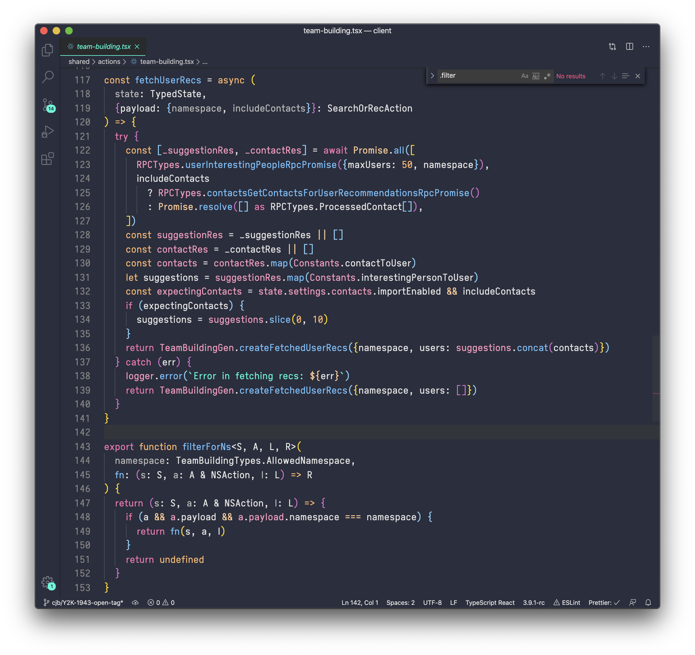
https://typeof.net/Iosevka/
Oh, Iosevka is one of my favourite fonts, thanks!
I've been using cuis smalltalk with proportional fonts, even a slightly cursive looking one.
And before you get your pitchforks out, that's from a longtime (since 1998) vim user, whose other current weapon of choice is a neovim setup which acts as as its own multiplexer, thereby replacing gnu-screen (tmux for the rest of you).
In cuis, the morphic graphics system has been rebuilt to be entirely vector-graphics based. Entirely. Everything. The text rendering is beautiful. Each window can be scaled up or down with just a right click to bring up the 'halo', and then just drag the icon. The fonts are redrawn with vector graphics. There is zero quality loss, up or down.
Scaling up or down to cater for different dpi screens is no longer an issue.
The beauty of it is actually a little inspirational, as silly as that sounds. You feel like you have an expensive Japanese-nibbed fountain pen, and high quality parchment, and it forces you to write something.
(yes, the rendering quality remains, even if you also rotate the window as well).
And before you get your pitchforks out, that's from a longtime (since 1998) vim user, whose other current weapon of choice is a neovim setup which acts as as its own multiplexer, thereby replacing gnu-screen (tmux for the rest of you).
In cuis, the morphic graphics system has been rebuilt to be entirely vector-graphics based. Entirely. Everything. The text rendering is beautiful. Each window can be scaled up or down with just a right click to bring up the 'halo', and then just drag the icon. The fonts are redrawn with vector graphics. There is zero quality loss, up or down.
Scaling up or down to cater for different dpi screens is no longer an issue.
The beauty of it is actually a little inspirational, as silly as that sounds. You feel like you have an expensive Japanese-nibbed fountain pen, and high quality parchment, and it forces you to write something.
(yes, the rendering quality remains, even if you also rotate the window as well).
one trick that always impresses is when you rotate the window and scroll the text.
I use Verdana. Everyone thinks I'm nuts, but I like reading code that way.
The hallmark of a good font is that it does not draw attention to itself. It does not interfere with the reader’s grasp of the author’s meaning, and it recedes into the background.
Yes, and?
Proportional fonts draw attention to themselves and fail the criteria by being distracting.
Smalltalk environments have defaulted to proportional fonts back to the beginning of time [1]. Some of the newer ones allow for richtext code, so if you really need to make that ascii art drawing, you can change the font in the comment. Also look up elastic tabstops for an alternate alignment solution.
The tricky part is there aren't many proportional fonts designed for coding (but more than there used to be). One early 90s version of ST defaulted to Helvetica, which was a nightmare to read on the then current lowres screens. Of the current choices, Input is probably the best place to start. Verdana is popular with some, and I've used Lucida a bunch, both sans and serifed. I have also had fun using not really suited display fonts like Zapfino or surprisingly readable drafting handwriting fonts like Tekton. I am currently fiddling with using various ports of the TeX fonts, particularly the CM Concrete as I find the big serifs easy to read. It is usually recommened to use a sans font for readability, but I think that advice is outdated on modern very hires displays with subpixel antialising.
[1] https://fontstruct.com/fontstructions/show/1693628/cream-10p...
The proportional fonts question recurrs periodically:
2005 https://ask.metafilter.com/16469/Proportional-programming-fo...
2010 https://slashdot.org/story/130020
https://www.quora.com/Are-monospace-or-proportional-fonts-be...
2019 https://news.ycombinator.com/item?id=18958046
The tricky part is there aren't many proportional fonts designed for coding (but more than there used to be). One early 90s version of ST defaulted to Helvetica, which was a nightmare to read on the then current lowres screens. Of the current choices, Input is probably the best place to start. Verdana is popular with some, and I've used Lucida a bunch, both sans and serifed. I have also had fun using not really suited display fonts like Zapfino or surprisingly readable drafting handwriting fonts like Tekton. I am currently fiddling with using various ports of the TeX fonts, particularly the CM Concrete as I find the big serifs easy to read. It is usually recommened to use a sans font for readability, but I think that advice is outdated on modern very hires displays with subpixel antialising.
[1] https://fontstruct.com/fontstructions/show/1693628/cream-10p...
The proportional fonts question recurrs periodically:
2005 https://ask.metafilter.com/16469/Proportional-programming-fo...
2010 https://slashdot.org/story/130020
https://www.quora.com/Are-monospace-or-proportional-fonts-be...
2019 https://news.ycombinator.com/item?id=18958046
You'd probably have to use tabs to make your indented blocks and other alignment look nice. Then you get into the whole tabs vs. spaces debate.
Why? Most companies are requiring auto formatters these days, so it doesn’t really matter if you can’t precisely align code.
Really? I've never used an autoformatter for anything ever, much less had one required. Which companies are these?
Google (I think they started the trend with Go?), Facebook, Amazon, … which companies “don’t” require auto formatters would be more interesting and specific.
Google leaves that as a team preference. Go certainly has highly opinionated style enforcement, but it is surprisingly not automatic formatting across the board.
Amazon may have changed, but this is also not universal. Team preference, though they may be enforcing it in the older code base for the site (i.e. detail pages, etc.).
Facebook is the only one on your list I can confirm does, in part perhaps due to the predominant language (Hack).
Amazon may have changed, but this is also not universal. Team preference, though they may be enforcing it in the older code base for the site (i.e. detail pages, etc.).
Facebook is the only one on your list I can confirm does, in part perhaps due to the predominant language (Hack).
I'm curious what line-length limits these company's have (either imposed by an autoformatter or imposed by informal means).
I have been using Comic Sans for years. I like it.
I switch between golang's proportional font and Nirmala UI. They look really good on high dpi screens and are just generally attractive fonts. Indentation width is a drawback since space characters tend to be small. Code that uses two spaces for indentation is not nearly enough of an offset in my opinion. Four space indentation looks like two space for a monospace font, which is generally good enough. Also punctuation can be an issue as proportional fonts tend to have small, easy to miss punctuation.
Use tabs to left indent, and you can then use whatever spacing you want for readability.
They preclude ASCII and Unicode diagrams.
They preclude ASCII, but not Unicode diagrams.
Unicode block characters have constant width.
Unicode also contains fixed-width equivalents to ASCII letters: abc. Just add 0xFEE0 to the code point.
And 0x3000 is an ideographic space, with the same width.
Unicode block characters have constant width.
Unicode also contains fixed-width equivalents to ASCII letters: abc. Just add 0xFEE0 to the code point.
And 0x3000 is an ideographic space, with the same width.
    +---------+
    |         |                        +--------------+
    |   NFS   |--+                     |              |
    |         |  |                 +-->|   CacheFS    |
    +---------+  |   +----------+  |   |  /dev/hda5   |
                 |   |          |  |   +--------------+
    +---------+
    |         |                        +--------------+
    |   NFS   |--+                     |              |
    |         |  |                 +-->|   CacheFS    |
    +---------+  |   +----------+  |   |  /dev/hda5   |
                 |   |          |  |   +--------------+
Those diagrams might look nice, but are hard to edit (for your average user without a CJK input method) and hard to copy things from (you can't get the string /dev/hda5 from your example, you'll get something Linux won't do anything meaningful with.)
I don't think diagrams are meant to be copy-pasted from a lot, so I'm not worried about that.
For editing, I'd just use a conversion tool, and edit it in a fixed-width editor rather than directly in code. Yes, it's an extra tool, but I don't think it's that outlandish to edit pictures in a tool for editing pictures.
For editing, I'd just use a conversion tool, and edit it in a fixed-width editor rather than directly in code. Yes, it's an extra tool, but I don't think it's that outlandish to edit pictures in a tool for editing pictures.
My experience is that I get annoyed when text isn't copyable whether or not the author means for it to be copyable.
... but issues would never happen outside of HN, so this is all cool.
This sounds like a nightmare for Python. No auto formatter would solve inconsistent indentation for you.
You would need to put a little more effort into using your caret to find issues when a compiler gives a row and column coordinate.
Max width restrictions (i.e. 80 columns) would become meaningless and arbitrary.
Your entire team would likely have to agree to the font choice for consistency.
OS font rendering differences would make life very interesting.
You would need to put a little more effort into using your caret to find issues when a compiler gives a row and column coordinate.
Max width restrictions (i.e. 80 columns) would become meaningless and arbitrary.
Your entire team would likely have to agree to the font choice for consistency.
OS font rendering differences would make life very interesting.
You get in trouble only if you see hanging indentations:
Foo(Bar(...), baz)
But they are not required for a happy life:
Foo( Bar(...), baz, )
It's not PEP8, but it works, and it does not depend on the font at all. 80 columns is bollocks in any case, but with this style, width is usually even reduced.
Alternatively, Elastic Tabstops solves this, but it's supported by approximately no one.
https://nickgravgaard.com/elastic-tabstops/
Foo(Bar(...), baz)
But they are not required for a happy life:
Foo( Bar(...), baz, )
It's not PEP8, but it works, and it does not depend on the font at all. 80 columns is bollocks in any case, but with this style, width is usually even reduced.
Alternatively, Elastic Tabstops solves this, but it's supported by approximately no one.
https://nickgravgaard.com/elastic-tabstops/
Good luck with positional languages :)
Care to elaborate?
Take cobol. The data division is highly column based, not mandatory though but you never get any of the columns straight except the first one. It will work but its hard on the eyes.
Take (ibm) assembler, it sometimes needs a continuation character in column 72. Where is column 72 in proportional?
hehe, I can live with that, I punch my cards by hand like a true 10x engineer.
Punch cards??? Luxury!
Why, when I was a lad, we had to punch paper tape by hand! And it wasn't any of this buy-it-by-the-roll stuff either. My da' would send me to the woods, and I'd have to chew a branch for a week to make my own paper!
Why, when I was a lad, we had to punch paper tape by hand! And it wasn't any of this buy-it-by-the-roll stuff either. My da' would send me to the woods, and I'd have to chew a branch for a week to make my own paper!
Real Programmers don't use punch cards; they toggle the programs in directly via front-panel switches (in octal).
Oh, we're talking about real programmers?
Well, real programmers just tweak the bias voltages on the op-amps driving the transistor networks.
And not using the potentiometers that today's "real programmers" use. No sir, when I was a lad...
Well, real programmers just tweak the bias voltages on the op-amps driving the transistor networks.
And not using the potentiometers that today's "real programmers" use. No sir, when I was a lad...
Back in my day we had real man’s trees rather than the silly “programmer” soft lad trees. It took us a MONTH to chew our punch cards.
You could always use free format COBOL.
https://gnucobol.sourceforge.io/faq/index.html#do-you-have-a...
https://gnucobol.sourceforge.io/faq/index.html#do-you-have-a...
What are you, a monster?
Yes, how did you know? Here’s my portrait: https://www.potato.horse/about
I fell odd even seeing a filename in proportional within a normal paragraph.
Yes, but my workflow is very unconventional: https://www.youtube.com/watch?v=aD6vmbmzdBo
fonts? real programmers use paper and pencil
nope.
I'm curious about any less obvious pros and cons, as well as recommendations for any fonts to try.