Achieving Accessibility Through Simplicity(sourcehut.org)
sourcehut.org
Achieving Accessibility Through Simplicity
https://sourcehut.org/blog/2020-05-27-accessibility-through-simplicity/
86 comments
I think a big part of the issue here, and one that's often overlooked, is that both browser vendors and the resulting spec are to blame for the emergence of many of these patterns. For example, making a button that visually looks like a link but keeps the correct semantics takes over 20 lines of non-trivial CSS, even today [1]. It is then no wonder that developers take the easier route of attaching event listeners to links instead.
Realistically, if we want to have sites that are semantically sound, writing them the correct way should be so easy that you'd have to go out of your way to make them broken. Even with standards as new as HTML5 we have nonsense like the <article> and the <section> tag. Quoting MDN [2][3], "[the] <article> element represents a self-contained composition" and "[the] <section> element represents a standalone section". Even when I try my best to be semantically correct, I can't really tell when to use which.
[1] https://stackoverflow.com/a/12642009/1470607
[2] https://developer.mozilla.org/en-US/docs/Web/HTML/Element/ar...
[3] https://developer.mozilla.org/en-US/docs/Web/HTML/Element/se...
Realistically, if we want to have sites that are semantically sound, writing them the correct way should be so easy that you'd have to go out of your way to make them broken. Even with standards as new as HTML5 we have nonsense like the <article> and the <section> tag. Quoting MDN [2][3], "[the] <article> element represents a self-contained composition" and "[the] <section> element represents a standalone section". Even when I try my best to be semantically correct, I can't really tell when to use which.
[1] https://stackoverflow.com/a/12642009/1470607
[2] https://developer.mozilla.org/en-US/docs/Web/HTML/Element/ar...
[3] https://developer.mozilla.org/en-US/docs/Web/HTML/Element/se...
>For example, making a button that visually looks like a link but keeps the correct semantics takes over 20 lines of non-trivial CSS, even today.
Can you explain the use-case here? What about "being a button" do you need for the desired functionality? You just want it not to look like a button, while still acting like a button and looking like a link?
Can you explain the use-case here? What about "being a button" do you need for the desired functionality? You just want it not to look like a button, while still acting like a button and looking like a link?
Over-simplifying, but in general a link should take you to a different url/destination.
So if you want something that takes an action on the current page via JS but looks like a text link, it should be a <button> element styled as a link.
Here's a good, extensive article on the differences and use-cases for links and buttons: https://css-tricks.com/a-complete-guide-to-links-and-buttons...
So if you want something that takes an action on the current page via JS but looks like a text link, it should be a <button> element styled as a link.
Here's a good, extensive article on the differences and use-cases for links and buttons: https://css-tricks.com/a-complete-guide-to-links-and-buttons...
That much I understand. But then, if you want it to act like a button -- do something on the page but not link anywhere -- why not leave it to look like a button so the user has the right expectation for what it's doing?
As I thought, this use-case comes down to "How do I trick the user into treating something like a link when it's really a button?" Or, more generally, "How do I subvert user expectations for a website?"
How about, don't? Maybe the fact that it's hard to do within the web spec means you should re-think what you were trying to do?
As I thought, this use-case comes down to "How do I trick the user into treating something like a link when it's really a button?" Or, more generally, "How do I subvert user expectations for a website?"
How about, don't? Maybe the fact that it's hard to do within the web spec means you should re-think what you were trying to do?
Do you think the [-] link on this very comment should look and layout flow like a button?
Let me first say, this is a really great discussion that has forced me to think, and I'm upvoting both sides, including Deimorz and ratww.
On one hand, if I expect buttons, and only buttons, to have some non-link in-page effect, then yes, those [-] things should be buttons.
OTOH, as ratww, notes, the up/downvotes "are links", in a sense -- if JS is disabled, it just does the upvote with a page load, so functionally it's like a link and deserves <a> and not being a button. But by that logic, nothing deserves to be a button because you could replace it with a page load + the desired effect.
So let's go with the "make it a button" implication. I tried wrapping the [-]s it <button> tags, and yeah, that gives the button styling, which doesn't fit with the HN general style -- I'd prefer it stay text.
So I grudgingly (and tentatively) concede there are things that semantically should be buttons but whose default styling I'd still want to excise right out of them, forcing me into that dilemma I previously ridiculed. But is there still a way that I'm wrong about that concession?
On one hand, if I expect buttons, and only buttons, to have some non-link in-page effect, then yes, those [-] things should be buttons.
OTOH, as ratww, notes, the up/downvotes "are links", in a sense -- if JS is disabled, it just does the upvote with a page load, so functionally it's like a link and deserves <a> and not being a button. But by that logic, nothing deserves to be a button because you could replace it with a page load + the desired effect.
So let's go with the "make it a button" implication. I tried wrapping the [-]s it <button> tags, and yeah, that gives the button styling, which doesn't fit with the HN general style -- I'd prefer it stay text.
So I grudgingly (and tentatively) concede there are things that semantically should be buttons but whose default styling I'd still want to excise right out of them, forcing me into that dilemma I previously ridiculed. But is there still a way that I'm wrong about that concession?
My objection is more about making a button looking like a link, as in the linked StackOverflow answer. I stand by my post that this is wrong because you're subverting user expectations and probably making life harder for everyone involved ("why am I tabbing to this, this is not a button... why can't I right click it... aaaaargh").
> But by that logic, nothing deserves to be a button because you could replace it with a page load + the desired effect.
Not really. For instance, for the downvote/upvote buttons (or links?) here I actually agree with mwcampbell, they should be buttons. I don't think my other answers don't apply to them, because they don't look like links anyway. They could even be submit buttons inside forms to keep the site working when JS is disabled.
And for the [-], couchand just suggested <details> and this is the correct answer for me now.
> But by that logic, nothing deserves to be a button because you could replace it with a page load + the desired effect.
Not really. For instance, for the downvote/upvote buttons (or links?) here I actually agree with mwcampbell, they should be buttons. I don't think my other answers don't apply to them, because they don't look like links anyway. They could even be submit buttons inside forms to keep the site working when JS is disabled.
And for the [-], couchand just suggested <details> and this is the correct answer for me now.
>My objection is more about making a button looking like a link, as in the linked StackOverflow answer.
Oh, I agree on that point -- if it is legitimately a button, you should not make it look like a link. That's like you're trying to them into thinking the click will take them to a different page. (Among other problems.)
It's just that the issue of handling the [-] collapse icon caused me to realize there could be a use under those constraints.
>And for the [-], couchand just suggested <details> and this is the correct answer for me now.
Ah, wasn't aware of that. That seems like a better approach.
Oh, I agree on that point -- if it is legitimately a button, you should not make it look like a link. That's like you're trying to them into thinking the click will take them to a different page. (Among other problems.)
It's just that the issue of handling the [-] collapse icon caused me to realize there could be a use under those constraints.
>And for the [-], couchand just suggested <details> and this is the correct answer for me now.
Ah, wasn't aware of that. That seems like a better approach.
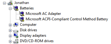
I’d say it already looks like a button. To me, [-] comes off as basically ASCII art for a box with a minus sign in it, similar to the classic Windows progressive disclosure controls:
https://docs.microsoft.com/en-us/windows/win32/uxguide/image...
And a rectangular outline and/or background is of course the basic visual element that indicates a button.
The ASCII art look works well here, but that’s because HN has an intentionally lo-fi aesthetic. On an average site I’d say it should be changed to a real box. Not a plain unstyled <button>, since (depending on the platform) those stand out too much for a relatively unimportant UI element. But I think a styled one would work.
I don’t have enough HTML experience to know what the issues are with layout.
https://docs.microsoft.com/en-us/windows/win32/uxguide/image...
And a rectangular outline and/or background is of course the basic visual element that indicates a button.
The ASCII art look works well here, but that’s because HN has an intentionally lo-fi aesthetic. On an average site I’d say it should be changed to a real box. Not a plain unstyled <button>, since (depending on the platform) those stand out too much for a relatively unimportant UI element. But I think a styled one would work.
I don’t have enough HTML experience to know what the issues are with layout.
No, the proper semantic element is <details>, just let the browser render the expand/collapse control.
[deleted]
Yes. So should the upvote, downvote, and unvote links, because these things don't go to nw pages, and the voting links take immediate action.
I agree with you, but just a point: the upvote and downvote arrows actually go to other pages when you disable JS, so it makes sense for them to be <a> tags. They should provide better feedback though (and a title attribute for screen readers).
The [-] is more complicated. Ideally it would link to a non-js fallback, but alas. But it's much better as an anchor tag than as a button disguised as a link.
The [-] is more complicated. Ideally it would link to a non-js fallback, but alas. But it's much better as an anchor tag than as a button disguised as a link.
The title attribute is not a good way to give elements an accessible name for screen readers (except iframes, title attribute is the right choice for them). Better would be to put the text inside the existing div and use CSS to visually hide it (which does take ~11 properties to cover older and different browsers):
<div class="votearrow" title="upvote">Upvote</div>
Alternately, instead of having the grayarrow.gif as a background image on a div, they could use an img element so the alt attribute becomes the accessible name of the link. Editing it in my browser's inspector, it looks exactly the same:
<img src="grayarrow.gif" alt="upvote" title="upvote">
An advantage of this approach is if the GIF doesn't load, the alt text is displayed instead (in some browsers, not all).
If you want to leave the title attribute to show on hover, that's fine but it's only going to help a sighted mouse user who needs more than triangles to understand that clicking them will upvote or downvote.
Since there are many upvote buttons on a page, a standard accessibility recommendation would be for each to have unique names to differentiate them out of context, something like "upvote ratww message 23326798." If user testing was done with people who use screen readers, I suspect they'd say that's too wordy and these controls should not be used out of context therefore, "upvote" and "downvote" are fine.
<div class="votearrow" title="upvote">Upvote</div>
Alternately, instead of having the grayarrow.gif as a background image on a div, they could use an img element so the alt attribute becomes the accessible name of the link. Editing it in my browser's inspector, it looks exactly the same:
<img src="grayarrow.gif" alt="upvote" title="upvote">
An advantage of this approach is if the GIF doesn't load, the alt text is displayed instead (in some browsers, not all).
If you want to leave the title attribute to show on hover, that's fine but it's only going to help a sighted mouse user who needs more than triangles to understand that clicking them will upvote or downvote.
Since there are many upvote buttons on a page, a standard accessibility recommendation would be for each to have unique names to differentiate them out of context, something like "upvote ratww message 23326798." If user testing was done with people who use screen readers, I suspect they'd say that's too wordy and these controls should not be used out of context therefore, "upvote" and "downvote" are fine.
Great post, thanks for the correction.
A submit button also takes you to a new page using a POST, and functionally if JavaScript is disabled then upvote/downvote would be acting as a submit button.
There is some nuance to getting that right (forms). I think an <a></a> shouldn’t be used, because that is a GET action, which should be idempotent.
There is some nuance to getting that right (forms). I think an <a></a> shouldn’t be used, because that is a GET action, which should be idempotent.
That's true, I agree that this is a better option.
No, it's the absolute worst kind of anchor link: it's linking to javascript:void(0). It should be a button. Not complicated.
The upvote link on your comment goes to [ https://news.ycombinator.com/vote?id=23327414&how=up&auth=51... ] not [ javascript:void(0) ]. Are you sure you don't have RCE vulnerabilities enabled?
Read again. The point was that it should be a button that looks like a button, or a link with proper fallback for non-JS users. It should have a title attribute and feedback as well, for screen readers.
It should never be a button disguised as a link, however. Fake links are much worse than javascript:void(0), because they break expectations of users, and are more prone to breaking. At least with javascript:void(0) browsers are able to use it as a hint to disable certain context-menu items, and it's much better than having a fake link. For accessibility purposes, if you need button behavior but link-look you should use role="button".
It should never be a button disguised as a link, however. Fake links are much worse than javascript:void(0), because they break expectations of users, and are more prone to breaking. At least with javascript:void(0) browsers are able to use it as a hint to disable certain context-menu items, and it's much better than having a fake link. For accessibility purposes, if you need button behavior but link-look you should use role="button".
> The point was that it should be a button that looks like a button, or a link with proper fallback for non-JS users.
And in case I wasn't clear, I agree with that.
And in case I wasn't clear, I agree with that.
> So if you want something that takes an action on the current page via JS but looks like a text link, it should be a <button> element styled as a link.
Why? It really shouldn't look like a link.
The mere fact that it requires a 20-line-hack is enough proof that this is a hack. It subvert user expectations (example: it's a link that you can't right click, tab behaves differently), accessibility (example: it looks like a link but will register as a button to a screen reader) and will probably look different in some browsers.
If you indeed need a navigational link you can freely attach a onclick event to a link. If the link has no proper non-javascript fallback (it ideally should, though) you can link to javascript:void(0); and most browsers will prevent the "Open in New Window" option from showing up in context menus.
Why? It really shouldn't look like a link.
The mere fact that it requires a 20-line-hack is enough proof that this is a hack. It subvert user expectations (example: it's a link that you can't right click, tab behaves differently), accessibility (example: it looks like a link but will register as a button to a screen reader) and will probably look different in some browsers.
If you indeed need a navigational link you can freely attach a onclick event to a link. If the link has no proper non-javascript fallback (it ideally should, though) you can link to javascript:void(0); and most browsers will prevent the "Open in New Window" option from showing up in context menus.
The entire subject of this thread is about getting accessibility and other benefits for free if you write semantically-correct HTML. You're arguing for the exact opposite: just using whatever element gives you the appearance you want, regardless of whether it's the correct one or not.
Using CSS to change the appearance of a button isn't a hack, that's the explicit purpose of CSS. It's a hack to make a link point to "javascript:void(0)" to prevent it from doing the thing it's supposed to do.
Using CSS to change the appearance of a button isn't a hack, that's the explicit purpose of CSS. It's a hack to make a link point to "javascript:void(0)" to prevent it from doing the thing it's supposed to do.
That's not true. I'm not advocating that.
I'm making exactly the same point as the article: using semantic HTML will get you accessibility for free.
If you need something that makes an action, then it should be a button but never disguised as a link. It should just look like a button. This way you won't subvert users expectations (you said it yourself: links are for taking users to another URL), and will still be accessible to screen-reader users.
If you need something that takes to another page, then it should be a link, even if it uses Javascript behind the scenes. This way screen-reader users will know it's a link taking somewhere else and sighted users will have the same experience.
-
> Using CSS to change the appearance of a button isn't a hack, that's the explicit purpose of CSS. It's a hack to make a link point to "javascript:void(0)" to prevent it from doing the thing it's supposed to do.
I disagree. MDN's CSS accessibility page starts precisely with this: "It is possible to use CSS to make any HTML element look like anything, but this doesn't mean that you should". [1]
Changing the whole look and feel of an element to emulate another is definitely a hack. You would also need aria-role="link" to have proper accessibility, btw. Which is exactly the point of the article: not having to sprinke aria-role just because you're using non-semantic HTML.
Ideally you would have a proper link instead of a fallback, so that users can open the link in a new window or save a bookmark. Using javascript:void(0) is less than ideal but at least gives a hint to the browser that the link is not taking the user to another URL.
[1] https://developer.mozilla.org/en-US/docs/Learn/Accessibility...
EDIT: Replaced bad argument with the MDN quote.
I'm making exactly the same point as the article: using semantic HTML will get you accessibility for free.
If you need something that makes an action, then it should be a button but never disguised as a link. It should just look like a button. This way you won't subvert users expectations (you said it yourself: links are for taking users to another URL), and will still be accessible to screen-reader users.
If you need something that takes to another page, then it should be a link, even if it uses Javascript behind the scenes. This way screen-reader users will know it's a link taking somewhere else and sighted users will have the same experience.
-
> Using CSS to change the appearance of a button isn't a hack, that's the explicit purpose of CSS. It's a hack to make a link point to "javascript:void(0)" to prevent it from doing the thing it's supposed to do.
I disagree. MDN's CSS accessibility page starts precisely with this: "It is possible to use CSS to make any HTML element look like anything, but this doesn't mean that you should". [1]
Changing the whole look and feel of an element to emulate another is definitely a hack. You would also need aria-role="link" to have proper accessibility, btw. Which is exactly the point of the article: not having to sprinke aria-role just because you're using non-semantic HTML.
Ideally you would have a proper link instead of a fallback, so that users can open the link in a new window or save a bookmark. Using javascript:void(0) is less than ideal but at least gives a hint to the browser that the link is not taking the user to another URL.
[1] https://developer.mozilla.org/en-US/docs/Learn/Accessibility...
EDIT: Replaced bad argument with the MDN quote.
You probably know this but aria-role is not an attribute, the ARIA attribute you're thinking of is simply role.
Your point still stands, if someone makes an element other than <a href...> look and behave like a link, they should also add role="link" to convey that role to assistive technologies.
Your point still stands, if someone makes an element other than <a href...> look and behave like a link, they should also add role="link" to convey that role to assistive technologies.
Ooops, thanks again. You're absolutely correct.
[deleted]
This is a similar discussion to what happened last month
https://news.ycombinator.com/item?id=22965184
I asked if book now should be a button or a link if it takes you to an ordering page, still not sure.
https://news.ycombinator.com/item?id=22965184
I asked if book now should be a button or a link if it takes you to an ordering page, still not sure.
I think focusing solely on the link side of things is missing the forest for the trees. All of the same points apply if you want a button element to look like pretty much anything other than the default button, that is, use an actual design on your page while keeping semantics in tact.
[deleted]
I would append 'unless you do it really well' to a lot of these statements. In fact, I bet you use websites on a daily basis that do many of these, but you don't even notice because they do it well. You only notice those who do it badly.
Except for stealing the back button. There's a special hell for any dev who does that.
Except for stealing the back button. There's a special hell for any dev who does that.
The problem is that you can do it well enough that no one using a browser in the normal way would notice, but people doing things differently, whether by necessity (e.g. because of a disability) or preference, would still notice.
Yeah. With a lot of time and effort, you can get a result that's so good, it's indistinguishable from not doing anything special at all.
Trouble is that many of these things are impossible to do correctly. Taking some of the items in the list quoted:
• Scrolljacking. The web doesn’t provide the APIs necessary to synthesise the effect of scrolling from mouse events.
• Context menu behaviour: a tricky one, because there are some web apps where it seems reasonable and useful to provide your own context menu, but where it is conceivable that items in the native context menu may be desirable also. There’s no winning move here. There was a web API to handle this properly, where you could add items to the native context menu (<menu type=context>), but only Firefox has implemented it (and the writing is on the wall for it). I have no idea why the others have scuttled this seriously useful functionality.
• Custom combo boxes: there’s a baseline of functionality (which most custom combo box widgets don’t cover properly anyway…), but beyond that each platform has its own subtleties that are not exposed in any way. If you truly want a custom combo box to feel native, you’ll need to sniff the platform and special-case. This leaves you open to getting things wrong in quite a few ways.
• Custom scrollbars: all the relevant APIs are async and these days typically debounced a tad, so that it’s simply not possible to guarantee that your custom scrollbar will match the scroll container on every frame—and in almost all cases it will be delayed by at least one frame.
(For the rest it is possible to do a flawless job. But it’s generally a much better idea to just not fiddle with things. I say this as someone who has made complex custom input controls and made sure they’re as close to perfect as is technically feasible without platform specialisation, but who definitely prefers to keep things simple. Oh, and I hate scrolljacking unconditionally.)
• Scrolljacking. The web doesn’t provide the APIs necessary to synthesise the effect of scrolling from mouse events.
• Context menu behaviour: a tricky one, because there are some web apps where it seems reasonable and useful to provide your own context menu, but where it is conceivable that items in the native context menu may be desirable also. There’s no winning move here. There was a web API to handle this properly, where you could add items to the native context menu (<menu type=context>), but only Firefox has implemented it (and the writing is on the wall for it). I have no idea why the others have scuttled this seriously useful functionality.
• Custom combo boxes: there’s a baseline of functionality (which most custom combo box widgets don’t cover properly anyway…), but beyond that each platform has its own subtleties that are not exposed in any way. If you truly want a custom combo box to feel native, you’ll need to sniff the platform and special-case. This leaves you open to getting things wrong in quite a few ways.
• Custom scrollbars: all the relevant APIs are async and these days typically debounced a tad, so that it’s simply not possible to guarantee that your custom scrollbar will match the scroll container on every frame—and in almost all cases it will be delayed by at least one frame.
(For the rest it is possible to do a flawless job. But it’s generally a much better idea to just not fiddle with things. I say this as someone who has made complex custom input controls and made sure they’re as close to perfect as is technically feasible without platform specialisation, but who definitely prefers to keep things simple. Oh, and I hate scrolljacking unconditionally.)
No, it's especially if you do it really well, because then it takes longer for people to realize it's broken.
[deleted]
Something that I struggle with is finding how to do things properly. For example, search for "learn HTML" and you'll see all these online tutorials which I can already tell aren't gonna be what I'm actually looking for. How do you find out what to avoid and what standards to follow?
Sorry you didn't get an answer. Unfortunately, as with many things, the answer is, "be someone who already knows all the things that you're trying to learn", or, "be an old person who witnessed the progression in real time".
You could try replicating the old person experience by starting with something like Dave Raggett's introduction to HTML or anything that focuses on HTML 4, and then look at why HTML5 added the things that it did. alistapart.com also hosts a lot of articles on this type of thing.
You could try replicating the old person experience by starting with something like Dave Raggett's introduction to HTML or anything that focuses on HTML 4, and then look at why HTML5 added the things that it did. alistapart.com also hosts a lot of articles on this type of thing.
> Don’t use JavaScript to create custom input elements like text boxes, combo boxes, or scrollbars.
You can style input elements heavily, and in some cases you can shadow them (associate a manufactured UI element with a real input element, and then conceal the real element). In fact for certain interactions you have to do this due to user agent hardening against CSRF attacks.
You can style input elements heavily, and in some cases you can shadow them (associate a manufactured UI element with a real input element, and then conceal the real element). In fact for certain interactions you have to do this due to user agent hardening against CSRF attacks.
One thing stood out to me, from reading the post and the HN discussion. I think there's a real distinction to be made between web pages and web applications. HN seems to have a bias against web applications which is probably unfair.
Most web developers today do not set out to build web pages. They start with full-on experiences they would like to bring to users, and the web stack is their tool of choice in doing so. There is nothing wrong with this! And different considerations apply in the development of such applications versus a web page.
Philosophically, SourceHut is about non-browser-based workflows (e.g. using email for merge requests). Since SourceHut users do far less of their SourceHut-related work on the actual website, SourceHut can afford to take a web page approach. GitHub, in contrast, focuses on browser-based workflows. They actually do a pretty great job at it - and this is something that they can do only because they take a web application approach. I like their keyboard shortcuts, for example, but these would be difficult (impossible?) to implement on a simple HTML page.
No single user can say that one approach is right and the other is wrong. All they can do is assert preferences. At the end of the day, traffic does the talking.
But thinking in terms of web pages vs. web applications makes things like this:
> Many companies have written checks with an uncomfortable number of zeroes on them to get the job done.
more understandable.
Most web developers today do not set out to build web pages. They start with full-on experiences they would like to bring to users, and the web stack is their tool of choice in doing so. There is nothing wrong with this! And different considerations apply in the development of such applications versus a web page.
Philosophically, SourceHut is about non-browser-based workflows (e.g. using email for merge requests). Since SourceHut users do far less of their SourceHut-related work on the actual website, SourceHut can afford to take a web page approach. GitHub, in contrast, focuses on browser-based workflows. They actually do a pretty great job at it - and this is something that they can do only because they take a web application approach. I like their keyboard shortcuts, for example, but these would be difficult (impossible?) to implement on a simple HTML page.
No single user can say that one approach is right and the other is wrong. All they can do is assert preferences. At the end of the day, traffic does the talking.
But thinking in terms of web pages vs. web applications makes things like this:
> Many companies have written checks with an uncomfortable number of zeroes on them to get the job done.
more understandable.
> HN seems to have a bias against web applications which is probably unfair.
It may be unfair, but I think part of it is a pushback against the cultural zeitgeist that the web is meant as a platform to deliver content to passive users. If web authors assume that users are out there to just passively consume content, then yes most of the web will just be elaborately designed applications designed to guide the passive user.
> All they can do is assert preferences. At the end of the day, traffic does the talking.
I think this simplification is part of the problem. Traffic doesn't dictate anything. Just because The Bachelor receives more eyeballs than War and Peace doesn't mean that The Bachelor is a superior product to War and Peace, or conversely that War and Peace is a better product than The Bachelor. Each has its place in our species' cultural milieu. The web has a growing culture of trying to erase media plurality and embrace a single hot, or dominant form of publishing, and I think this specifically leads to the outgrowth of these sorts of big flamewars. Different forms of media can coexist, and traffic isn't the only mark of success.
It may be unfair, but I think part of it is a pushback against the cultural zeitgeist that the web is meant as a platform to deliver content to passive users. If web authors assume that users are out there to just passively consume content, then yes most of the web will just be elaborately designed applications designed to guide the passive user.
> All they can do is assert preferences. At the end of the day, traffic does the talking.
I think this simplification is part of the problem. Traffic doesn't dictate anything. Just because The Bachelor receives more eyeballs than War and Peace doesn't mean that The Bachelor is a superior product to War and Peace, or conversely that War and Peace is a better product than The Bachelor. Each has its place in our species' cultural milieu. The web has a growing culture of trying to erase media plurality and embrace a single hot, or dominant form of publishing, and I think this specifically leads to the outgrowth of these sorts of big flamewars. Different forms of media can coexist, and traffic isn't the only mark of success.
Your reply really made me think - you are absolutely correct about traffic not being the end all and be all measure of successful content. Thank you for pulling me out of the echo chamber. :)
It isn't just about guiding passive users through content, though. My comment was motivated by a little dilemma that I have been wrestling with:
I'm building a search engine and have written the first version as a React app. I've been wondering if we shouldn't switch to a more traditional web page structure.
Drew's post made me realize that I want to give my users - not passive - an application experience so it's okay to stick with the current setup.
It isn't just about guiding passive users through content, though. My comment was motivated by a little dilemma that I have been wrestling with:
I'm building a search engine and have written the first version as a React app. I've been wondering if we shouldn't switch to a more traditional web page structure.
Drew's post made me realize that I want to give my users - not passive - an application experience so it's okay to stick with the current setup.
> Drew's post made me realize that I want to give my users - not passive - an application experience so it's okay to stick with the current setup.
Yup, and I think that's fine! I love using the web applications that I do use. I think we just need to take a hard look at what should be an application and what shouldn't, especially given the target audience. Having SPAs with infinite scroll to display a blog post really is just unnecessary.
Yup, and I think that's fine! I love using the web applications that I do use. I think we just need to take a hard look at what should be an application and what shouldn't, especially given the target audience. Having SPAs with infinite scroll to display a blog post really is just unnecessary.
> I like their keyboard shortcuts, for example, but these would be difficult (impossible?) to implement on a simple HTML page.
There is a very old (pre-Javascript) attribute called accesskey that allows primitive shortcuts without using JS. [1] Can't really use the same optimal shortcuts as GH, though!
As for the webpage vs web app, is it strange that I still consider GitHub having a webpage-based approach? I think they got a lot of functionality, but I don't really see them as being an SPA.
[1] https://developer.mozilla.org/en-US/docs/Web/HTML/Global_att...
There is a very old (pre-Javascript) attribute called accesskey that allows primitive shortcuts without using JS. [1] Can't really use the same optimal shortcuts as GH, though!
As for the webpage vs web app, is it strange that I still consider GitHub having a webpage-based approach? I think they got a lot of functionality, but I don't really see them as being an SPA.
[1] https://developer.mozilla.org/en-US/docs/Web/HTML/Global_att...
Thank you for teaching me about accesskey, very useful.
You are right that GitHub is not an SPA, but they seem to be moving towards becoming a proper web application - probably will happen over the next year or two.
The site is quite interactive - e.g. closing issues automatically when a PR is merged to master, GitHub actions triggering on pushed commits and giving developers valuable feedback on their changes.
Now that they are pushing GitHub Codespaces, they are a small step from turning the GitHub site into the only place a developer needs to go to write code, test it, and release it.
You are right that GitHub is not an SPA, but they seem to be moving towards becoming a proper web application - probably will happen over the next year or two.
The site is quite interactive - e.g. closing issues automatically when a PR is merged to master, GitHub actions triggering on pushed commits and giving developers valuable feedback on their changes.
Now that they are pushing GitHub Codespaces, they are a small step from turning the GitHub site into the only place a developer needs to go to write code, test it, and release it.
That's true! The Actions UI is also very SPA-ish compared to the older parts of the site.
> The user is already comfortable with the way their browser works, and you will fail to capture the subtle nuances of their user agent with your pretty imitations.
Amen! One form of browser imitation that particularly annoys me is client-side page loading. This is where JavaScript code intercepts activation of links, loads the new page using XHR or the like, then updates the current DOM in-place. Yes, this gives web developers the opportunity to prefetch pages or do fancy animations. But the accessibility problem here is that there's no way for an implementation of this technique to signal to a screen reader that a page loaded just as if the browser itself had loaded the page. Yes, you can use an ARIA live region to make a screen reader read your own message when you've finished loading the page. But I want my screen reader to be in control of what it does when a new page loads, e.g. automatically reading the contents of the page, possibly in a user-configurable way. So I think it's better to let the browser just load the page.
Amen! One form of browser imitation that particularly annoys me is client-side page loading. This is where JavaScript code intercepts activation of links, loads the new page using XHR or the like, then updates the current DOM in-place. Yes, this gives web developers the opportunity to prefetch pages or do fancy animations. But the accessibility problem here is that there's no way for an implementation of this technique to signal to a screen reader that a page loaded just as if the browser itself had loaded the page. Yes, you can use an ARIA live region to make a screen reader read your own message when you've finished loading the page. But I want my screen reader to be in control of what it does when a new page loads, e.g. automatically reading the contents of the page, possibly in a user-configurable way. So I think it's better to let the browser just load the page.
That sounds like a problem with the accessibility APIs then. I'd imagine that the script that replaces the DOM in-place also uses History API to tell the browser that this is a new page. At that point the browser should announce that it's a new page and do whatever you've configured it to do, but I just tried it in ChromeVox and it doesn't.
[deleted]
There are a few ways of making announcements in screen readers and handling SPA changes. I haven't tested them thoroughly, but had to implement a few aria alerts in a SPA.
https://developer.mozilla.org/en-US/docs/Web/Accessibility/A...
https://developer.mozilla.org/en-US/docs/Web/Accessibility/A...
https://developer.mozilla.org/en-US/docs/Web/Accessibility/A...
https://developer.mozilla.org/en-US/docs/Web/Accessibility/A...
No JS is needed to prefetch resources that might be needed by the user in the future (e.g. the next navigation) because prefetch it's an HTML5 standard so let the browser handle it, see https://www.keycdn.com/blog/resource-hints
I think we all recognize that the web today has become overcomplicated. That said, a lot of Drew's advice here is dogmatic.
> Leave the page at its default font size and avoid using custom fonts, preferring to use vague selections like “sans-serif” and “monospace”.
Why? These are all easily customizable by the user.
> Try not to use a purely visual representation of information, such as an icon: these should always be paired with text.
There are plenty of near–universally recognizable icons. Do your OS's windows say "close" in the title bar, or do they simply have an X?
> Also avoid moving information around — animations and visually complex state transitions.
Animations can be overused, but they can also serve an important purpose: displaying the transition between states.
For example, when you scroll your mouse, does the window just snap to the next page? Or does it go bit by bit so you can see where the new information comes from, and where the old information goes? Which do you think is a better experience?
> Leave the page at its default font size and avoid using custom fonts, preferring to use vague selections like “sans-serif” and “monospace”.
Why? These are all easily customizable by the user.
> Try not to use a purely visual representation of information, such as an icon: these should always be paired with text.
There are plenty of near–universally recognizable icons. Do your OS's windows say "close" in the title bar, or do they simply have an X?
> Also avoid moving information around — animations and visually complex state transitions.
Animations can be overused, but they can also serve an important purpose: displaying the transition between states.
For example, when you scroll your mouse, does the window just snap to the next page? Or does it go bit by bit so you can see where the new information comes from, and where the old information goes? Which do you think is a better experience?
> Why? These are all easily customizable by the user.
...yes, exactly? Why is that an issue?
> For example, when you scroll your mouse, does the window just snap to the next page? Or does it go bit by bit so you can see where the new information comes from, and where the old information goes? Which do you think is a better experience?
Yes, it snaps to the next scroll spot, because I disabled the "Use smooth scrolling" option, because I find it annoying.
But overall, I feel like you're arguing that it's okay to do things because in very small doses they can be useful. And that's fair, but IMO it's quite rare to actually see it done at a tasteful/sane level. Scroll hijacking is basically a meme on HN, in practice animations are almost always a net negative, icons are confusing because nobody actually sticks themselves to common known icons. Given the choice between the extremes, I'd strongly prefer minimalism, and that's relevant because people suck at actually implementing a happy medium.
...yes, exactly? Why is that an issue?
> For example, when you scroll your mouse, does the window just snap to the next page? Or does it go bit by bit so you can see where the new information comes from, and where the old information goes? Which do you think is a better experience?
Yes, it snaps to the next scroll spot, because I disabled the "Use smooth scrolling" option, because I find it annoying.
But overall, I feel like you're arguing that it's okay to do things because in very small doses they can be useful. And that's fair, but IMO it's quite rare to actually see it done at a tasteful/sane level. Scroll hijacking is basically a meme on HN, in practice animations are almost always a net negative, icons are confusing because nobody actually sticks themselves to common known icons. Given the choice between the extremes, I'd strongly prefer minimalism, and that's relevant because people suck at actually implementing a happy medium.
>> Leave the page at its default font size and avoid using custom fonts, preferring to use vague selections like “sans-serif” and “monospace”.
> Why? These are all easily customizable by the user.
monospace and sans-serif are customizable. Helvetica isn't. Regarding font size, not that long ago there was a post here from someone who set "font-size: 1.4em" in their CSS, because they couldn't be bothered to set up HiDPI scaling on their system. Mind you this CSS rule doesn't set the font size to anything specific. It tells the browser "whatever size you wanted to use for this text, make it 1.4 times bigger". So if user set say 14px as their preferred font size, it would be 19.6 px instead. That's just asshole design.
> Why? These are all easily customizable by the user.
monospace and sans-serif are customizable. Helvetica isn't. Regarding font size, not that long ago there was a post here from someone who set "font-size: 1.4em" in their CSS, because they couldn't be bothered to set up HiDPI scaling on their system. Mind you this CSS rule doesn't set the font size to anything specific. It tells the browser "whatever size you wanted to use for this text, make it 1.4 times bigger". So if user set say 14px as their preferred font size, it would be 19.6 px instead. That's just asshole design.
> monospace and sans-serif are customizable. Helvetica isn't.
Sure it is: https://support.mozilla.org/en-US/kb/change-fonts-and-colors...
> So if user set say 14px as their preferred font size, it would be 19.6 px instead. That's just asshole design.
I don't see that as any different from saying "use 19.6px text unless the user specifically overrides it." Maybe the designer just likes big text! If a user doesn't, they can easily make it smaller.
Sure it is: https://support.mozilla.org/en-US/kb/change-fonts-and-colors...
> So if user set say 14px as their preferred font size, it would be 19.6 px instead. That's just asshole design.
I don't see that as any different from saying "use 19.6px text unless the user specifically overrides it." Maybe the designer just likes big text! If a user doesn't, they can easily make it smaller.
> I don't see that as any different from saying "use 19.6px text unless the user specifically overrides it." Maybe the designer just likes big text!
If the designer wants to make text big, they should first set somewhere a specific value for its size, not go on to "you like your text this way? fuck you, i'll make it bigger than that!". There was no "px" or "pt" size setting anywhere higher in the DOM, so that's effectively what the author was saying to the readers.
> If a user doesn't, they can easily make it smaller.
The user already set their text preferences in browser settings. It's the designer that decided that they will make every user, who made that choice at some point, miserable.
If the designer wants to make text big, they should first set somewhere a specific value for its size, not go on to "you like your text this way? fuck you, i'll make it bigger than that!". There was no "px" or "pt" size setting anywhere higher in the DOM, so that's effectively what the author was saying to the readers.
> If a user doesn't, they can easily make it smaller.
The user already set their text preferences in browser settings. It's the designer that decided that they will make every user, who made that choice at some point, miserable.
You seem to be talking at cross-purposes with everyone else in this your comment and your grandparent comment.
The point that is being made in the article and by everyone here is that the keywords “monospace” and “sans-serif” allow the user to customise what they want it to mean, whereas specific font names like “Helvetica” don’t let the user choose to use their preferred sans-serif.
The point that is being made in the article and by everyone here is that the keywords “monospace” and “sans-serif” allow the user to customise what they want it to mean, whereas specific font names like “Helvetica” don’t let the user choose to use their preferred sans-serif.
No, I'm directly rebutting the argument. Even if the page specifies the specific font "Helvetica", the user can change that.
I see. The only way you can “change that” is by disabling all fonts, and it wasn’t clear that you were referring to that (which is a small part of the relevant config and help).
This approach is problematic when fonts are used significantly: as part of design direction, for example, where metrics matter; or on the large number of sites that use icon fonts—and so all your icon-only buttons are now meaningless gibberish.
This approach is problematic when fonts are used significantly: as part of design direction, for example, where metrics matter; or on the large number of sites that use icon fonts—and so all your icon-only buttons are now meaningless gibberish.
Strictly through built–in settings, sure. There are plenty of extensions that will let you override fonts in a more granular way [0] or even override styles altogether [1].
[0] https://addons.mozilla.org/en-US/firefox/search/?q=change+fo...
[1] https://addons.mozilla.org/en-US/firefox/search/?q=style
[0] https://addons.mozilla.org/en-US/firefox/search/?q=change+fo...
[1] https://addons.mozilla.org/en-US/firefox/search/?q=style
The deal with using icon-only approaches is to make sure that we use standardized icons, like ISO icons: https://www.iso.org/obp/ui/#iso:pub:PUB400001:en
I have made the mistake of "improving" standard icons (I was, at one time, an artist, and I believed that this gave me "creative license").
It did not end well.
I write about using "clichés" here: https://medium.com/chrismarshallny/the-road-most-traveled-by...
I have made the mistake of "improving" standard icons (I was, at one time, an artist, and I believed that this gave me "creative license").
It did not end well.
I write about using "clichés" here: https://medium.com/chrismarshallny/the-road-most-traveled-by...
> make sure that we use standardized icons, like ISO icons: https://www.iso.org/obp/ui/#iso:pub:PUB400001:en
Ha, the page is completely inaccessible to me:
> You have to enable javascript in your browser to use an application built with Vaadin.
Ha, the page is completely inaccessible to me:
> You have to enable javascript in your browser to use an application built with Vaadin.
Figures.
ISO isn't an accessibility advocacy organization, but they should be accessible.
ISO isn't an accessibility advocacy organization, but they should be accessible.
> Try not to use a purely visual representation of information, such as an icon: these should always be paired with text.
Curious and purely technical question: are screen readers not using the alt text of an <img ... /> tag? Does something like this not cause the "foo bar baz" text to be read out twice in a row?
Curious and purely technical question: are screen readers not using the alt text of an <img ... /> tag? Does something like this not cause the "foo bar baz" text to be read out twice in a row?
<div><img src=... alt="Foo bar baz" />Foo bar baz</div>Icons are often included using different methods that don't support the alt attribute. Icon font systems like Font Awesome use CSS like this:
.fa-trash::before { content: "\f1f8"; }
Screen readers these days have good support of the ::before and ::after pseudo-elements and most can the values of content properties but if the icon font is using the Unicode private use area, a screen reader can't read it. There's a new standard for content properties that allow for inclusion a text alternative within the value but it's not broadly supported and in browsers that don't support it, the visual content is not rendered.
Icons are also sometimes included using a background-image (maybe one that's part of a sprite sheet) so a text alternative needs to be added somewhere.
aria-label and aria-labelledby attributes can provide text alternatives but generally including the text in an adjacent element that's visually hidden is more robust.
Screen readers these days have good support of the ::before and ::after pseudo-elements and most can the values of content properties but if the icon font is using the Unicode private use area, a screen reader can't read it. There's a new standard for content properties that allow for inclusion a text alternative within the value but it's not broadly supported and in browsers that don't support it, the visual content is not rendered.
Icons are also sometimes included using a background-image (maybe one that's part of a sprite sheet) so a text alternative needs to be added somewhere.
aria-label and aria-labelledby attributes can provide text alternatives but generally including the text in an adjacent element that's visually hidden is more robust.
They do!
If you need to label an image for both screen-readers and screen you can use the aria-labelledby attribute. [1] [2]
[1] https://www.w3.org/WAI/GL/wiki/Using_aria-labelledby_to_prov...
[2] https://fae.disability.illinois.edu/rulesets/IMAGE_1/
If you need to label an image for both screen-readers and screen you can use the aria-labelledby attribute. [1] [2]
    <img src="sunflowers.jpg" aria-labelledby="my_txt">
    <span id="my_txt">Foo bar baz</span>
[1] https://www.w3.org/WAI/GL/wiki/Using_aria-labelledby_to_prov...
[2] https://fae.disability.illinois.edu/rulesets/IMAGE_1/
Of course. Analogous to how your closet is a lot easier to keep organized when there's less crap in it.
Drew, if you are reading this, please add Gogs/Gitea and OneDev to this list of benchmarks on the performance page. Otherwise it is somewhat disingenuous by comparing against Gitlab and GitHub since Rails and Ruby are hardly known for their speed when it comes to web apps. Compare against Go and the JVM if you want an honest comparison.
https://forgeperf.org/
https://gogs.io/
https://gitea.io/en-us/ (Gogs fork)
https://onedev.io
https://forgeperf.org/
https://gogs.io/
https://gitea.io/en-us/ (Gogs fork)
https://onedev.io
Simplicity is difficult.
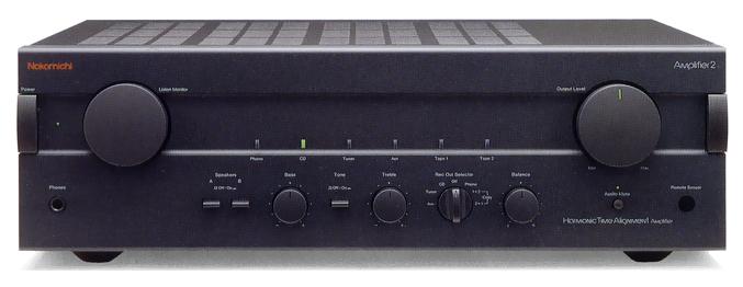
I use a comparison that I call "Nakamichi vs. Adcom."
Those of us...of a "certain age"...will remember these as top-shelf stereo brands. They used to cost a bundle.
Nakamichi amps tended to be...engineer-friendly: https://audio-database.com/NAKAMICHI/amp/amplifier2.JPG
Adcom amps tended to be a bit simpler: https://www.hifiengine.com/images/model/adcom_gfa-585_power_...
Both were pretty awesome, but they definitely "spoke to" different crowds.
I think that the debates over which is better would never be resolved.
I like to take the tack of "Make it simple, but no simpler than absolutely necessary to get the principal task done."
This is really important in both usability and accessibility.
There's a famous quote from Josef Albers: "In design, sometimes one plus one equals three."
Every element that we add to a design; whether functional or ornamental, can have a combinatorial impact on complexity.
I use a comparison that I call "Nakamichi vs. Adcom."
Those of us...of a "certain age"...will remember these as top-shelf stereo brands. They used to cost a bundle.
Nakamichi amps tended to be...engineer-friendly: https://audio-database.com/NAKAMICHI/amp/amplifier2.JPG
Adcom amps tended to be a bit simpler: https://www.hifiengine.com/images/model/adcom_gfa-585_power_...

Both were pretty awesome, but they definitely "spoke to" different crowds.
I think that the debates over which is better would never be resolved.
I like to take the tack of "Make it simple, but no simpler than absolutely necessary to get the principal task done."
This is really important in both usability and accessibility.
There's a famous quote from Josef Albers: "In design, sometimes one plus one equals three."
Every element that we add to a design; whether functional or ornamental, can have a combinatorial impact on complexity.
Off topic, but I noticed something funny: the simpler amp looks is closer to what professional audio engineers use. We expect not having treble/bass controls in our mixing monitors because we expect their response curve to be as flat as possible.
(In practice some have controls to compensate for room issues, but we rarely use, and just blame the room)
(In practice some have controls to compensate for room issues, but we rarely use, and just blame the room)
I'm not surprised. The Adcom amp relies almost entirely on its preamp, which, though simpler than the Nakamichi one, is a bit more complex.
On the other hand, this is the Nakamichi preamp: https://i.pinimg.com/originals/b9/7b/d6/b97bd60bcbedd59ddf4e...
On the other hand, this is the Nakamichi preamp: https://i.pinimg.com/originals/b9/7b/d6/b97bd60bcbedd59ddf4e...

> Also avoid putting text over a variable background, such as a gradient or tiled background.
For sure. And especially don't have text over a background image that scrolls beneath it. Since the image isn't likely uniform in color, you will end up creating color/contrast problems.
For sure. And especially don't have text over a background image that scrolls beneath it. Since the image isn't likely uniform in color, you will end up creating color/contrast problems.
> <meta charset="utf-8" />
I’m curious: why do many people continue to use the trailing slash in many places? As far as HTML parsers are concerned, it’s completely useless. (On HTML tags, that is. It’s still significant on MathML and SVG tags.) Doesn’t seem to me that it will help authors to understand what’s going on, either—if anything, it muddies the waters so that people will think that you can close tags that way (you can’t).
I’m curious: why do many people continue to use the trailing slash in many places? As far as HTML parsers are concerned, it’s completely useless. (On HTML tags, that is. It’s still significant on MathML and SVG tags.) Doesn’t seem to me that it will help authors to understand what’s going on, either—if anything, it muddies the waters so that people will think that you can close tags that way (you can’t).
Accessibility is one of those things that isn't taken seriously enough by many people. It's good to see this on the front of HN.
I share the same sentiment, but it would be even better if what’s shared was more factual / less dogmatic – or in this case if sourcehut itself was a better example. At a high level it’s somewhat correct that sticking to HTML-only features is better, but otherwise there are a lot of issues with the specific guidance in the post:
> Don’t use JavaScript to create custom input elements like text boxes
Sure. But some JavaScript would be valuable, for example to display validation errors without a full page reload (try typing special characters in https://git.sr.ht/create). This means screen reader / keyboard users have to navigate back through the page, to the field, and discover what the error is. A skip link would be nice too, that only takes HTML.
> A good way of simulating the screen reader experience is to view your page with Lynx. Conveniently, Lynx does not support JavaScript.
Please don’t waste time in Lynx if you want to simulate the screen reader experience – if you’re knowledgeable enough to have Lynx installed and use it, you can learn to use a screen reader. There are good, free ones with every OS these days. They are much more capable than Lynx, and support JavaScript just fine.
> Avoid littering marketing garbage, superlatives, and ads for other parts of the site (or even ads outright) throughout your page, as skipping these is more difficult for a screen reader than for the typical visitor.
If your ad is wrapped in a `<section aria-label="My ad">` or aside, then it should be very easy to skip.
The general guidance here is to focus on plain language. Sourcehunt should avoid error messages like "Name must match [A-Za-z._-][A-Za-z0-9._-]*"
> In summary, if you want to get accessible quick, a good start for your new website might eschew npm install in favor of this:
Please update this template to have the `html` element with its `lang` attribute defined. Not having "lang" defined means screen reader users have the page read out in their browser’s default language, rather than the page’s language, which can make the content unintelligible.
> Don’t use JavaScript to create custom input elements like text boxes
Sure. But some JavaScript would be valuable, for example to display validation errors without a full page reload (try typing special characters in https://git.sr.ht/create). This means screen reader / keyboard users have to navigate back through the page, to the field, and discover what the error is. A skip link would be nice too, that only takes HTML.
> A good way of simulating the screen reader experience is to view your page with Lynx. Conveniently, Lynx does not support JavaScript.
Please don’t waste time in Lynx if you want to simulate the screen reader experience – if you’re knowledgeable enough to have Lynx installed and use it, you can learn to use a screen reader. There are good, free ones with every OS these days. They are much more capable than Lynx, and support JavaScript just fine.
> Avoid littering marketing garbage, superlatives, and ads for other parts of the site (or even ads outright) throughout your page, as skipping these is more difficult for a screen reader than for the typical visitor.
If your ad is wrapped in a `<section aria-label="My ad">` or aside, then it should be very easy to skip.
The general guidance here is to focus on plain language. Sourcehunt should avoid error messages like "Name must match [A-Za-z._-][A-Za-z0-9._-]*"
> In summary, if you want to get accessible quick, a good start for your new website might eschew npm install in favor of this:
Please update this template to have the `html` element with its `lang` attribute defined. Not having "lang" defined means screen reader users have the page read out in their browser’s default language, rather than the page’s language, which can make the content unintelligible.
Antecedent(1)
Antecedent(2)
The Biggie:
>Remember that the browser is the user agent, not the developer agent.
Others I find significant:
>“trust the web browser”.
>Don’t mess about with the scroll wheel
>don’t override default behaviors on the right click and text selection.
>Don’t use JavaScript to create custom input elements like text boxes, combo boxes, or scrollbars.
>Try not to use a purely visual representation of information, such as an icon: these should always be paired with text.
>Also avoid moving information around — animations and visually complex state transitions.
>When adding images, always include an “alt” tag with a plain-English description of the image.
When using correct document structure and semantics, it can be amazing what you get for "free" with respect to usability.
Additional issues I deal with on a daily basis which exist because some folks weren't satisfied with the default, correct behavior:
- A div with a "click" event is not a button or link
- A div with nested span elements is not a select
- The ad hoc "click" event handling does not handle auxiliary/middle click behavior
- An icon, with no accompanying text, also has no title attribute or anything else to convey its purpose to the user
- The ad hoc navigation implementation does not recall scroll position
- The ad hoc navigation implementation does not allow me to "back" out of the website
- The scroll event handler, called tens/hundreds of times per second, so that it can update the sticky "progress" bar that someone thought was necessary to inform me how far along the article I've come, increases my energy bill and the ambient temperature inside my home
Sometimes I just want to grab these folks by the collar and yell "Stop touching it!"