The artist whose book covers distilled the 1980s(newyorker.com)
newyorker.com
The artist whose book covers distilled the 1980s
https://www.newyorker.com/books/page-turner/the-artist-whose-book-covers-distilled-the-nineteen-eighties
16 comments
Makes me want to play some 8-bit games.
These are really awesome!
These are simply amazing.
Been a loooong time, since I did those. I maintain my design aesthetic and visual articulation, but I'd need to get back into practice, to do that stuff again.
Did you ever take inspiration from Sierra's box art, because the second one reminds me of a game called Ruins of Cawdor.
Also, are they both digitally drawn? I'm quite sure the first one is, but the second one looks like it was inked.
All in all, very well done.
Also, are they both digitally drawn? I'm quite sure the first one is, but the second one looks like it was inked.
All in all, very well done.
Thanks!
My inspirations were Michael Whelan, Frank Frazetta, Boris Vallejo, Roger Dean, and Rodney Matthews. These were all popular artists, at the time.
These were Acrylic, and I used airbrush, for the sky gradients, in the Sentinels one.
My inspirations were Michael Whelan, Frank Frazetta, Boris Vallejo, Roger Dean, and Rodney Matthews. These were all popular artists, at the time.
These were Acrylic, and I used airbrush, for the sky gradients, in the Sentinels one.
This blog post is linked from the New Yorker article and has a lot of pictures of the book covers, as well as interviews with the writers and artists:
https://talkingcovers.com/2012/09/12/vintage-contemporaries/
The “Ransom” cover is really wonderful.
Overall this series is a triumph of art direction. The various cover paintings were made by different artists, but they blend into a unified series that reflects the sensibility of the original designer — “Magritte in Memphis, California” would be my summary of the associations.
https://talkingcovers.com/2012/09/12/vintage-contemporaries/
The “Ransom” cover is really wonderful.
Overall this series is a triumph of art direction. The various cover paintings were made by different artists, but they blend into a unified series that reflects the sensibility of the original designer — “Magritte in Memphis, California” would be my summary of the associations.
I suspect she also did the art for the cover of "Days Between Stations" (which I read decades ago).
https://i.gr-assets.com/images/S/compressed.photo.goodreads....
https://i.gr-assets.com/images/S/compressed.photo.goodreads....
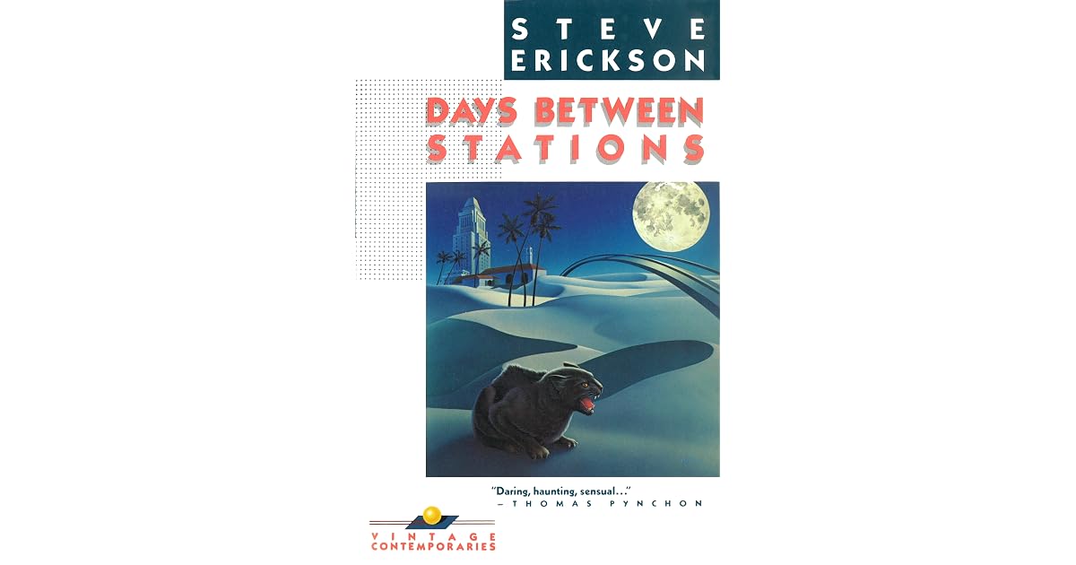
Looks like that was a 1986 version, which would have been in her heyday, so I suspect you're right.
UPDATE: That link that another commenter posted, has it: https://talkingcovers.com/2012/09/12/vintage-contemporaries/
UPDATE: That link that another commenter posted, has it: https://talkingcovers.com/2012/09/12/vintage-contemporaries/
[deleted]
Is there a complete list of all her covers? I read a book in the mid 1980's that I don't recall the name of but the art was definitely hers.
[deleted]
Incredible art
When I was a young man, I wanted to be a SciFi book cover artist. I wasn't half bad, but I wasn't a master, either.
I figured out that even a mediocre programmer could do better than even a really well-known commercial artist (which I was not really assured of).
Here's a couple of examples of the kind of stuff I was doing in the 1980s:
https://littlegreenviper.com/art/Cavalier.png
https://littlegreenviper.com/art/Sentinels.png