Iosevka typeface for code, from code(github.com)
github.com
Iosevka typeface for code, from code
https://github.com/be5invis/Iosevka
76 comments
The nice thing about Iosevka is that you can customize those and many other glyphs to taste!
I switched from DejaVu Sans Mono earlier this year, and haven't looked back - so much so that I set up Git LFS support on my Emacs init repo, just so I could add the custom-built .ttf and have Iosevka available on every machine where I do any meaningful work with text of any kind.
Sure, DejaVu Sans Mono (Menlo, et al) are "good enough", and that's fine. For me at least, Iosevka is great.
I switched from DejaVu Sans Mono earlier this year, and haven't looked back - so much so that I set up Git LFS support on my Emacs init repo, just so I could add the custom-built .ttf and have Iosevka available on every machine where I do any meaningful work with text of any kind.
Sure, DejaVu Sans Mono (Menlo, et al) are "good enough", and that's fine. For me at least, Iosevka is great.
There seems to be an overview at https://github.com/be5invis/Iosevka/blob/main/doc/stylistic-...
though I would ask the same: which of those is the default, and if none of them is, why is there no comparison image?
though I would ask the same: which of those is the default, and if none of them is, why is there no comparison image?
The website has a better view of that. https://typeof.net/Iosevka/ Scroll down to the variants section, where you can choose presets and it will show the set of characters and highlight the ones that are modified in the selected set. Or select each variant individually. (Not present on mobile; view in desktop mode.)
I wasn’t sure how to articulate this exact thought, but I wholeheartedly feel the same. Some of the quote characters (' vs ` for example) have been problematic for me in the past too, and even though more common special characters like ;:., are almost always distinct enough, it’s nice when designers pay special attention to the core concerns of the target audience.
So many good things to say about Iosevka. The font is great and the “customizability” is top-notch.
I created my own flavor of Iosevka called Monocode that I use everywhere a monospaced font makes sense.
https://github.com/aaronmbos/monocode
I created my own flavor of Iosevka called Monocode that I use everywhere a monospaced font makes sense.
https://github.com/aaronmbos/monocode
I’m a font nerd, and this one is easily my favorite.
As a Debian sysdmin, I don’t do much in the way of pure coding, but I use terminals frequently, write Bash scripts, Dockerfiles/Docker Compose files, and generally engage with monospaced text daily. Iosevka has become my default over the last several months, to the extent that I have added its GitHub repo to my dotfiles and deploy it everywhere that I operate. It is one of the only narrow monospaced typefaces that doesn’t look squished, but rather crisp and clean while being extremely efficient in its use of space. It’s italics are stylish without being overly decorative, and its glyphs/Powerline support seem to just work across Linux, MacOS, and Windows.
As a Debian sysdmin, I don’t do much in the way of pure coding, but I use terminals frequently, write Bash scripts, Dockerfiles/Docker Compose files, and generally engage with monospaced text daily. Iosevka has become my default over the last several months, to the extent that I have added its GitHub repo to my dotfiles and deploy it everywhere that I operate. It is one of the only narrow monospaced typefaces that doesn’t look squished, but rather crisp and clean while being extremely efficient in its use of space. It’s italics are stylish without being overly decorative, and its glyphs/Powerline support seem to just work across Linux, MacOS, and Windows.
Iosevka is the best font I've used. I've repeatedly tried to switch, but I end up just circling back.
PragmataPro is the only font that has come close, due to the author's obsessive optimization (including embedded pixmaps, something Iosevka lacks and may always lack).
The pricing is a bit weird on PragmataPro, which scares me away from it. "Essential" includes no coding ligatures (if that's your thing), makes you pay for regular and bold separately and has no italic at 20 euros a whack. With ligatures, its 60 euros each style.
PragmataPro is the only font that has come close, due to the author's obsessive optimization (including embedded pixmaps, something Iosevka lacks and may always lack).
The pricing is a bit weird on PragmataPro, which scares me away from it. "Essential" includes no coding ligatures (if that's your thing), makes you pay for regular and bold separately and has no italic at 20 euros a whack. With ligatures, its 60 euros each style.
Although that is interesting (a project to improve Iosevka's PragmataPro style), the only reason PragmataPro stands out so well is the ridiculous amount of hand tuning at every height, not necessarily the actual aesthetic look of the font (of which, Iosevka certainly picks up important design cues from, even without SS08 enabled).
Arguably, Pragmata is worth the money, but I wish the author of it would sell it in a way that makes sense to programmers, instead of trying to sell it like he was selling a font to designers.
Arguably, Pragmata is worth the money, but I wish the author of it would sell it in a way that makes sense to programmers, instead of trying to sell it like he was selling a font to designers.
With all these posts about fonts, I have to wonder, am I the weird one here for just using DejaVu Sans Mono for like past ten years and just, like, not caring that much? Does the font make that much of a difference?
I enjoy comparing new fonts to Consolas, and then going right back to Consolas. It helps me feel justified!
And I hate ligatures as much as I hate table aliases, so Consolas suits me just fine. Although, DSM is a close second. I just wish its "<=>" were more distinguishable.
And I hate ligatures as much as I hate table aliases, so Consolas suits me just fine. Although, DSM is a close second. I just wish its "<=>" were more distinguishable.
What do you think about Cascadia? It was commissioned directly as the "sequel" to Consolas and is interesting because it is open source (unlike Consolas). (Therefore cheaply cross-platform and web-safe, versus paying for Consolas licenses for non-Windows machines or websites.)
You may have overlooked it before because one of the more advertised "sequel" features is ligatures, but Cascadia is one of the fonts that uses the Mono/Code naming scheme to turn on/off ligatures. ("Cascadia Mono" doesn't include the coding ligatures that "Cascadia Code" does.)
You may have overlooked it before because one of the more advertised "sequel" features is ligatures, but Cascadia is one of the fonts that uses the Mono/Code naming scheme to turn on/off ligatures. ("Cascadia Mono" doesn't include the coding ligatures that "Cascadia Code" does.)
Same here, just with Lucida Console. All those newfangled fonts aren’t properly optimized and hinted for small sizes/low DPI.
Other than that nice font is nice on the eye when you are staring at them for hours on end, I find that Iosevka does improve my workflow because I could pack more on my screen. Before Iosevka I was using Fira Code (because of ligatures), and before that I was using Courier New/Consolas.
Same reason for me, although I used Hack for X years before that. I still think Hack looks more pleasing, but it's just so much wider than Iosevka I just can't go back.
Once your vision starts to go a little bit, yea. The biggest thing that bugs me (assuming we're talking about a baseline more or less decent font) is the spacing. Like, "Sweden Sans" posted here yesterday is waaaaay too narrow to be comfrotable for me to read, much less write.
I've been using IntelOne Mono for about 6 months now, and I like it a lot. So legible I've actually been able to drop my main editor and terminal fonts sizes down a notch or two, while remaining readable.
I've been using IntelOne Mono for about 6 months now, and I like it a lot. So legible I've actually been able to drop my main editor and terminal fonts sizes down a notch or two, while remaining readable.
I hear that - I use Iosevka comfortably at point sizes that haven't worked for me with DejaVu Sans Mono for years.
I'm that weird as well! My brain has optimized itself for reading DejaVu Sans Mono; I try other programming fonts now and then, but it's all been a disappointment. Also, no ligatures and 100% black/white, none of that gray-on-grey for me. I'm sure I am offending 98% of Hacker News readers by writing this :P
I also tend to switch to straight black and white. I don't get the desire for less contrast.
I do like ligatures, and I like checking out new fonts, but I'm not going to be offended if you don't. ;)
I do like ligatures, and I like checking out new fonts, but I'm not going to be offended if you don't. ;)
I like to micromanage my dev environment, I have custom everything (terminal, editor, WM...) yet I'm on the same boat when it comes to fonts. DejaVu + Noto for CJK just works. DejaVu is just a good font.
Programmers spend all their working hours interacting with text. How the text is rendered on screen is arguably the most important aspect of their work, followed by a text editor, and programming language.
If a certain font works for you, by all means keep using it. Just like nobody should tell you what editor to use, a font is also a matter of personal preference.
That said, certain fonts have features that many find advantageous. I like that Iosevka is narrow, which means I can fit more text horizontally. Legibility and not having ambiguous symbols is also important. I also dislike ligatures, and want my font to be able to render multiple alphabets. But ultimately, I just like the way it looks. It renders nicely in all sizes and weights. All of these might be features your font choice also has, or you might not value some of these as much as me, which is perfectly fine.
If a certain font works for you, by all means keep using it. Just like nobody should tell you what editor to use, a font is also a matter of personal preference.
That said, certain fonts have features that many find advantageous. I like that Iosevka is narrow, which means I can fit more text horizontally. Legibility and not having ambiguous symbols is also important. I also dislike ligatures, and want my font to be able to render multiple alphabets. But ultimately, I just like the way it looks. It renders nicely in all sizes and weights. All of these might be features your font choice also has, or you might not value some of these as much as me, which is perfectly fine.
I've used that font under several names, initially Bitstream's licensed version, for almost 20 years - until earlier this year, when I switched to Iosevka.
It really is significantly more legible, especially in parens/braces/brackets and punctuation. Before, it was easy and common to mistype , for . or vice versa, and not notice until it failed to parse. Since, I've done that maybe twice.
It really is significantly more legible, especially in parens/braces/brackets and punctuation. Before, it was easy and common to mistype , for . or vice versa, and not notice until it failed to parse. Since, I've done that maybe twice.
I don't obsess over it and I don’t try to follow all the hip new programming fonts, but I do tend to change my IDE’s font a couple of times per year. It feels like a bit of a palette cleanser, I suppose.
My experience has been that there is a certain type of developer who likes to flex by showing they have new/neat tools.
Not saying there is anything wrong with it, but for me it feels like to much of a distraction.
Not saying there is anything wrong with it, but for me it feels like to much of a distraction.
Meh. I like nice fonts, but I never talk about what font I use.
I don't even know what font I'm currently using, though I put some thought into choosing it at the time.
Some of us just care about what our fonts look like. I'm loving the configurator with Iosevka; yes, I'll likely spend an hour tweaking a custom font, but after that I'll just be done and move on.
There's no "flex" if I never even show anyone my dev environment or talk about what font I use. I think you're experiencing selection bias in thinking that only people who flex care about their fonts. ;)
I don't even know what font I'm currently using, though I put some thought into choosing it at the time.
Some of us just care about what our fonts look like. I'm loving the configurator with Iosevka; yes, I'll likely spend an hour tweaking a custom font, but after that I'll just be done and move on.
There's no "flex" if I never even show anyone my dev environment or talk about what font I use. I think you're experiencing selection bias in thinking that only people who flex care about their fonts. ;)
I am of a similiar mindset. I put an afternoon into choosing what font will inspire me to code to, about every couple years. I set it up, forget about it, tell no one since it would feel petty and personal.
It'd be nice to have a word for something you care substantially about, but with fleeting desire and no desire to preen about.
I am on Iosevka now partly because I can pull it from AUR in my setup scripts which is something not all do.
It'd be nice to have a word for something you care substantially about, but with fleeting desire and no desire to preen about.
I am on Iosevka now partly because I can pull it from AUR in my setup scripts which is something not all do.
I don't know you, so I am not claiming you are flexing.
But you claim that I am suffering from mental bias, while you know nothing about me other than a single post.
Maybe it is just that I posted something a little too close to the mark for you, and rather than reflect on why that might bother you, you externalize it.
But you claim that I am suffering from mental bias, while you know nothing about me other than a single post.
Maybe it is just that I posted something a little too close to the mark for you, and rather than reflect on why that might bother you, you externalize it.
Also, I find that there just isn't a one best font, even for one person. There are just too many variables that effect how a font looks, not limited to the screen itself, the graphics controller, the software where I want to use the font.
For me I don't mind a change every now and then as a font can make my coding experience feel "fresh" without needing to change a theme or something.
It depends on how much of your time you spend looking at them. The bigger that quantity, the weirder it is to not put any thought into optimizing.
I've used Consolas for 10 years.
I've standardized on the mplus Nerd Font: https://www.programmingfonts.org/#mplus
It's narrow, comes in a very light weight (I use weight 250 for coding), and works well in Emacs, VSCode, and iTerm2. I find that its bold and italics are easier to read than many other fonts, and that oO08 iIlL1 g9qCGQ are all distinguishable from each other.
I used to use Source Code Pro but found that I wanted something that allowed me to view more in the same width windows.
Another option is Victor Mono: https://www.programmingfonts.org/#victor-mono
It's narrow, comes in a very light weight (I use weight 250 for coding), and works well in Emacs, VSCode, and iTerm2. I find that its bold and italics are easier to read than many other fonts, and that oO08 iIlL1 g9qCGQ are all distinguishable from each other.
I used to use Source Code Pro but found that I wanted something that allowed me to view more in the same width windows.
Another option is Victor Mono: https://www.programmingfonts.org/#victor-mono
I've used it for years almost everywhere (terminal, IDE, my blog, even DuckDuckGo/Kagi with Iosevka Aile) and I absolutely love it. Looks great everywhere, and highly readable.
I set it up on our company thinkpad t14 gen1 and the LCD panel + iosevka gives glowing precision in text editors.. it massages my brain quite brilliantly.
> Monospace Iosevka contains various stylistic sets to change the shape of certain characters
That's what's on display at the linked URL (if anyone else was confused)
You can also select variants for specific characters (there's 42 zeroes!): https://github.com/be5invis/Iosevka/blob/main/doc/character-...
That's what's on display at the linked URL (if anyone else was confused)
You can also select variants for specific characters (there's 42 zeroes!): https://github.com/be5invis/Iosevka/blob/main/doc/character-...
> You can also select variants for specific characters (there's 42 zeroes!)
Is there a browser that a page with a thousand .svg files will load in? because it ends up being a page of missing images and 'broken image' icons on every browser I've tried.
Really a bad decision to present the choices that way, IMO.
Is there a browser that a page with a thousand .svg files will load in? because it ends up being a page of missing images and 'broken image' icons on every browser I've tried.
Really a bad decision to present the choices that way, IMO.
Works perfectly fine on Firefox for Android for me
I've used Iosevka for many years. I love it's narrow but clear aesthetics. Makes vertically split tabs / windows more usable.
Must admit that I am a font / typeface hopper, I usually switch between Iosevka, Jetbrains Mono and more recently Comic Mono.
Must admit that I am a font / typeface hopper, I usually switch between Iosevka, Jetbrains Mono and more recently Comic Mono.
I freakin' love Iosevka. Most monospace fonts are kind of boring and look like variants of IBM Letter Gothic. The bitmap fonts from back in the day had character, so I often use those for terminals but they don't fit well in graphical IDEs. Fonts like Iosevka, Envy Code R, and Terminus have that "character" and make spending time reading the code in them more joyful.
Can you suggest any large bitmap fonts for use in terminals? I find them much cleaner than antialiased (i.e., blurred) fonts.
By "large", I mean that they are readable on a hidpi monitor without scaling. Thus at least of size 24 pixels, hopefully larger. So far the only one that I know is Terminus, which is not particularly beautiful.
By "large", I mean that they are readable on a hidpi monitor without scaling. Thus at least of size 24 pixels, hopefully larger. So far the only one that I know is Terminus, which is not particularly beautiful.
Closest I can come is ttyp0: https://people.mpi-inf.mpg.de/~uwe/misc/uw-ttyp0/ It goes up to 22px and is quite attractive.
You can also use bdfscale to blow up an X11 bitmap font, but will have to contend with the larger pixels: https://github.com/philj56/bdfscale
Alternatively, use a TTF/OTF "bitmap font" and scale it an integer multiple of its actual height. The fonts in the Ultimate Oldschool PC Font Pack are good for this: https://int10h.org/oldschool-pc-fonts/
You can also use bdfscale to blow up an X11 bitmap font, but will have to contend with the larger pixels: https://github.com/philj56/bdfscale
Alternatively, use a TTF/OTF "bitmap font" and scale it an integer multiple of its actual height. The fonts in the Ultimate Oldschool PC Font Pack are good for this: https://int10h.org/oldschool-pc-fonts/
This is fantastic! I've used JetBrains Mono for years now, but seeing that Iosevka can not only replicate it faithfully, but also allow me to apply my own tweaks makes me want to try Iosevka now!
The name reminds me of Iosefka, an NPC in the game Bloodborne: https://bloodborne.wiki.fextralife.com/Iosefka
It appears these are two ways of spelling the same name, and that has made me curious about its etymology.
I've not found much in the way of clues. Most of the search results are either in reference to the font or to the game.
According to names.org, Iosefka is tagged with Gender-Neutral and Hebrew: https://www.names.org/n/iosefka/about
Does anyone here have one of these names? Can you share the story behind them?
It appears these are two ways of spelling the same name, and that has made me curious about its etymology.
I've not found much in the way of clues. Most of the search results are either in reference to the font or to the game.
According to names.org, Iosefka is tagged with Gender-Neutral and Hebrew: https://www.names.org/n/iosefka/about
Does anyone here have one of these names? Can you share the story behind them?
I think it's a form of Joseph, with a Slavic diminutive suffix. Josef + -ka ("little Joseph", or "Joey").
If that's the case, then the reason Iosevka and Iosefka would be variations of the same name is that, in many Slavic languages, voiced consonants typically become devoiced in clusters before unvoiced consonants. So they'd both sound the same, despite the spelling difference (according to English spelling rules, they'd sound more or less like Yosefka).
If that's the case, then the reason Iosevka and Iosefka would be variations of the same name is that, in many Slavic languages, voiced consonants typically become devoiced in clusters before unvoiced consonants. So they'd both sound the same, despite the spelling difference (according to English spelling rules, they'd sound more or less like Yosefka).
I don't know every Slavic language, but know a few. There are rules of transformation of sounds which can make -ph to become -f, or -p, while -v is very-very unlikely. And the fact that in some languages "v" can be pronounced as "f" before unvoiced is not really applicable here - it doesn't make "f" to become "v". I think it's just a randomly generated Slavic-looking name. The author is Chinese btw
In Czech (but may be true for other Slavic languages, at least western ones):
* Josef - male form
* Josefa - female form
* Josefka - diminutive female form
so Iosevka to me looks like English spelling of Josefka
If you're curious, male diminutive forms of Josef are: Josífek, Jožin, Jožka, Pepa, Pepík and about 100 others.
* Josef - male form
* Josefa - female form
* Josefka - diminutive female form
so Iosevka to me looks like English spelling of Josefka
If you're curious, male diminutive forms of Josef are: Josífek, Jožin, Jožka, Pepa, Pepík and about 100 others.
Thank you!
Looks nice, but seems like it has too much of customisation.
I'm using Fira Code for multiple years now and the setup is super straightforward. Just install, add it to config, enable ligatures and you are good to go.
Looking at the Iosevka page I'm just thinking what the hell is going on here? How do I even start choosing which variant to use? I like nice fonts, but I also like to have a clear way of doing things. Iosevka doesn't offer one. I guess it's there for a much more motivated aesthetes.
I'm using Fira Code for multiple years now and the setup is super straightforward. Just install, add it to config, enable ligatures and you are good to go.
Looking at the Iosevka page I'm just thinking what the hell is going on here? How do I even start choosing which variant to use? I like nice fonts, but I also like to have a clear way of doing things. Iosevka doesn't offer one. I guess it's there for a much more motivated aesthetes.
Yeah, I don't understand why they focus so much on this. I guess there's a market in true "font nerds" but most of us aren't going to fixate over these small decision points.
That said, you really can just install the fonts and not worry about any of that. I have used iosevka-term since the first time I saw it on HN years ago and it remains my favorite fixed width font.
That said, you really can just install the fonts and not worry about any of that. I have used iosevka-term since the first time I saw it on HN years ago and it remains my favorite fixed width font.
I agree. I suppose it is meant for different folks. I like that Fira Code is easy to set up, readable with good ligatures and powerline, and something I just don't need to think about.
Because if they don't, some Hacker News person will go “well this looks nice, but it has a two-storey ‘a’, so I can't use it”.
If you're on OSX you can most easily get it from font-awesome using brew.
I love Iosevka, and well it has been only font I've used above Terminus and a pirated Pragmata Pro for coding, so don't let too many option hold you back from trying it if you like nice fonts.
I love Iosevka, and well it has been only font I've used above Terminus and a pirated Pragmata Pro for coding, so don't let too many option hold you back from trying it if you like nice fonts.
If you want to see what kind of customizations you can do with Iosevka, here's the blend that I use daily: https://git.sr.ht/~ashton314/iosevka-output
I essentially wanted Input Mono [1] but with more characters. Iosevka has a stylistic preset ("ss18") that sets the character variants to match the designs of Input. There's also the "extended" family, which matches the width almost perfectly, albeit I need the font size to be 13pt for Iosevka to match what Input looks like at 12pt. Go figure.
[1]: https://input.djr.com/
I essentially wanted Input Mono [1] but with more characters. Iosevka has a stylistic preset ("ss18") that sets the character variants to match the designs of Input. There's also the "extended" family, which matches the width almost perfectly, albeit I need the font size to be 13pt for Iosevka to match what Input looks like at 12pt. Go figure.
[1]: https://input.djr.com/
Thank you so much for this. I've been using Input for years, and the main things keeping me there were the line height and clarity at small font sizes. Your build makes Iosevka match those very, very closely. I think I've finally found my new code font. I sent a patch to fix the build for new versions of Iosevka :)
I use a custom variant of Iosevka on my website and all of my side projects such as Arsène: https://arsene.fly.dev. I like it because it makes Iaso not look like laso.
I try new fonts every now and then, but always find myself going back to Droid Sans Mono (looks very clear at tiny sizes). However, I switched to Iosevka a month ago (found by Googling for narrow monospace fonts), since its narrow enough to fit 80 columns in Emacs when my (Pine)phone's in portrait mode, and two 80-column buffers side-by-side in landscape mode :)
The terminal variant is great for CLI in my experience. It's tall and very information dense with programs like htop, glances, etc.
I forced myself to try it after years of using Input Mono Narrow (a really really good font), and was surprised to find that I like it even better than Input Mono.
It's good stuff.
If you have your favorite font and you find another font that seems interesting, I think it's important to force yourself to use something else for a week or two before you make a judgment. Habits die hard.
It's good stuff.
If you have your favorite font and you find another font that seems interesting, I think it's important to force yourself to use something else for a week or two before you make a judgment. Habits die hard.
The interspersed .'s and color changes are extremely distracting to actually seeing the font samples.
I'm thankful for Iosevka, it's been great. I even like the quasi-proportional version for code, Iosevka Aile: https://chris.printf.net/iosevka-aile.png
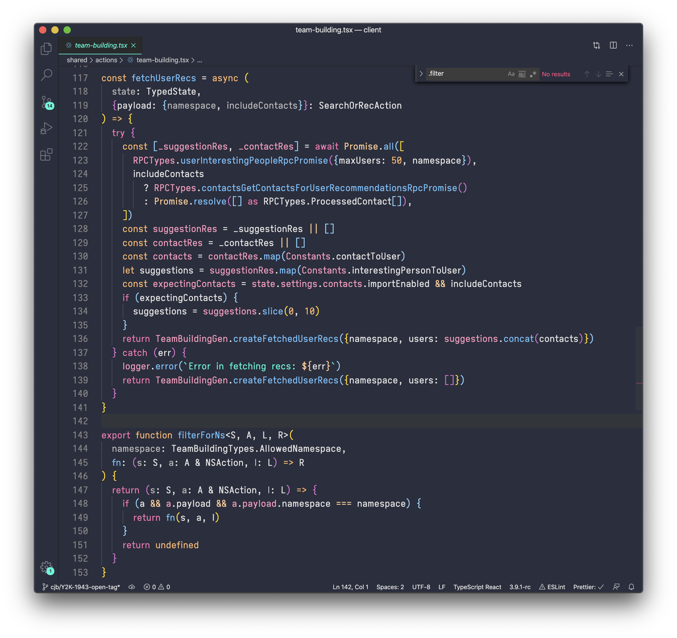
Been using a customized Iosevka build for years and can't use anything else, and I've tried.
I use a custom Iosevka (ORW) from someone's ricing repo.
I think it's a bit less narrow.
https://github.com/s0la/orw/tree/master/.fonts
I think it's a bit less narrow.
https://github.com/s0la/orw/tree/master/.fonts
Haha, what a coincidence! I mention Iosevka and then three hours later, here it is submitted:
https://news.ycombinator.com/item?id=36784005
https://news.ycombinator.com/item?id=36784005
See also SARASA GOTHIC, a CJK programming font based on Iosevka and Source Han Sans.
https://github.com/be5invis/Sarasa-Gothic
https://github.com/be5invis/Sarasa-Gothic
This has been my goto font since Envy Code R.
I appreciate that it is slightly thinner.
I appreciate that it is slightly thinner.
I switched from Pragmata Pro to Iosevka Term Curly Slab a few years ago and I'm really happy with it. It's easy to read and I can fit a lot of code on one screen.
Since I've seen it (around HN, no less) years ago, it has been among the first few installations on every machine I handled.
Beautiful. It feels tall in just the right way.
Beautiful. It feels tall in just the right way.
One of my favorites! I like to use it in the terminal since it’s such a skinny font, so things like log lines fit better on a tiny laptop screen
I've using JetBrains Mono just because it has boldItalic and other fonts like Fira Code and Iosevka don't.
What do you mean? According to the docs:
> In all the monospace subfamilies, 9 weights (Thin to Heavy), 2 widths (Normal and Extended), and 3 slopes (Upright, Italic and Oblique) are included.
If I set "style: Bold Italic" in my Alacritty config, the text becomes thick and slanted. Bold does only thick, italic only slanted.
> In all the monospace subfamilies, 9 weights (Thin to Heavy), 2 widths (Normal and Extended), and 3 slopes (Upright, Italic and Oblique) are included.
If I set "style: Bold Italic" in my Alacritty config, the text becomes thick and slanted. Bold does only thick, italic only slanted.
In my custom Iosevka variants configuration I have 90 fonts: three widths (condensed, normal, expanded); five weights (thin, light, regular, bold, black); different letter shapes for upright/italic/oblique (slope is also configurable) and for another "axis", normal (for general coding) vs. slab serif (fancy).
Been a huge fan of Envy Code R and Iosevka is just a natural progression. Loving that font!
Offers lots of customisation, great for terminal, great for code.
I use Iosevka for everything. Glad it gets some recognition.
this is brilliant!!
I have no patience for a font that doesn't get this right, and only limited patience for a font that doesn't make it clear that they did get it right.
:::scuttles back to DejaVu Sans Mono good-enough-ness:::